Abstraction:
Definition : Abstract photography, sometimes called non-objective, experimental, conceptual or concrete photography, is a means of depicting a visual image that does not have an immediate association with the object world and that has been created through the use of photographic equipment, processes or materials.
My thoughts : In my opinion, abstraction means simplifying complex things down into their essential parts (like shapes, colours, lines etc). In photography this usually involves taking images at interesting angles and close ups.
The formal elements:
|
|
|
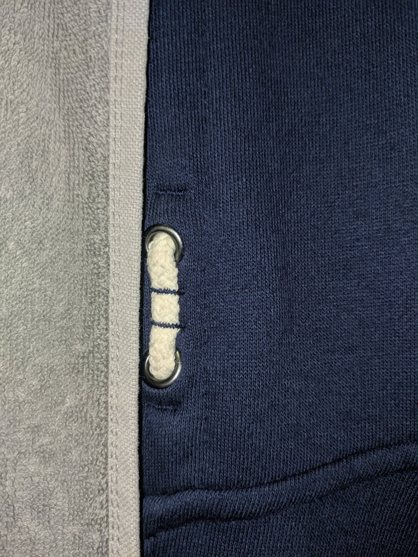
Focus: The technique of drawing attention to a specific element or objects within the image by making it clear or unclear to see.
|
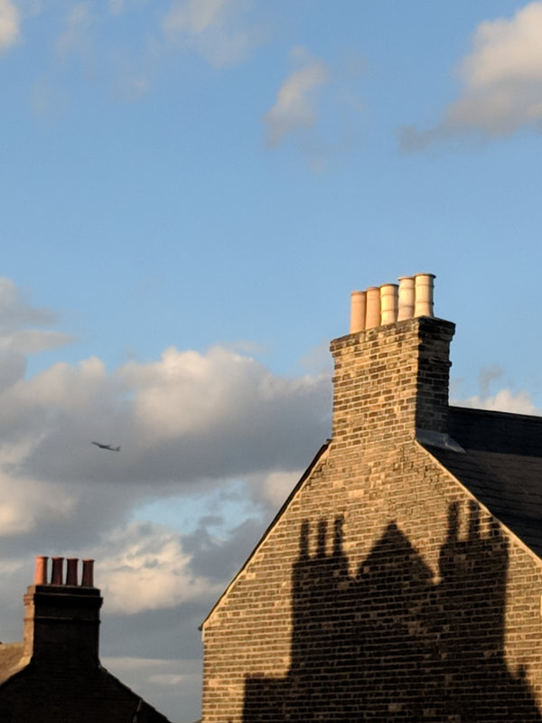
Light: The way the light reflects, refracts and contrasts with the shadows.
|
|
|
|
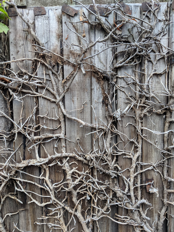
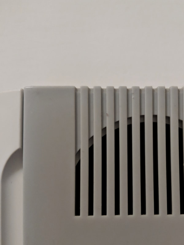
Lines: The sharpness and thickness of the lines and whether there are curves or sharp edges.
|
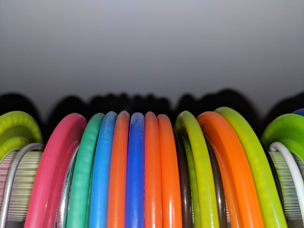
Repetition: Multiple shapes and colours within the photograph that create patterns.
|
Space: Cropping and framing as well as the composition of elements in the photograph. The narrow or wide field of view and the depth of the image
|
Texture: The effects that different materials have on the image is shown in the varying and contrasting textures.
|
|
|
|
Shapes: Geometric shapes or curved shapes.
|
Form: 3 dimensional space and objects with the image.
|
|
|
|
Value/Tone: The range of tone from light to dark. How the shadows interact with the light.
|
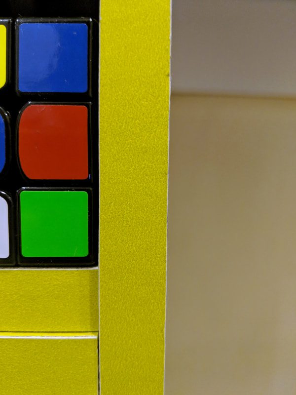
Colour: Different shades, hues and saturation of colours as well as how they interact with each other.
|
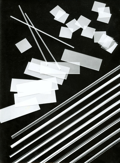
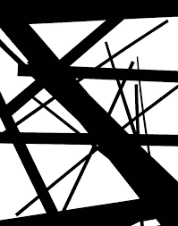
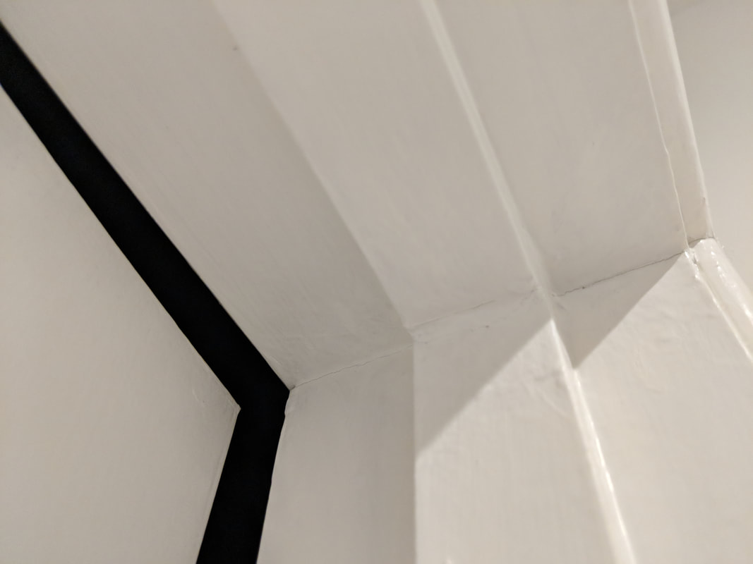
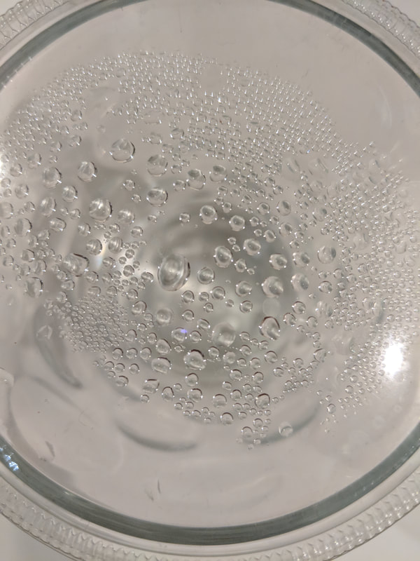
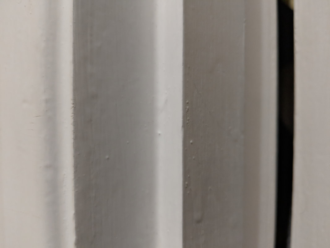
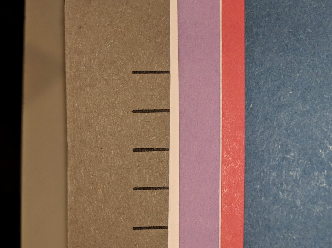
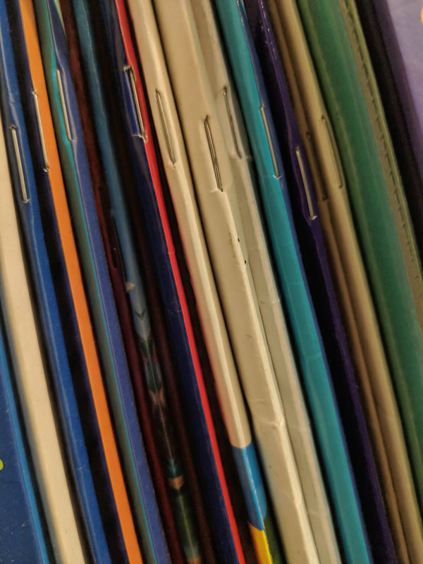
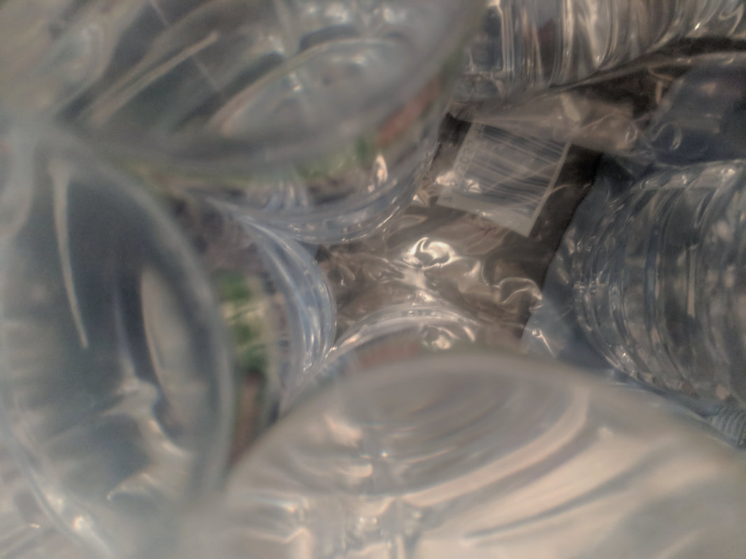
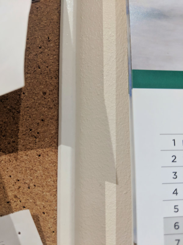
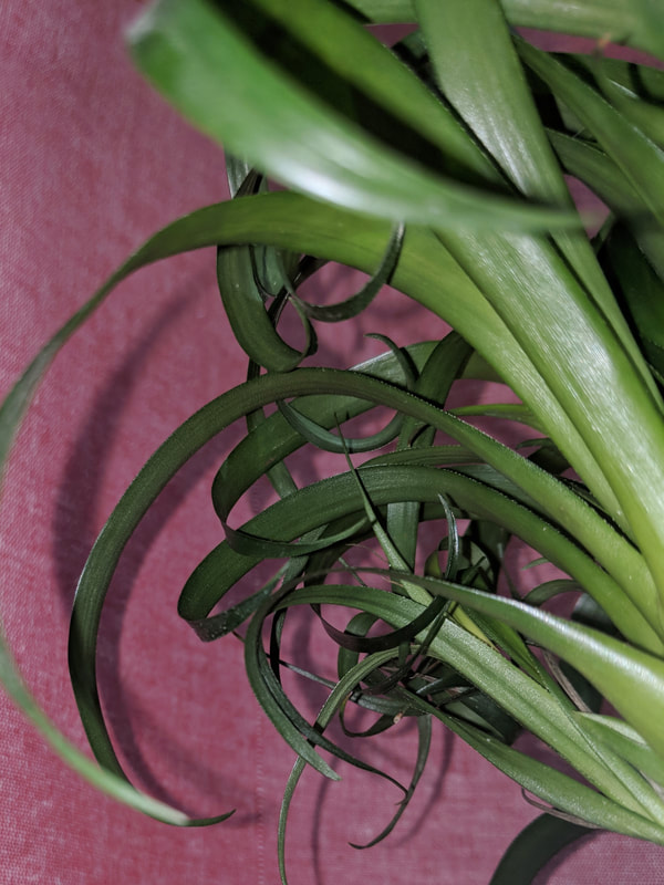
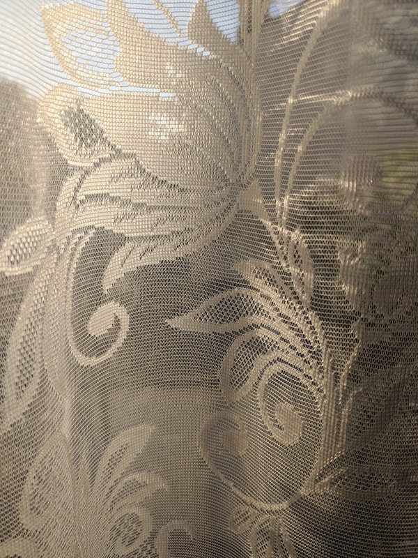
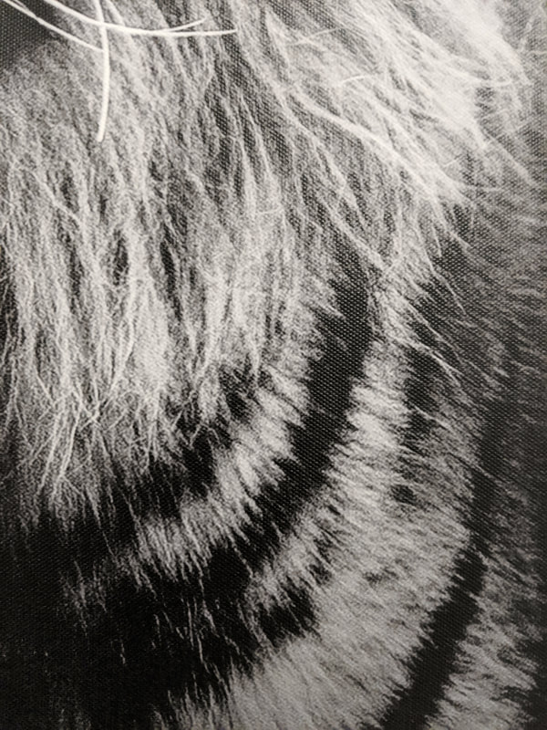
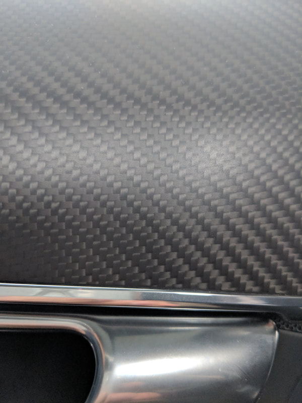
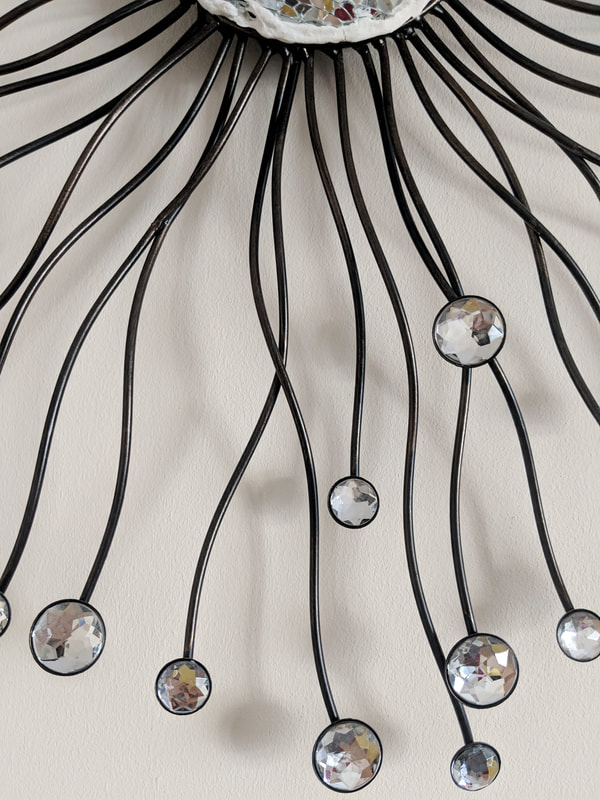
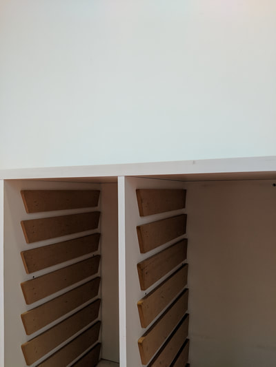
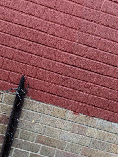
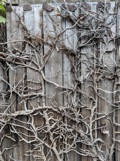
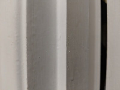
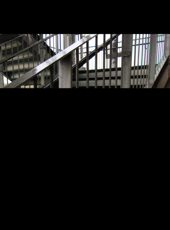
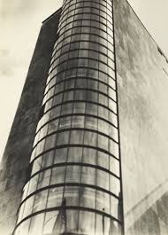
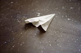
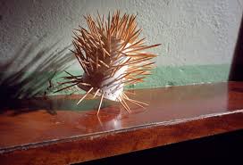
General formal element study:
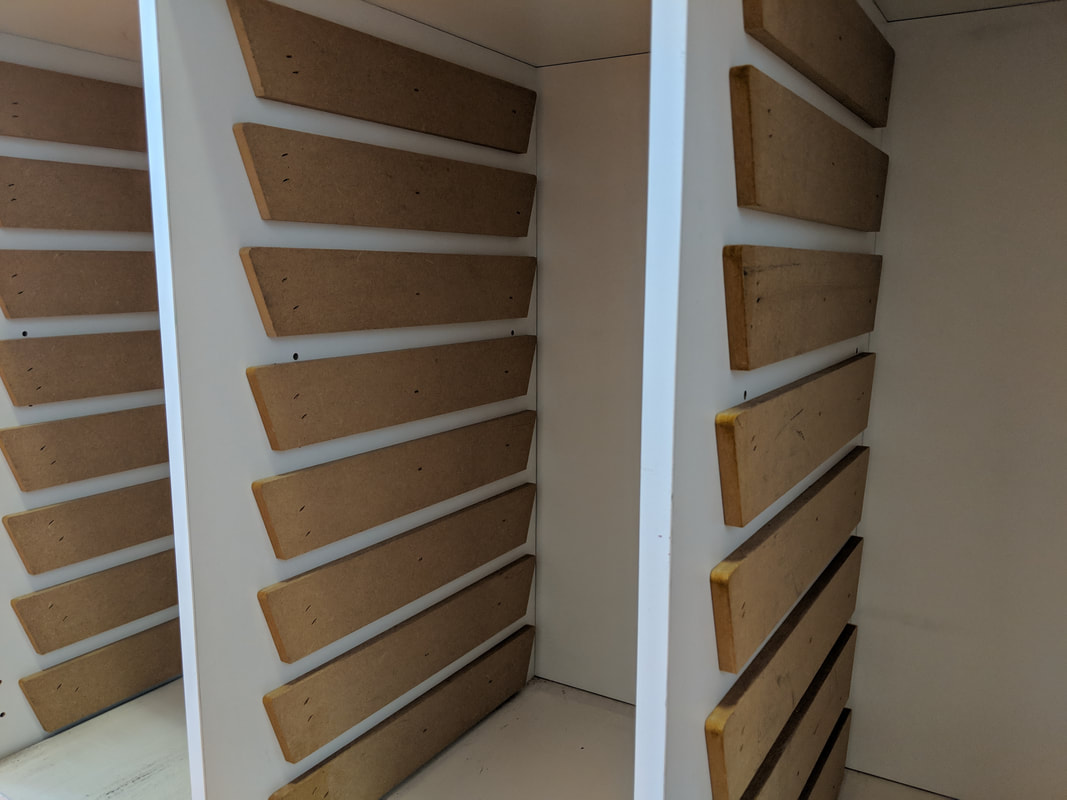
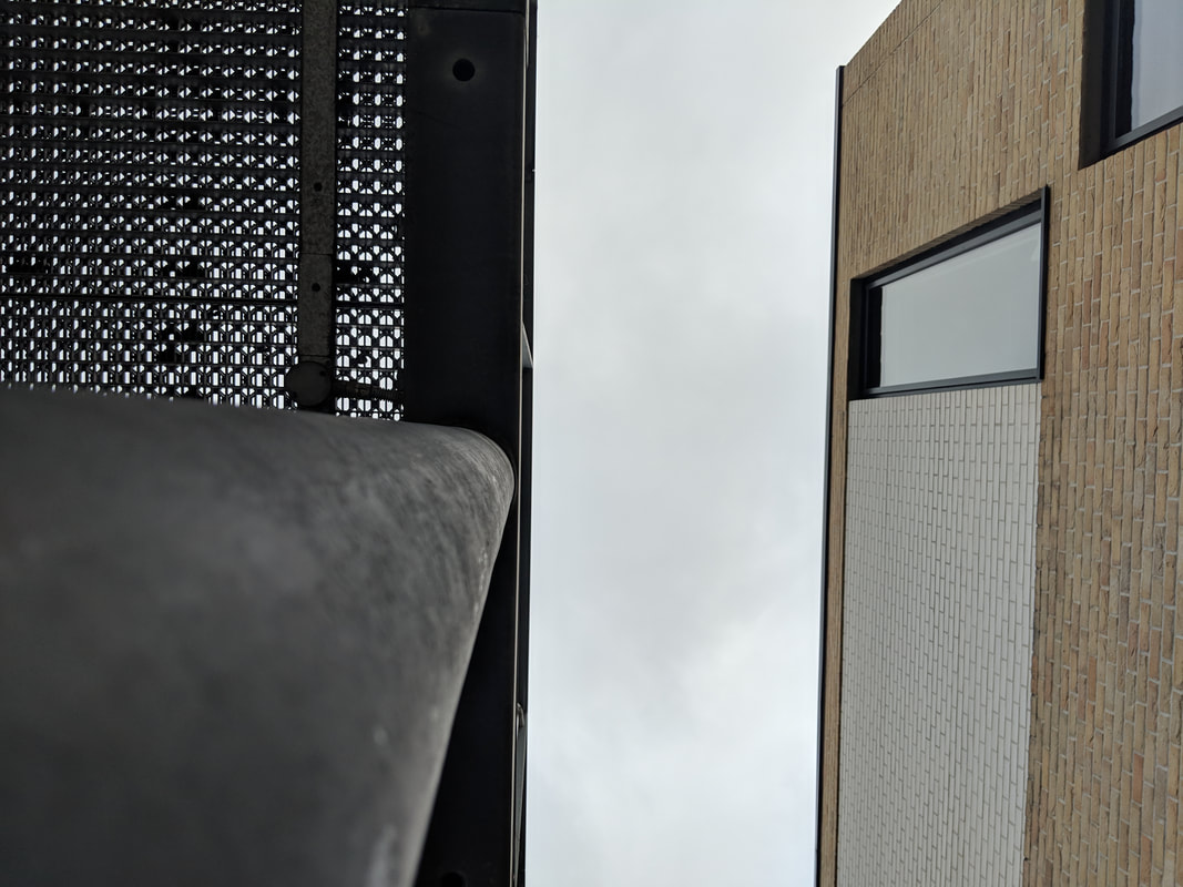
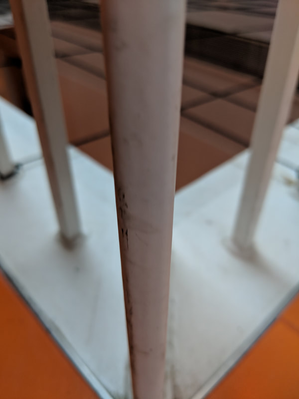
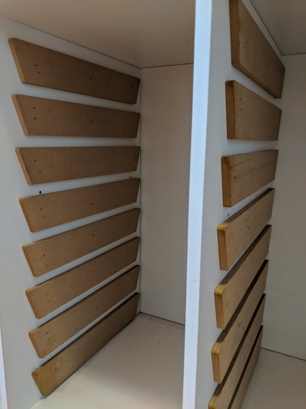
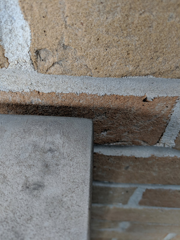
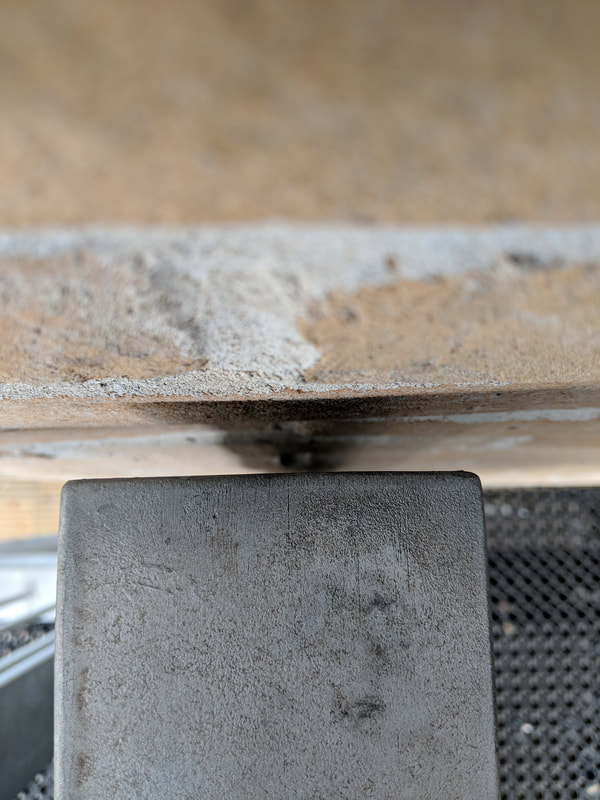
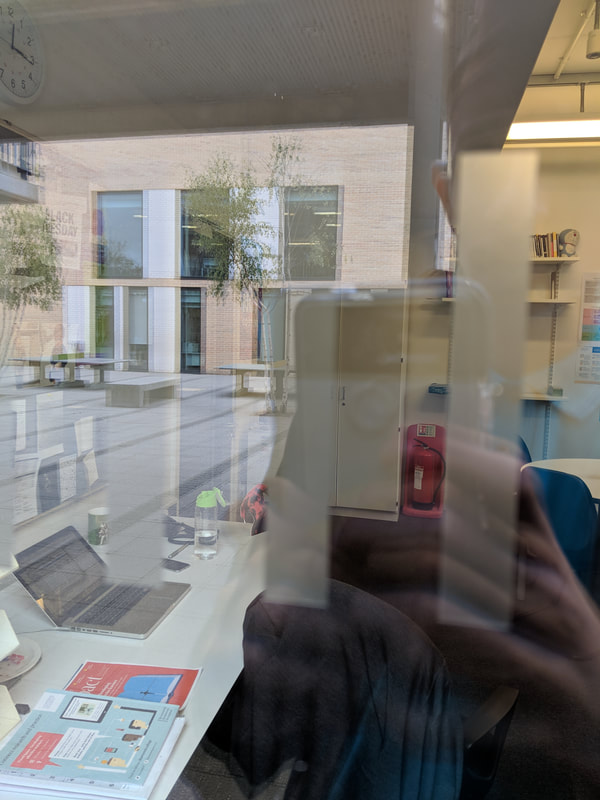

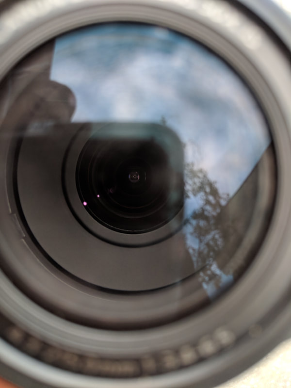
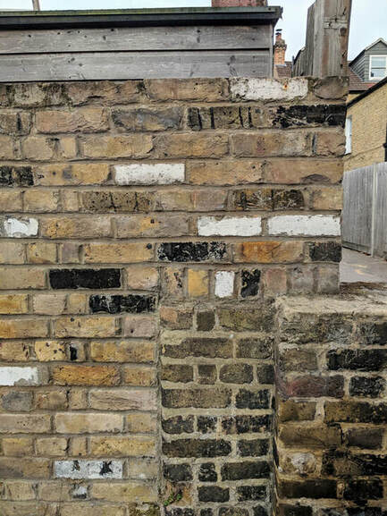
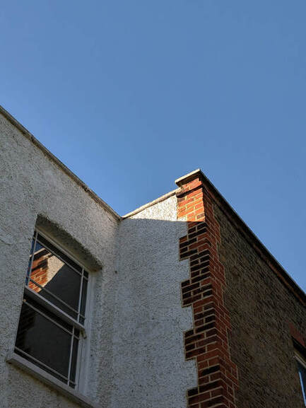
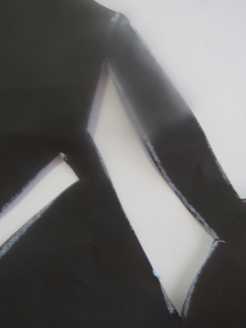
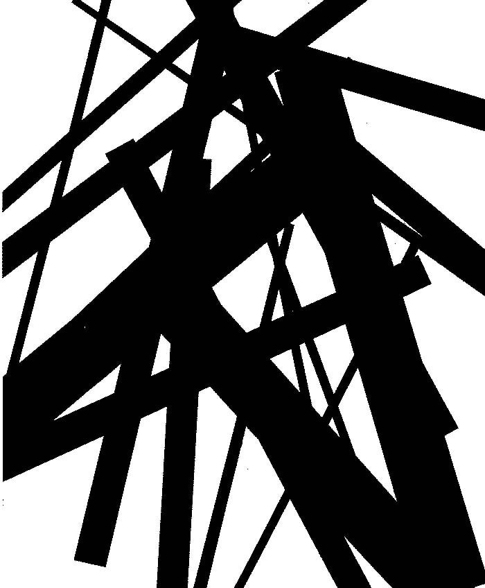
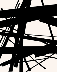
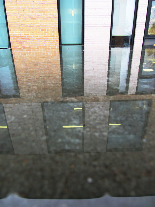
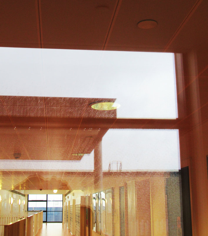
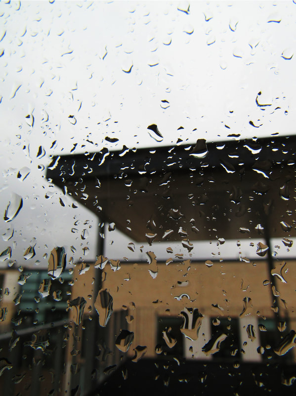
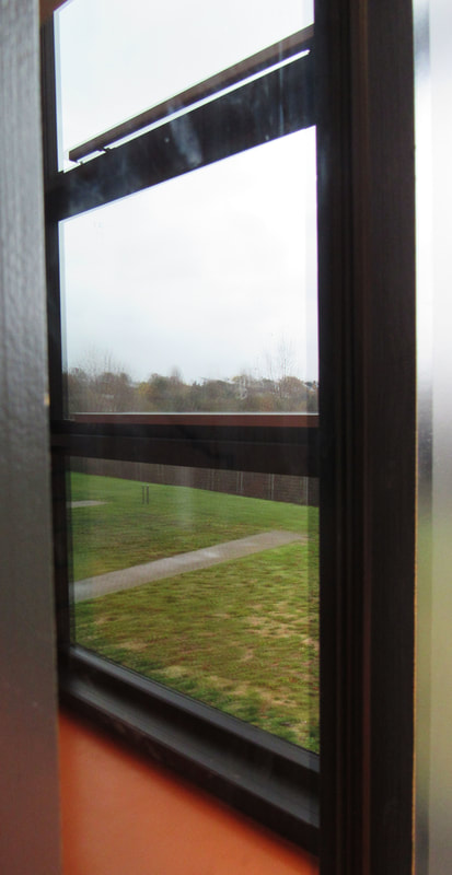
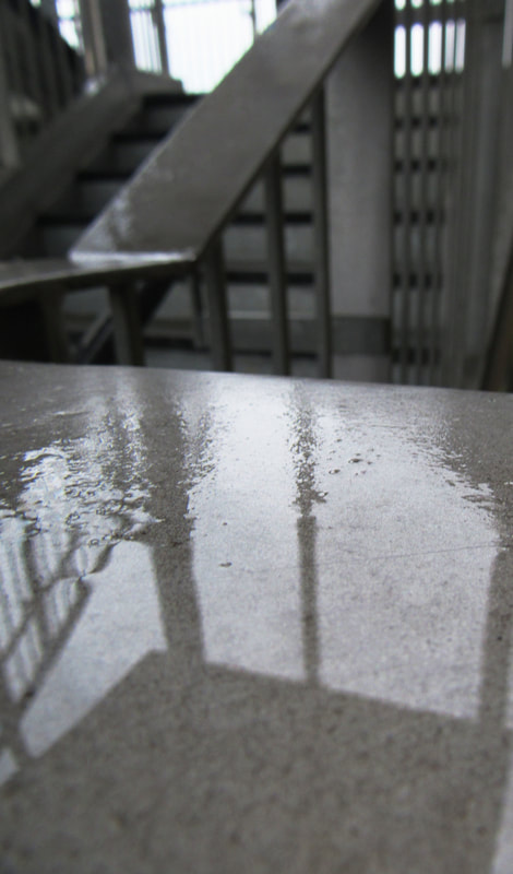
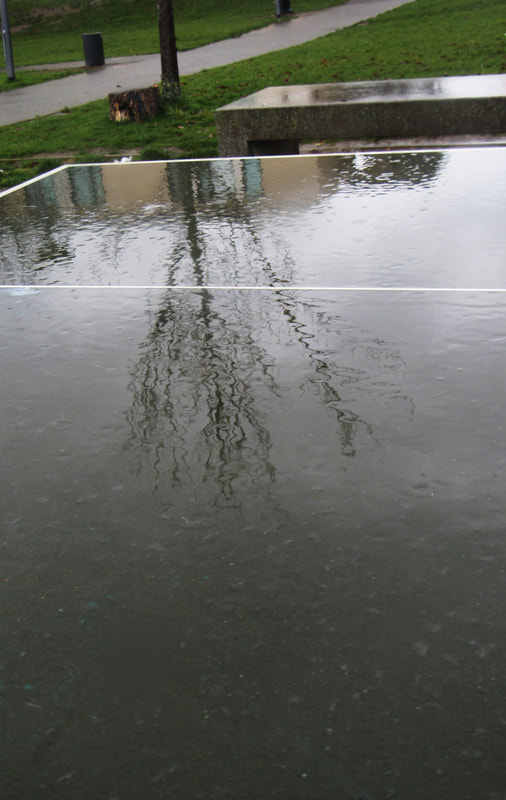
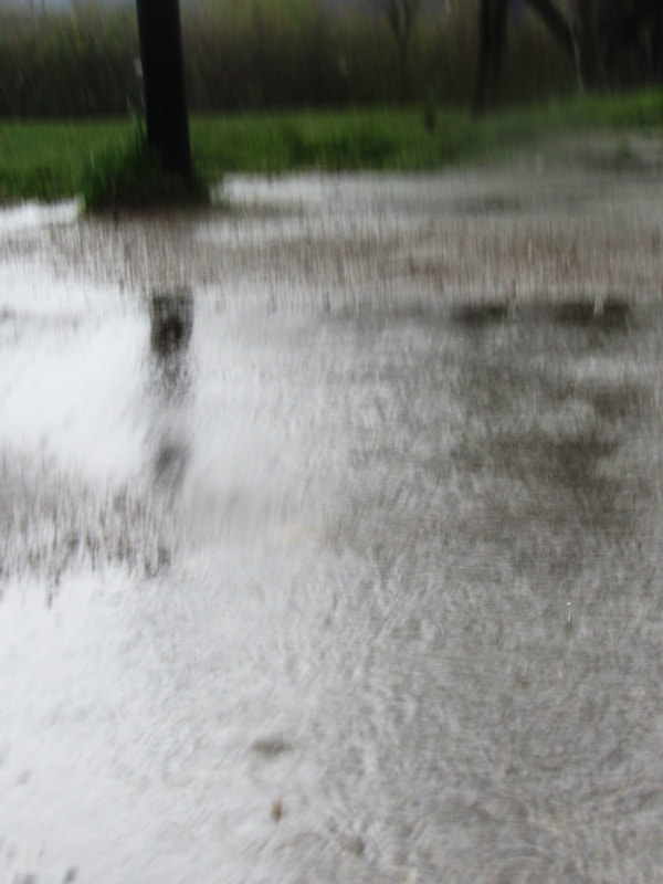
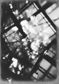
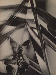
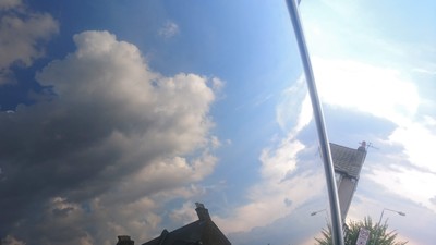
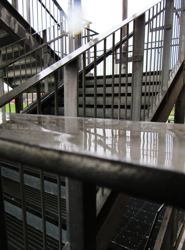
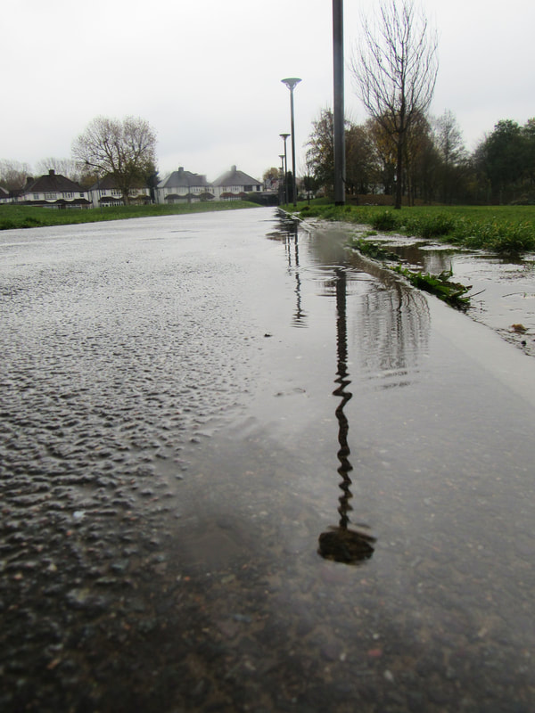
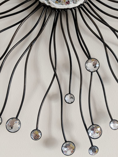
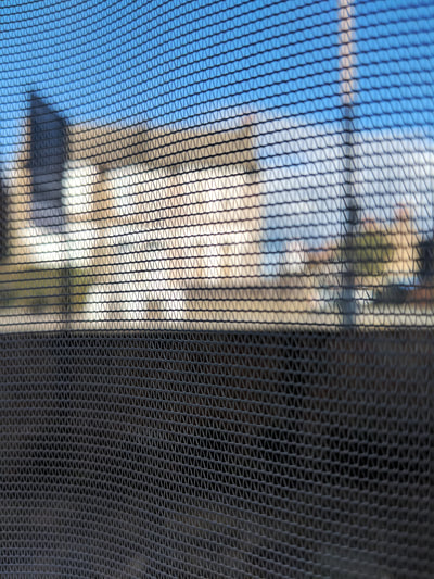
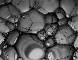
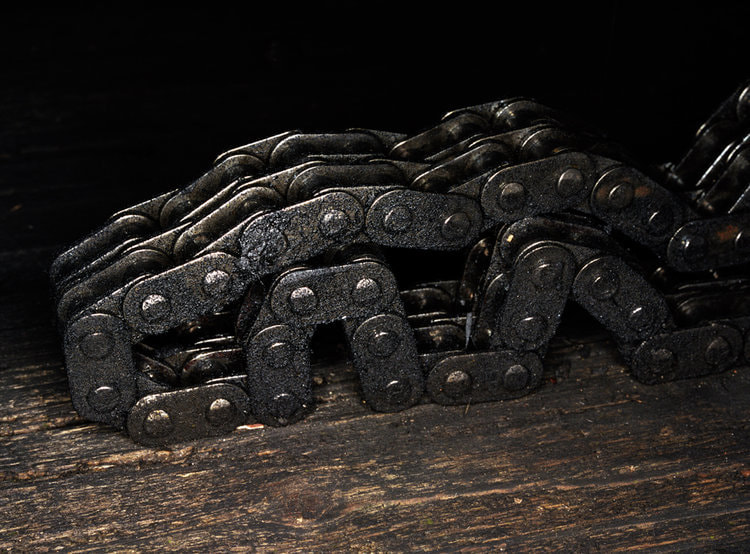
I think my photos here followed a few of the formal elements like lines, shapes, repetition and texture. However i feel like only a few photos are truly abstract because for most photos i took, you could tell exactly what it was.
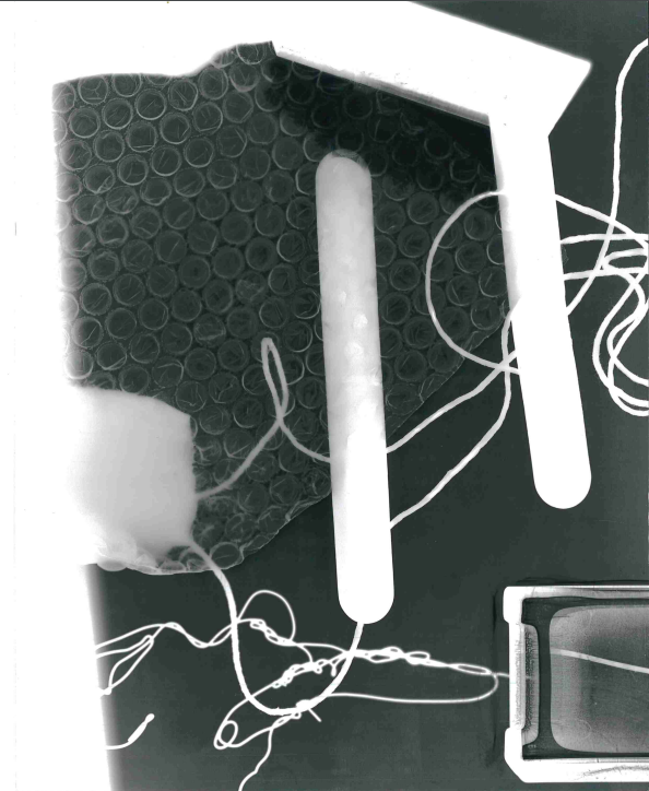
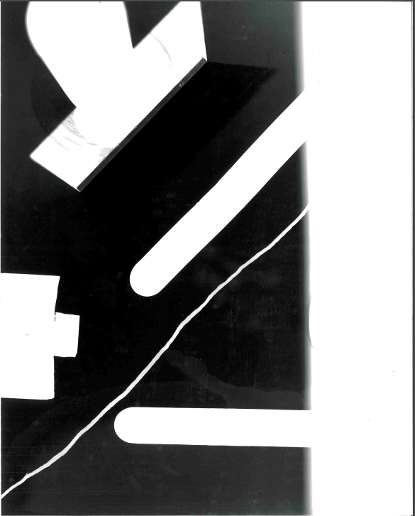
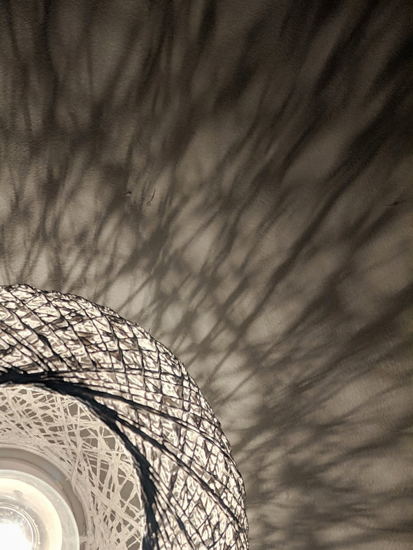
Specific formal element photographs:
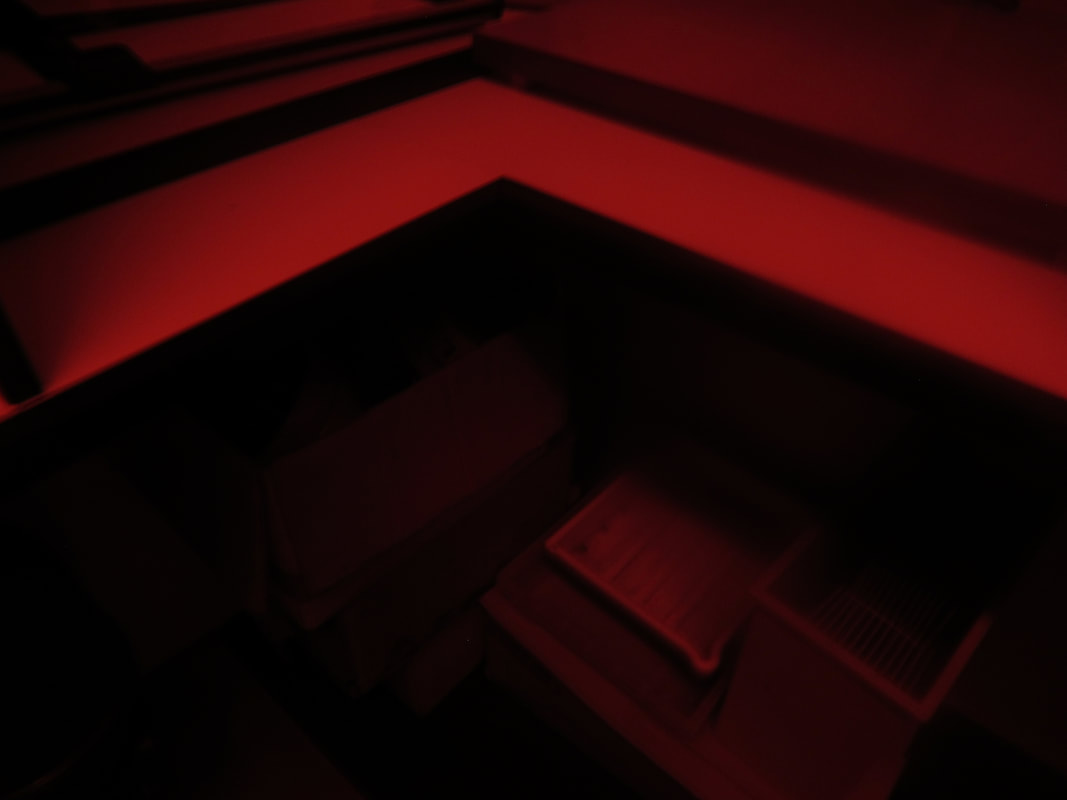
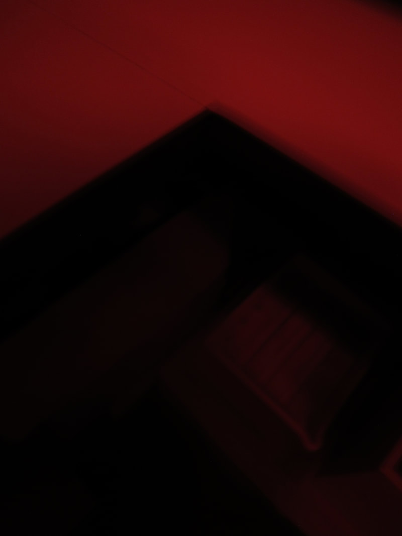
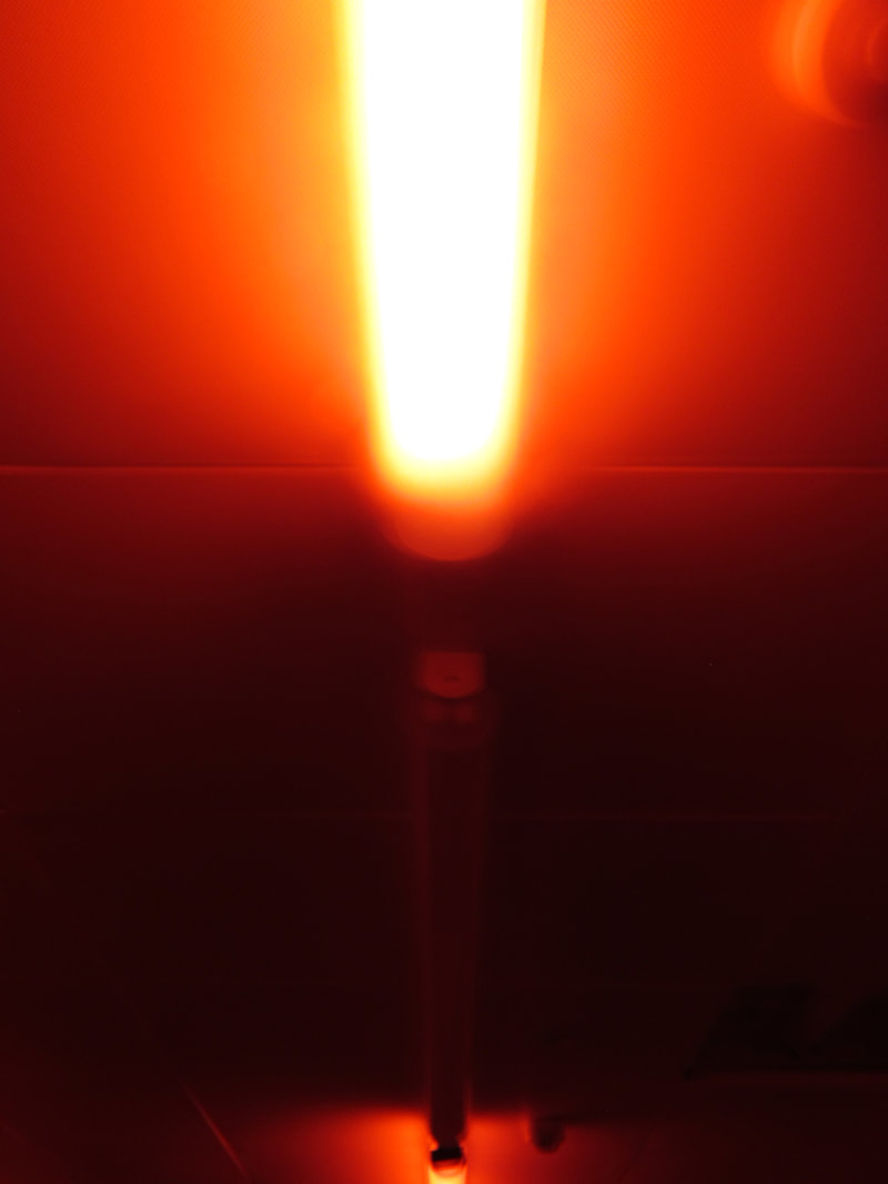

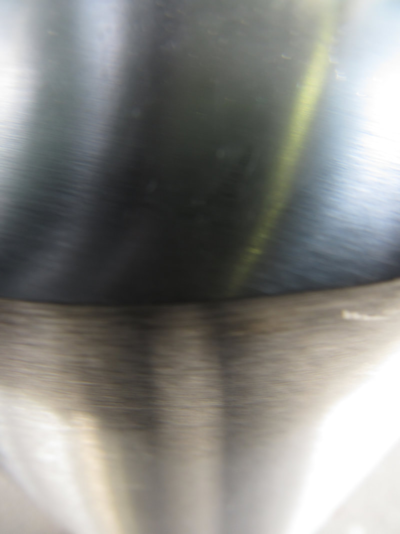
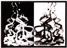
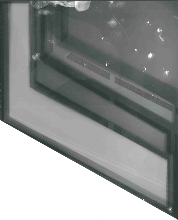
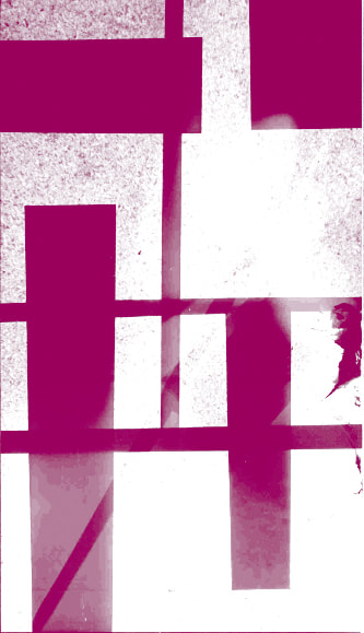
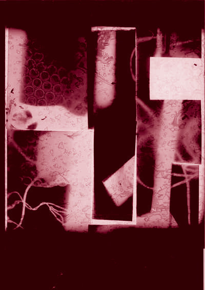
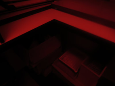
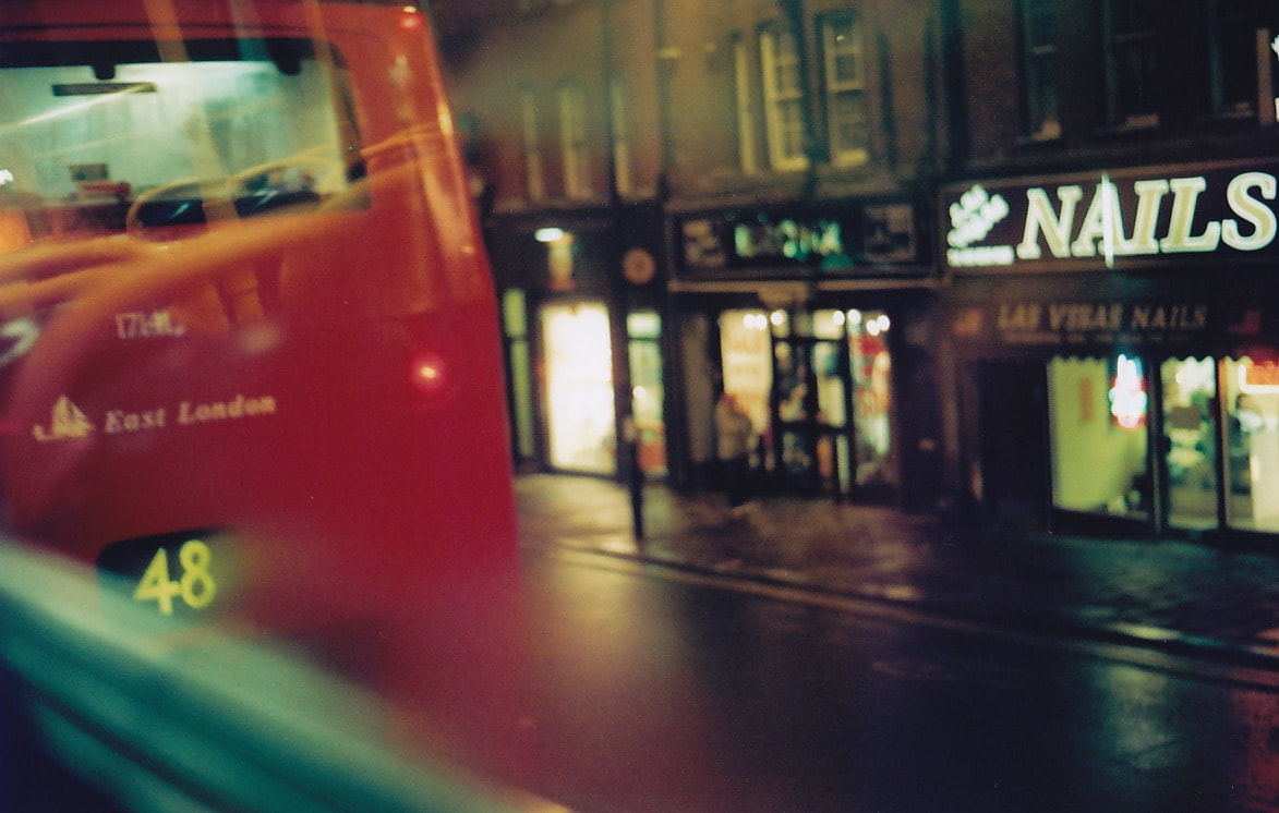
I decided to choose Light as my formal element. In the images i took, light is shown with contrasts to shadows and as different colours. I think my favourite images are the dark room photos (first 4 red images) because they are unrecognisable due to the red lighting.
|
Work sheet questions in neat:
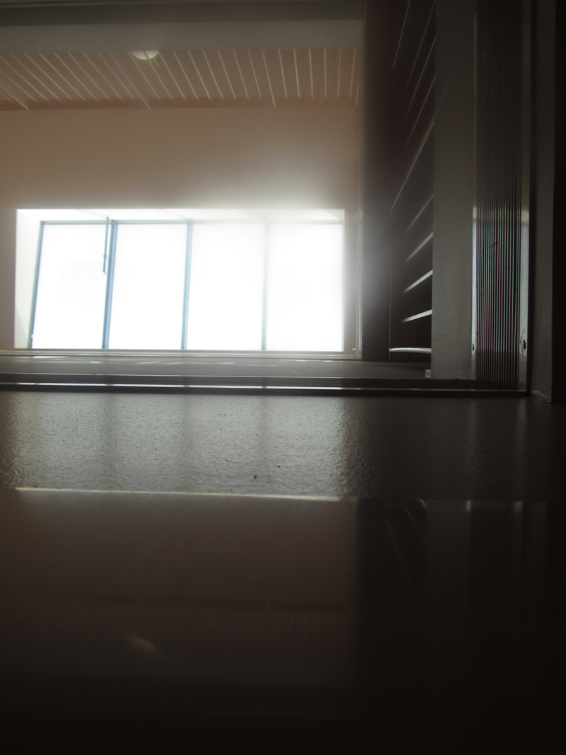
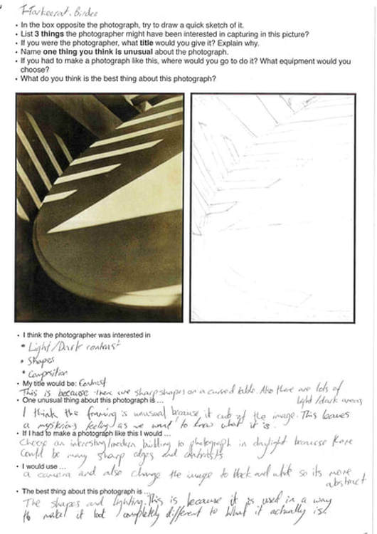
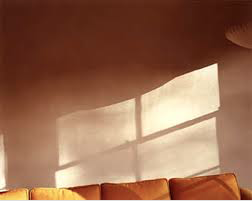
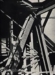
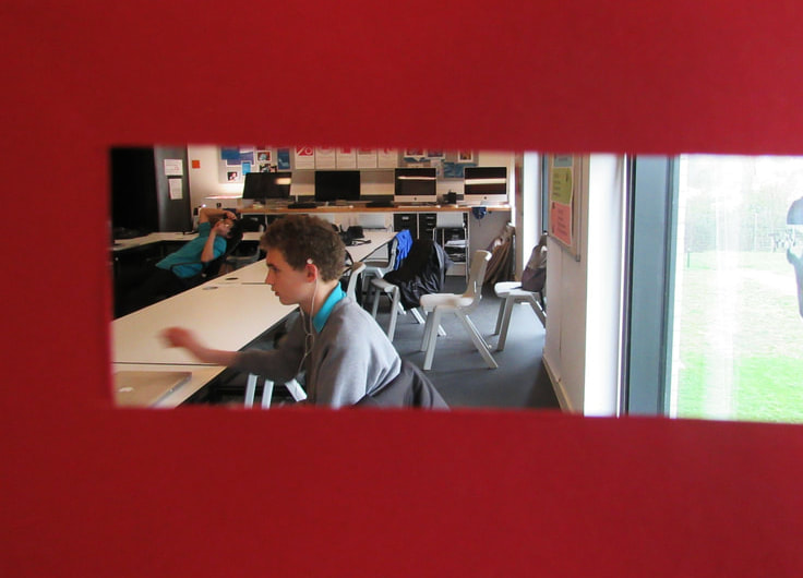
- I think the photographer was interested in light/dark contrast, shapes and composition. -My title would be contrast, this is because there are sharp shapes in contrast with the curved table. Also there are lots of light areas contrasting to dark areas. -I think the framing is unusual because it cuts of the image. This leaves a mysterious feeling as we want to know what it is. -If i had to make a photograph like this i would choose an interesting / modern building to photograph in the evening because there could be many sharp edges and contrast. -I would use a camera and also change the image to black and white so its more abstract. -The best thing about this photograph is the shapes and lighting. This is because it is used in a way to make it look completely different to what it actually is. |
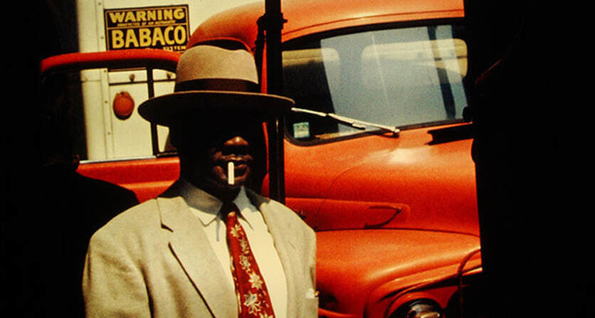
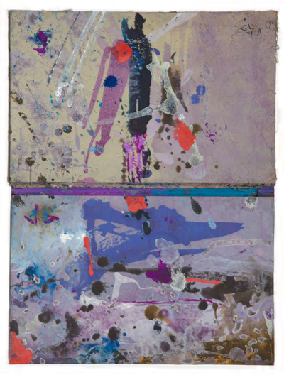
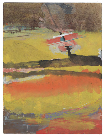
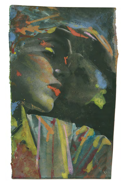
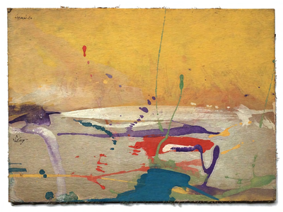
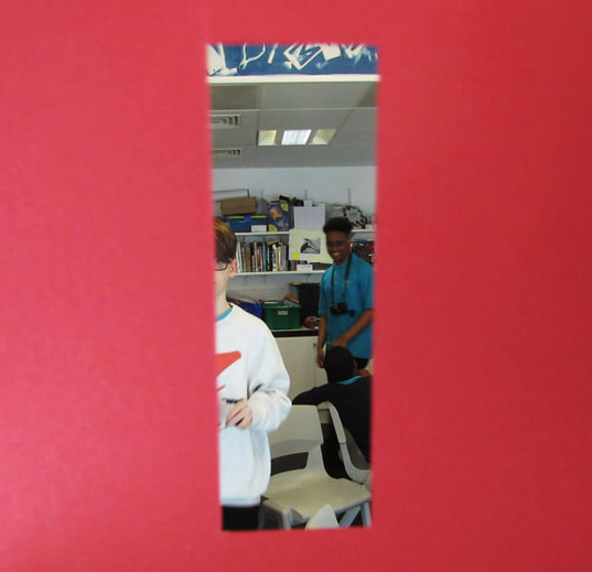
Here are some abstract photographs i have found on Flickr. |
|
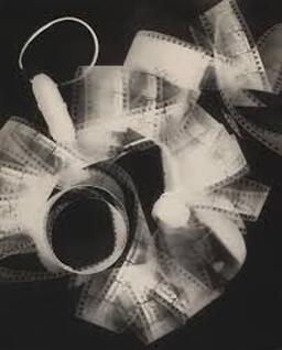
Abstract Photographer: Man Ray: re-analysis
Man Ray was famous for his unique photograms which later led to the development of Rayographs. His photograms often involve regular everyday items yet they are positioned in ways so we cant tell exactly what it is. A main theme in abstract photography is about turning something familiar into the unfamiliar. Man Ray does this by layering objects, playing with light and pairing objects together that have nothing to do with each other to add to the confusion.
|
|
|
|
How to make an abstract photogram:
1) Go into the dark room and turn on the red light (keep lights red for entire process)
2) Choose an array of objects to photogram.
3) Take a light sensitive paper and place it underneath a photogram light (turned off).
4) Position your objects on top of your paper.
5) Remove the red filter and turn on the light for roughly three seconds and then turn it off.
6) Remove the paper.
7) Place the light sensitive paper into the first solution (the developer) for one to two minutes.
8) Remove it and place the light sensitive paper into the second solution (the stop) for one minute.
9) Remove it and place the light sensitive paper into the third solution (the fixer) for one to two minutes.
10) Remove it and rinse the light sensitive paper in water.
11) Hang the light sensitive paper to dry.
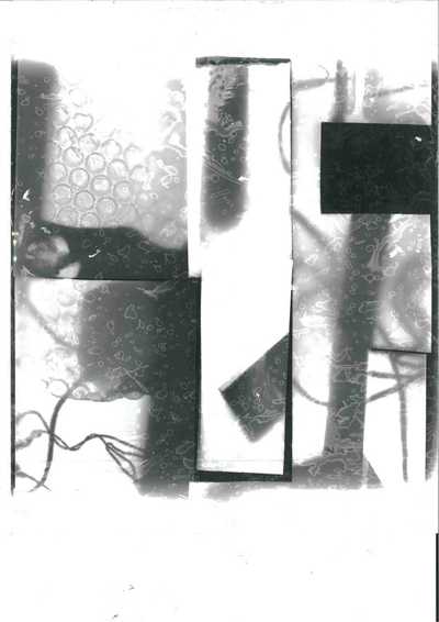
Abstract photograms i have found:

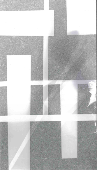
My favourite photogram:
|
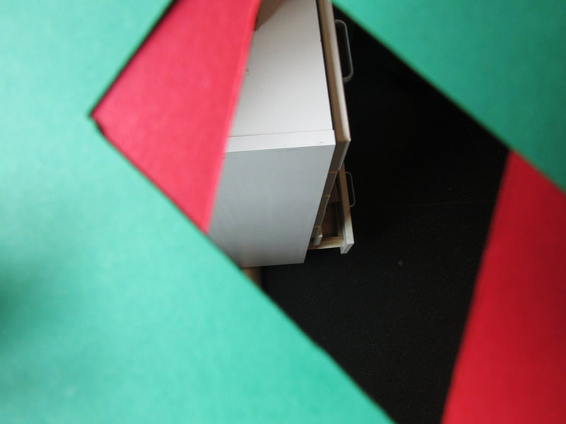
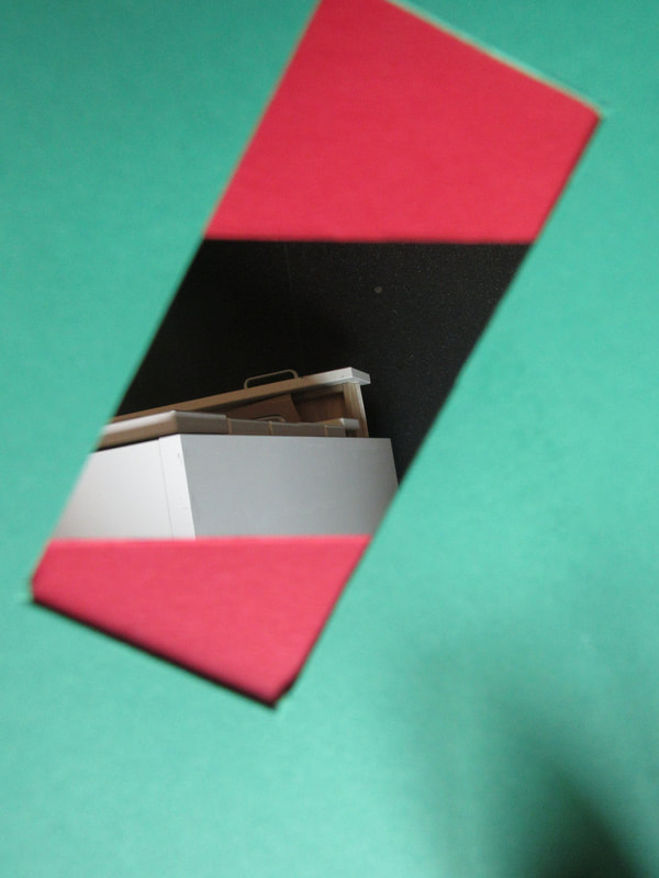
This is my favourite photogram because the photographer has used simple shapes such as rectangles to create an array of interesting contrasts and patterns.
The photographer has used the formal element of shapes.
|
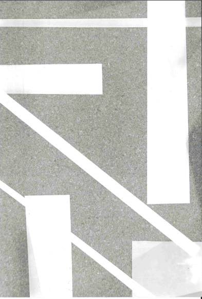
Large photograms:
How i could improve my photograms:
1) I could experiment with more shapes and objects to make it more difficult to understand.
2) I could correctly align the papers with the light so i don't end up with a photograms that has a large white section on one side.
3) I could cut the photograms themselves into interesting pieces and shapes to add an abstract cropping to the image.
Small photograms:
I experimented with cutting the paper into smaller rectangles and also cutting the paper into an abstract polygon. Then I placed objects on the paper specifically to match the edges of the polygon.
Cut up photogram photograms:

With the cut up photograms, i decided to create an unorganised and organic image. I like the way not all cut up pieces are perfectly in position which adds to the natural feeling.
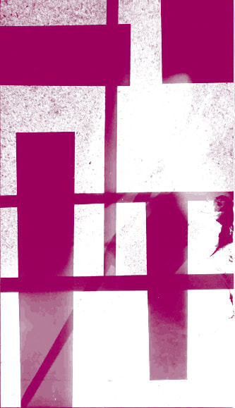
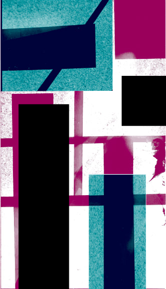
Duotone photograms:

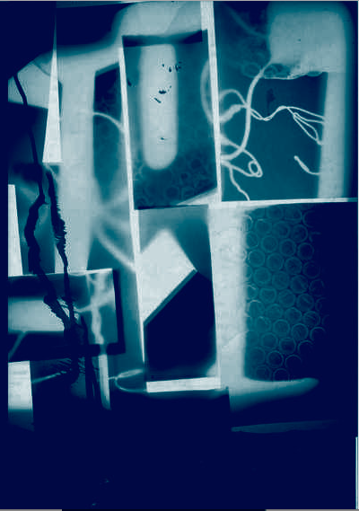
For the bottom two duotones i decided to create a dark and mysterious look by hiding the edges of the photograms. This creates a sinister or mysterious mood especially with the red duotone. However, for the first two duotones i made sure there were deep contrasts so the abstract and geometric shapes would stand out. In a way, the first two duotones contain modern, architectural and abstract imagery yet the last two duotones contain natural and organic imagery with lots of curves and messy objects.
Abstract Photo book:
My photo book will include abstract photos and the design will be sharp and interesting. The previous photo books i have made were very minimal in design yet had vert abstract covers. I think for this photo book, i will incorporate the front cover design of my previous book but a new interesting way of laying out the photos.
Here are the set of abstract photographs I took:


Abstract photography presentation research:
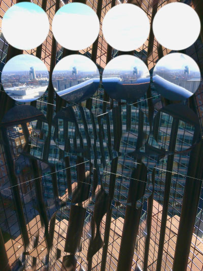
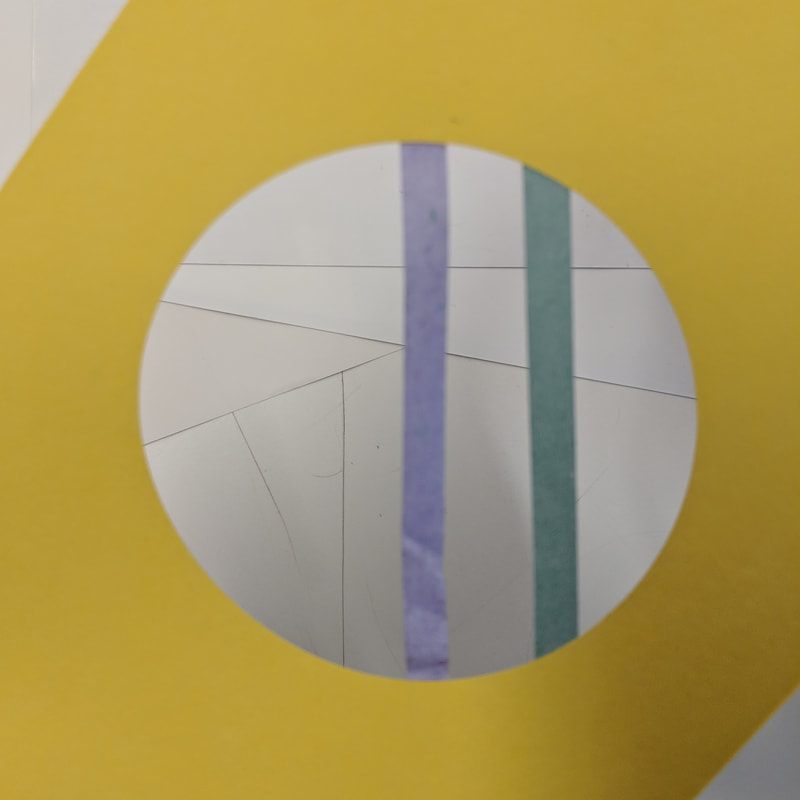
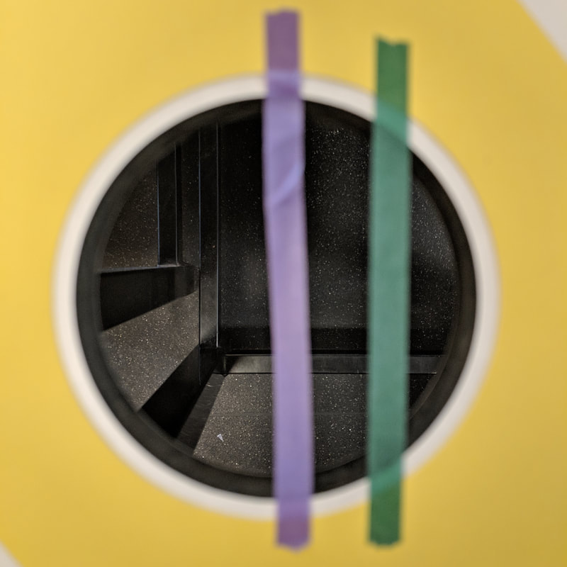
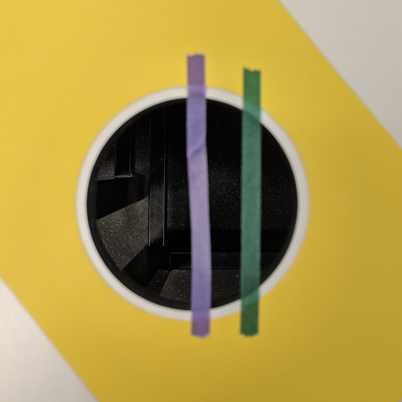
Final piece 1: Circles
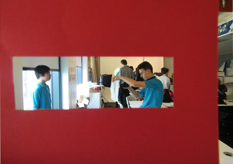
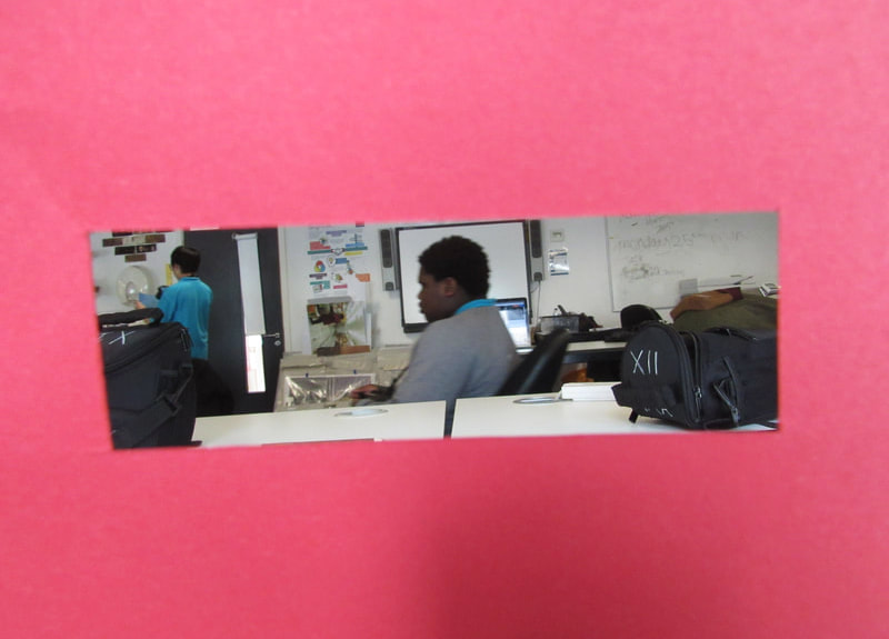
The images have been placed onto one card and the second card has holes in it so when the photographs are sandwiched between the two cards, it looks like the images have been cropped into circles. This is abstract because the cropping means that you can't see the entire image. I like the shapes however i don't like the images because i feel that they are very natural and not very interesting.
Final piece 2: Clouds
The images have been cut into squares and then glued to a large card so that they connect and this creates a geometric and blocky look. Also, there is a small poem about the sky cut out into a square and glued onto the top left corner. The reason this is abstract is because of the arrangement of squares and the added poem about the sky. I like the idea of connecting similar images to make it look abstract.
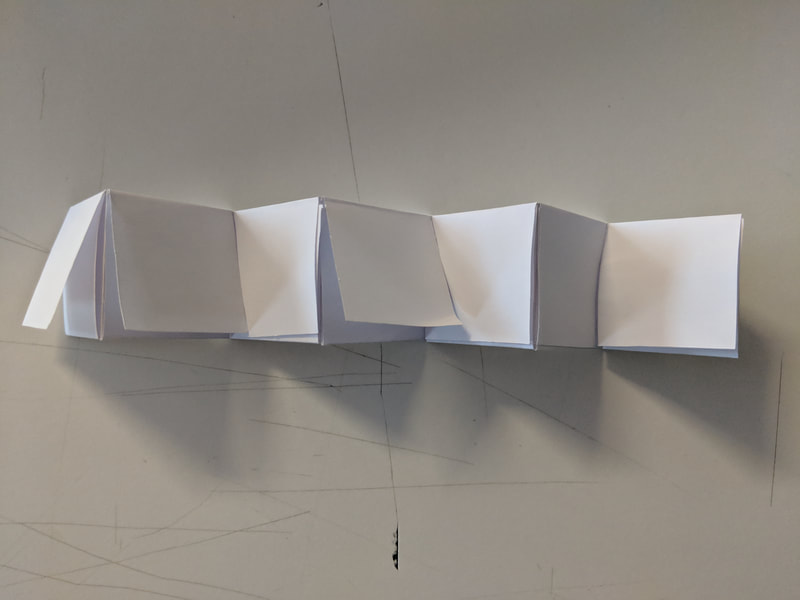
Final piece 3: 3D
There is only one big image and its been folded to create a 3D structure. The image is abstract because its been edited so that it seems like the one picture is actually many pictures due to the different colours, abstract edges and lines that act as marks for the folds. I like the idea of editing it so it looks like a few different images.
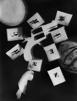
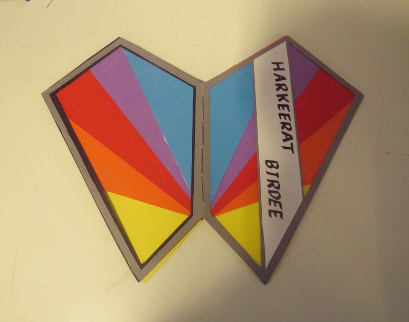
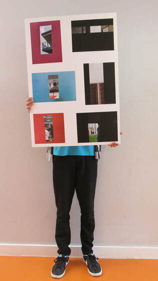
Final piece 4: Words
Six equal rectangles have been cut into the large card and then the images have been stuck to the back of the rectangles. The images themselves contain random yet recognisable objects paired with equally random and recognisable word. This is abstract because our brains try to create a relationship between the image and word but fails to and so we are left confused. I like the idea of adding randomness to the presentation, specifically the words, i think that this can further develop the abstract look and context of the presentation.
Final piece 5: Photogram
This piece contains lots of rectangular photograms and a few coloured photograms, all stuck onto the large card. The photograms themselves are abstract as they contain many polygons and lines yet have no context. I like the photograms themselves and think i will try to incorporate the coloured photograms.
The images have been placed onto one card and the second card has holes in it so when the photographs are sandwiched between the two cards, it looks like the images have been cropped into circles. This is abstract because the cropping means that you can't see the entire image. I like the shapes however i don't like the images because i feel that they are very natural and not very interesting.
Final piece 2: Clouds
The images have been cut into squares and then glued to a large card so that they connect and this creates a geometric and blocky look. Also, there is a small poem about the sky cut out into a square and glued onto the top left corner. The reason this is abstract is because of the arrangement of squares and the added poem about the sky. I like the idea of connecting similar images to make it look abstract.
Final piece 3: 3D
There is only one big image and its been folded to create a 3D structure. The image is abstract because its been edited so that it seems like the one picture is actually many pictures due to the different colours, abstract edges and lines that act as marks for the folds. I like the idea of editing it so it looks like a few different images.
Final piece 4: Words
Six equal rectangles have been cut into the large card and then the images have been stuck to the back of the rectangles. The images themselves contain random yet recognisable objects paired with equally random and recognisable word. This is abstract because our brains try to create a relationship between the image and word but fails to and so we are left confused. I like the idea of adding randomness to the presentation, specifically the words, i think that this can further develop the abstract look and context of the presentation.
Final piece 5: Photogram
This piece contains lots of rectangular photograms and a few coloured photograms, all stuck onto the large card. The photograms themselves are abstract as they contain many polygons and lines yet have no context. I like the photograms themselves and think i will try to incorporate the coloured photograms.
Photographer research:
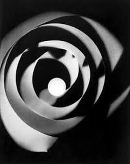
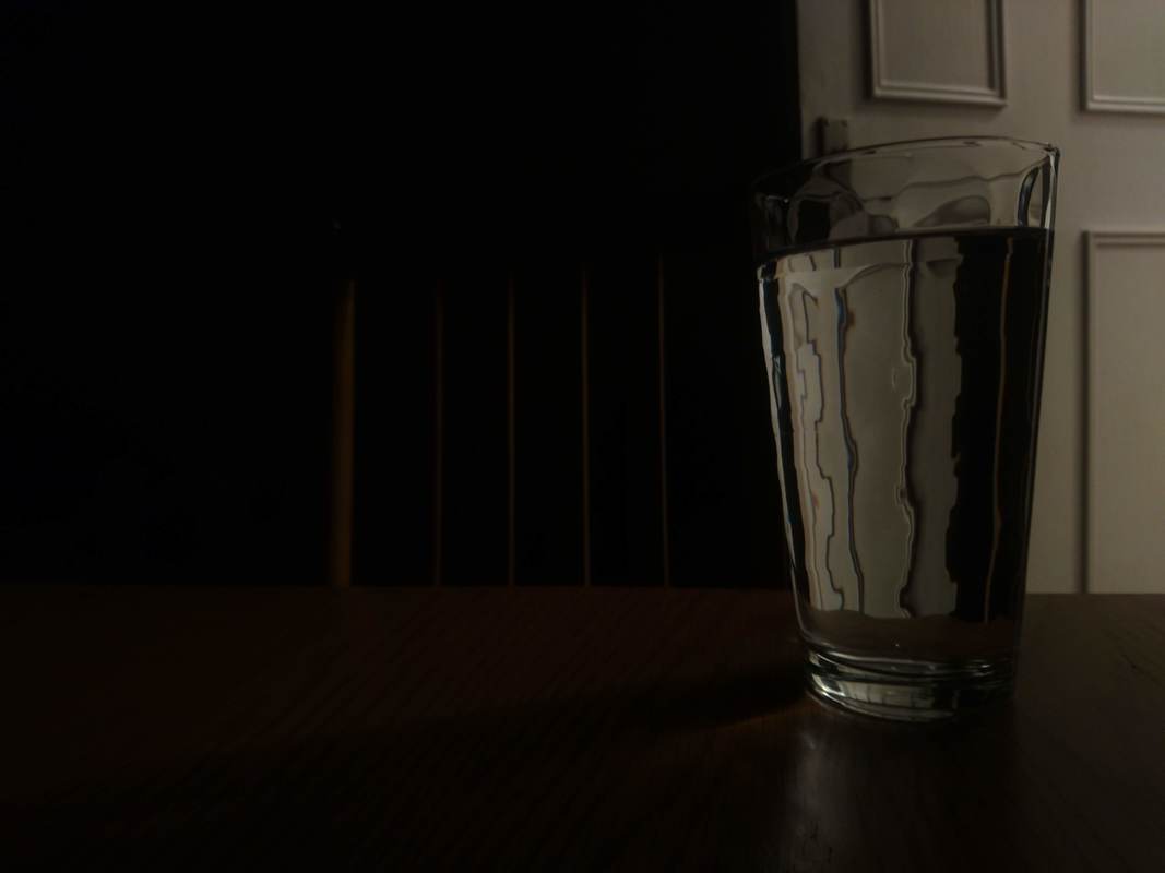
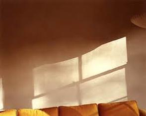
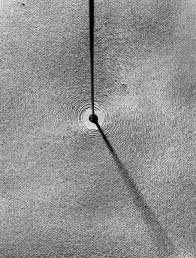
Uta Barth:
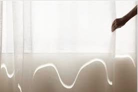
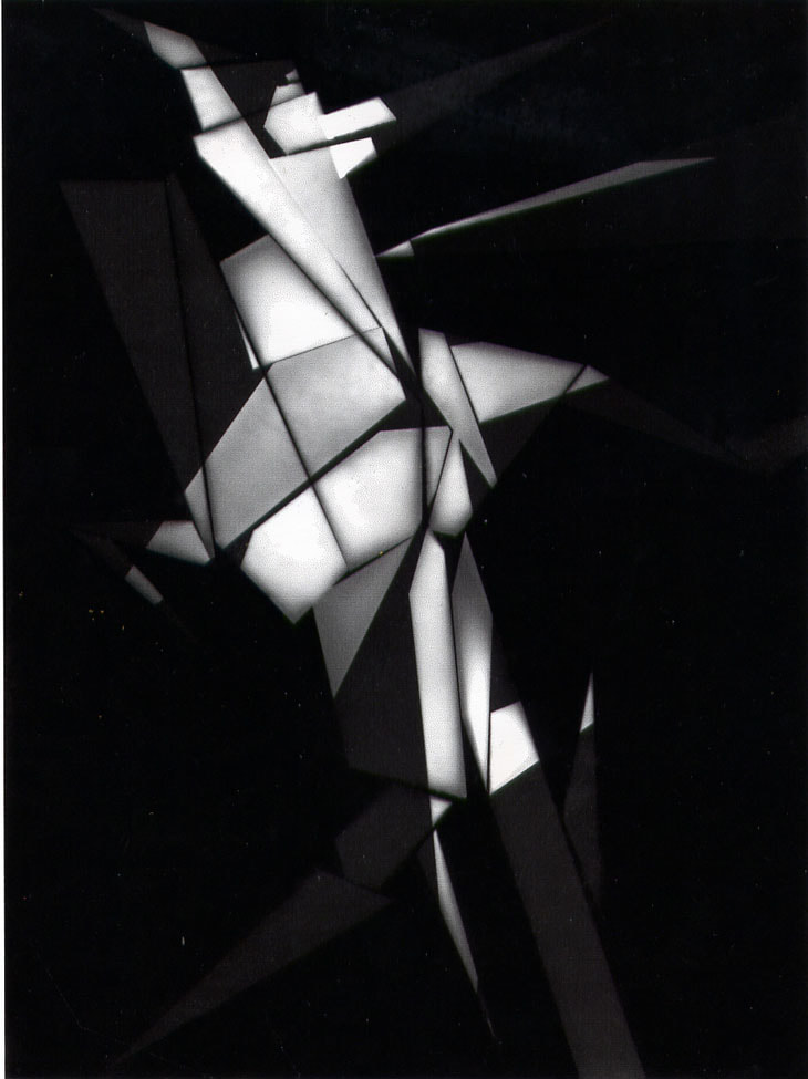
Uta Barth creates abstract photographs using light and shadows. The images are very monotone and contain little contrast. The abstract element in her photographs come from the shadows and light composed in geometric shapes. However the sharp shapes are contrasted by the limited colour palette and bright exposures.
|
I like this image because the light is composed in such a way to create an abstract and confused feeling. the specific shape of the light is nor round nor completely rectangle but more distorted. This generates questions like, ' what had caused the light to refract?', 'what is the shape of the refracting material?', 'is there a window?'.
|
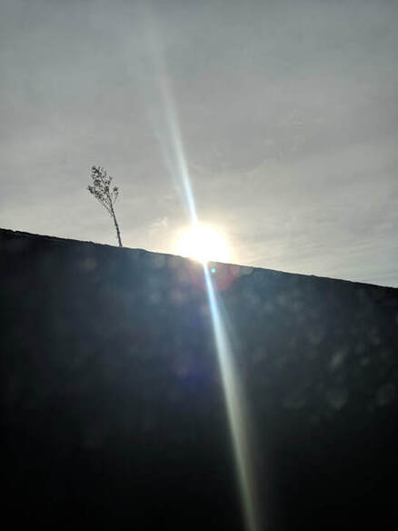
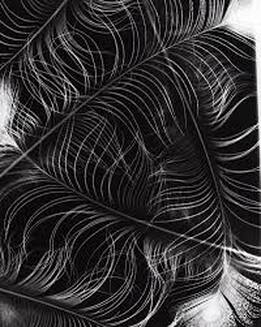
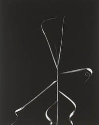
Harry Callahan:
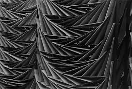
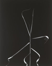
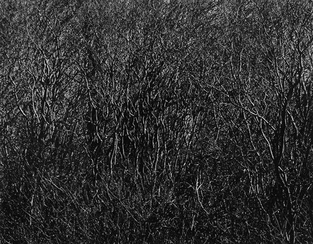
Harry Callahan takes black and white photographs that use nature and natural imagery to convey an abstract feeling. This is accomplished by having the natural objects contrast to their very geometric and sharp composition. He also uses space to isolate or crowd a subject. For example, if there is just a single or few objects to photograph, he would isolate them by having a very simple and plain background. On the other hand, for multiple or repeating patterns, he zooms in and chooses angles that purposely over crowd the area.
|
I like this image because the plant is positioned so that it becomes unfamiliar for a moment. The black and white effect adds to the conflicting ideas between natural or man made imagery.
|
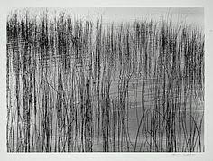
Ernst Haas:
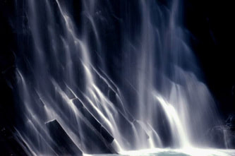

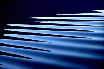
Ernst crafts abstract images by using colour and patterns and throughout his work, the natural imagery is repeated or similar throughout the space. His image often focus on water and show the interesting and abstract reflections and refractions of water as well as the dynamic flow and movement of the substance. He also uses long shutter speed for capturing things like water falls. This technique allows the water to continuously flow whilst the image is captured and therefore creating a silky and soft look to the water.
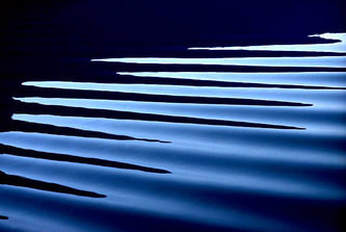
|
I like this image because the light reflects of the water to create a pattern. The colour of the water is a deep, rich and saturated navy blue. Therefore, the image represents water as a crystal/gem like jewel in a liquid form.
|
Replicating the style of Ernst Haas: Abstract photographer research
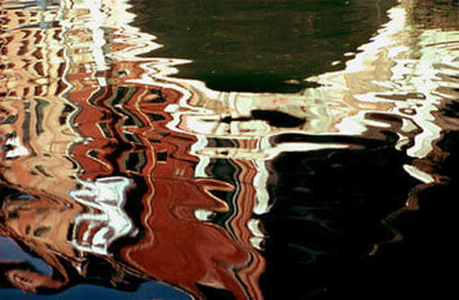
Ernst Haas uses specific rules and techniques when he takes his photographs.
-Firstly, he chooses specific subject matter that allows for interesting reflections. For example he chooses water as his main subject due to its ability to bend, refract and reflect light in fluid and smooth ways.
-Secondly, he crops his image so you are unable to identify the entire subject and this means the viewer is unable to see what the reflection in the water is, which adds to the abstract nature of the distorting and transforming images.
-Thirdly, he keeps a consistent warm tone or cold tone throughout the image to give it a uniform and consistent abstract pattern.
-Finally, Ernst makes sure his images have high contrast. This is done purposely to exaggerate and differentiate the shadows from highlights.
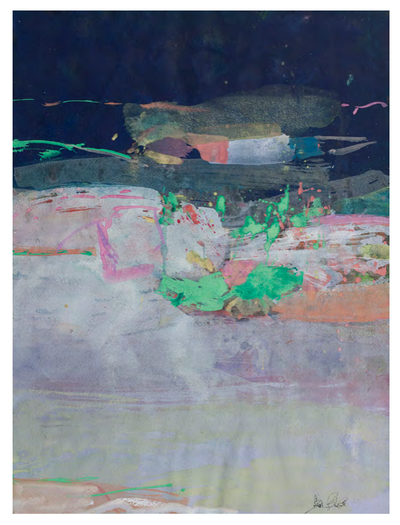
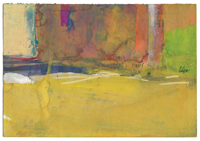
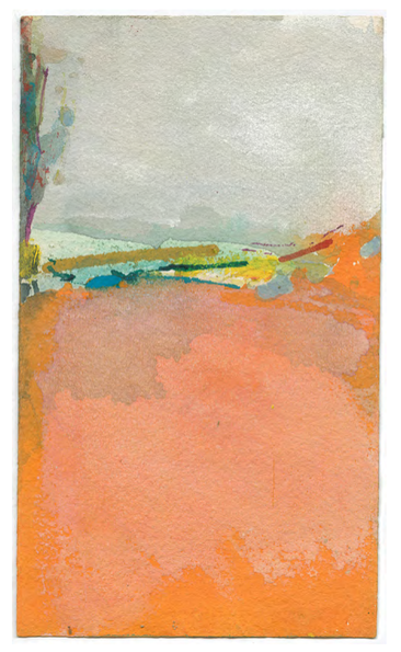
Ernst Haas inspired images:
Here i experimented with water and reflections. I like the way my images turned out, however i still increased the contrast of the images to mirror Ernst' photos. I prefer the first four images as they all have colour or interesting shapes and edges to make them abstract. For the last image, i experimented with blurring the image and found that it can obscure the image.


Abstract photogram board
For the photogram board i decided to arrange the four duotones in the corners of the board, the two small photograms between the duotones and then the two larger, cut up photograms in the center of the board. Finally i decided to position the cut up photogram pieces arround the two large photograms. I chose to place the four duotones in the corners so the board feels segmented and not completely random. This, paired with with the seemingly random arrangement of the cut up pieces creates an abstract look to the board. However, i believe that i could have improved the board by making clearer distinctions between the columns of duotones/small photograms, the cut up piece sections, and the large photogram section.
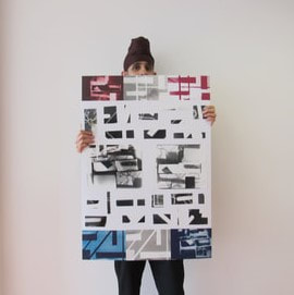
Abstract collage
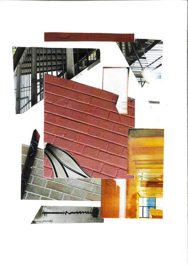
In this abstract collage, i focused on the edges and geometric shapes. My aim was to combine the colour and the edges in an organic way so that every shape compliments the other. I like the way it turned out however, i could have used a wider array of colour. I could experiment with different coloured paper instead of using a blank white paper. As for the five pictures, i am happy with the images i chose and next time i could focus on using my photograms to make a collage.
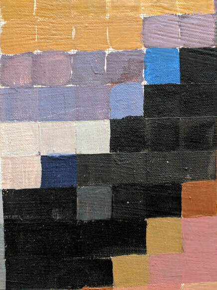
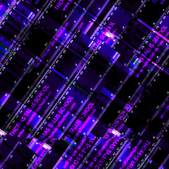
Photoshop abstraction:
Here are the images i have abstracted on photoshop. I think that i achieved the target since i managed to use all of the tools i had to. These tools include the eraser, brush, masking, clone stamp as well as layering. I found that layering was the most effective since i was able to simply duplicate an image, rotate / transform it, then use the eraser to bring out the first image. I decided to increase the contrast and saturation of the first two images to add to highlight the irregular and complex patterns made. However i could have experimented with the clone stamp more.
Abstract Photo book:
Inspiration board:
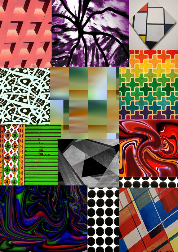
Here is an inspiration board i have made using the saved images from flikr. My photo book will focus on a complex and geometric design.
PHOTO BOOK INSPIRATION : |
|
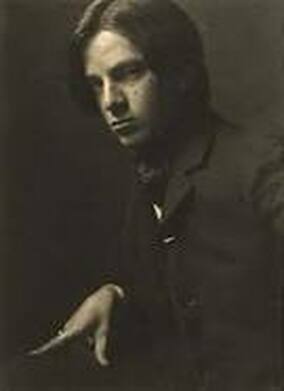
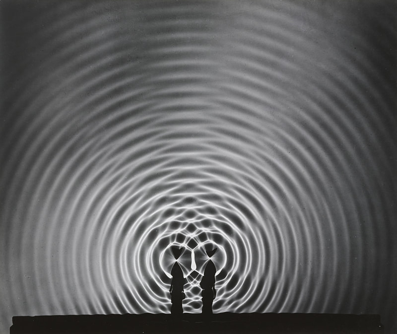
Photographer research: Alvin Langdon Coburn
|
|
Alvin Coburn incorporates a sense of mysticism within his later works after he left photography to pursue spirituality. His photographs have an intricate kaleidoscope style to them which heavily abstracts and twists the original subject. I will try to adapt some of this element to my photograms and possibly my photographs.
Photo book images:


These are the 20 images i have chosen for the book. I like the photographs because they include many interesting edges and lines. I like the heavy contrast on some of the images as they bring out the shapes and lines. I chose the four photograms and then played around with and edited the last two. This was very effective and i like the contemporary feeling of the edited photograms.
Prototypes:
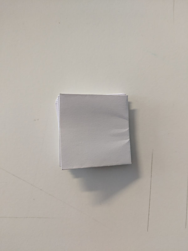
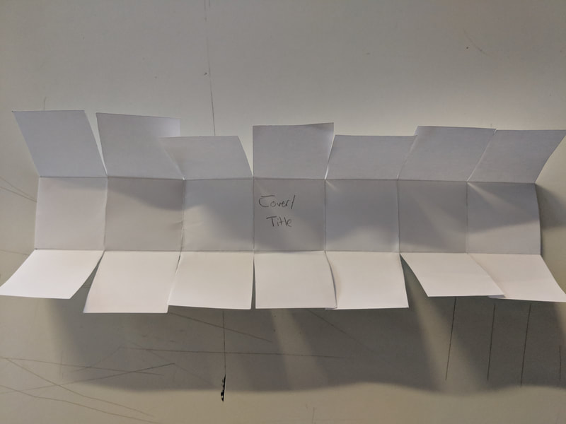
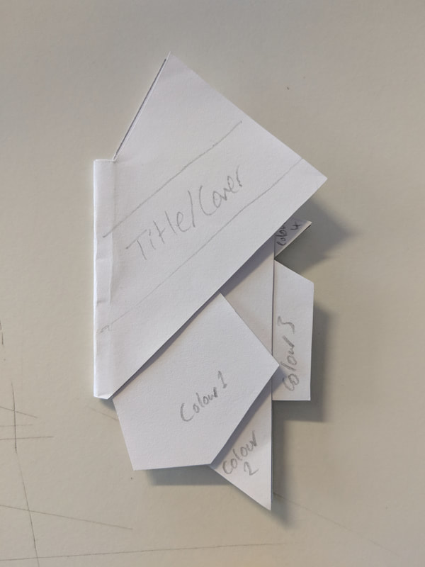
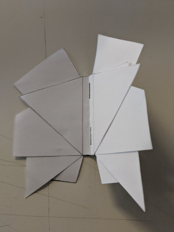
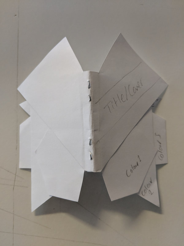
I had two photo book designs and decided to make mini models of each. The first was a square that folds out into many squares. The second was a normal photo book with abstract page designs. I prefer my second design because it is very abstract in shapes and colour.
Final Piece:
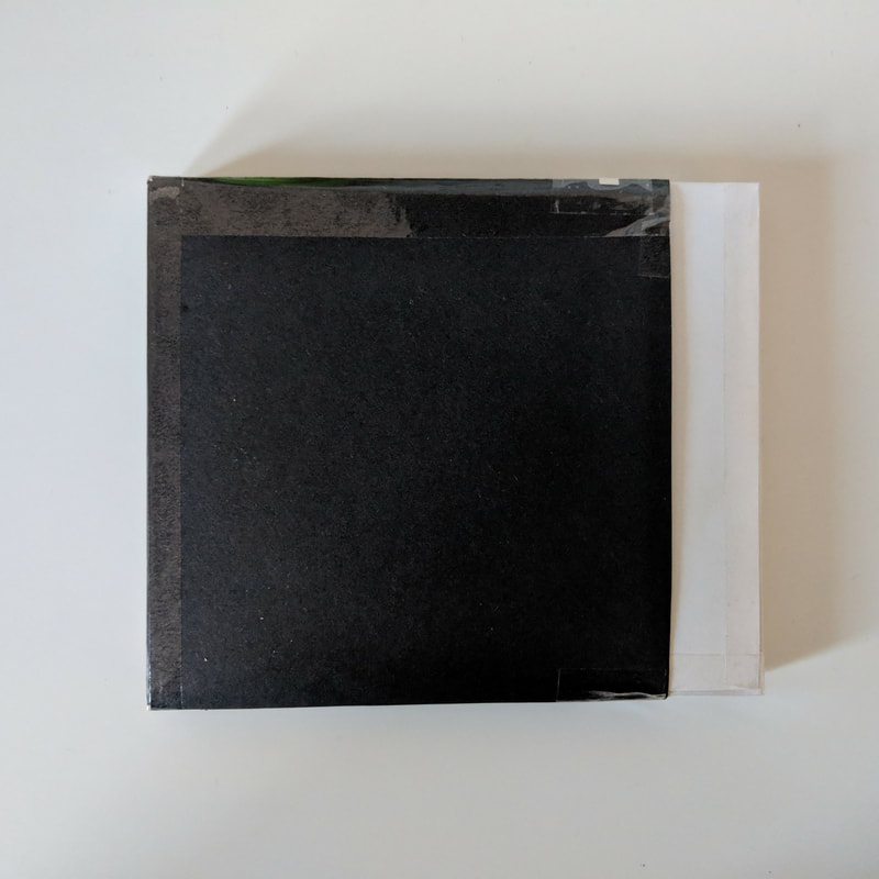
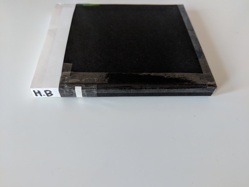
I believe my final piece was successful and incorporated all of my ideas of abstraction. The shapes are geometric and the colours are vibrant. I think the best feature of the photo book is the grey front cover since it has been cut in a way to allow you to view all of the different pages whilst still including my name on the front; which gives the book a 3D form unlike traditional photo books. If i could redo this photo book, i think i would make the book stronger and more durable by making the spine of the book more structured and using a better book binding sewing technique or using a different book binding technique.
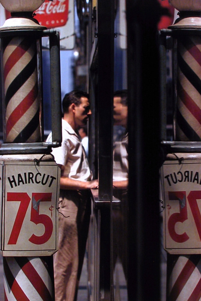
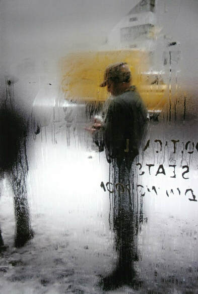
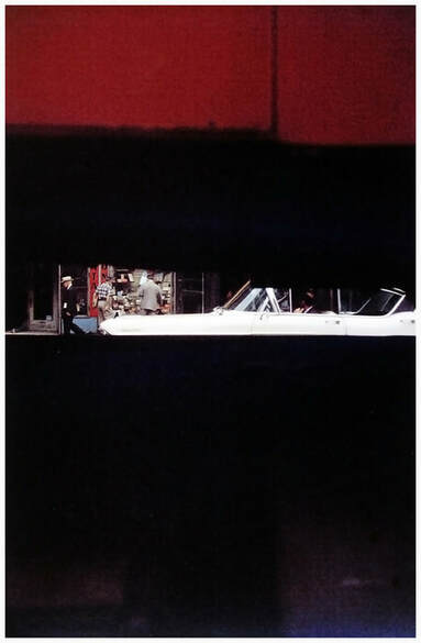
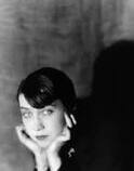
Photographer Analysis : Saul Lieter : ' I don't have a philosophy. I have a camera. '
Saul Leiter was an American photographer who pioneered coloured photographs. His work is largely inspired by the architecture and inhabitants of New York. He was mostly a painter however his colleague, Richard Pousett-Dart, persuaded him to try out photography and by the 1940s, he had chosen to shoot in colour. This was a long time before many famous art photographers chose to shoot in colour as a main medium. In 2006, Steidl Verlag published 'Saul Leiter: Early Color' which showcased Leiter's colour photography for the first time.

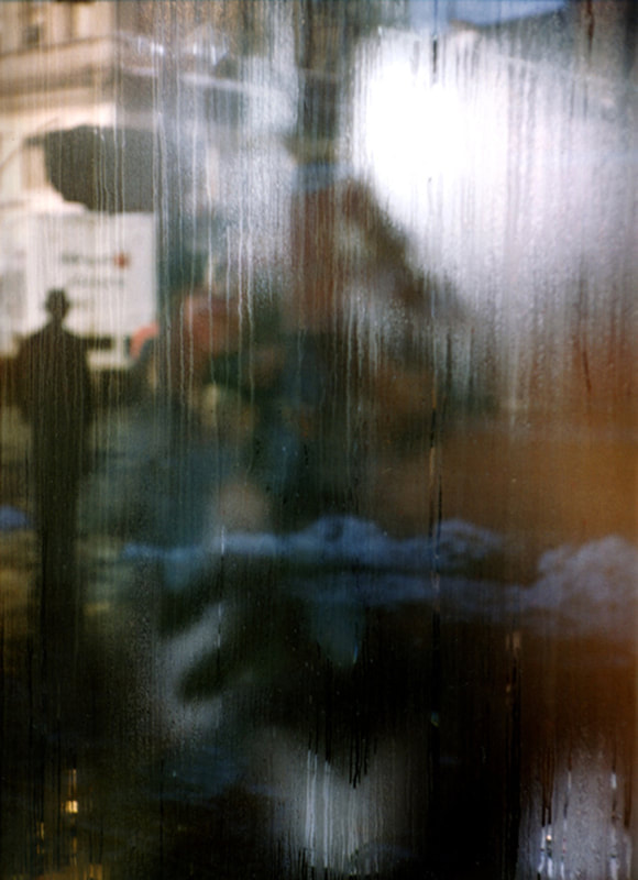
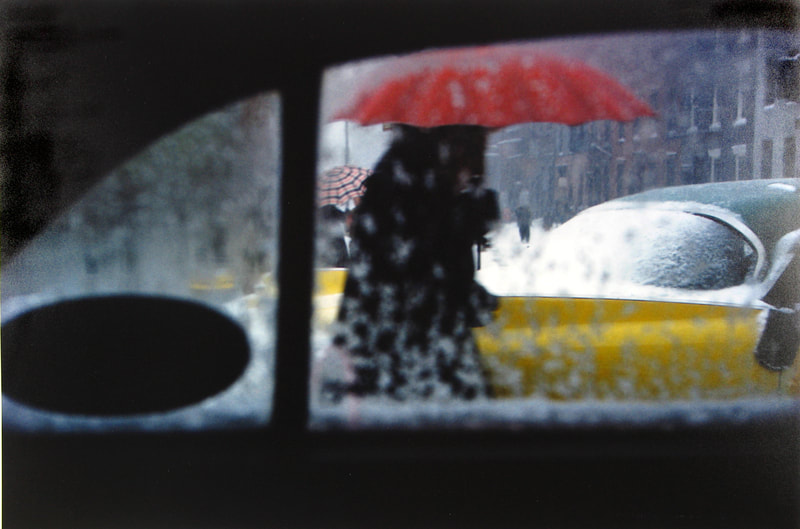
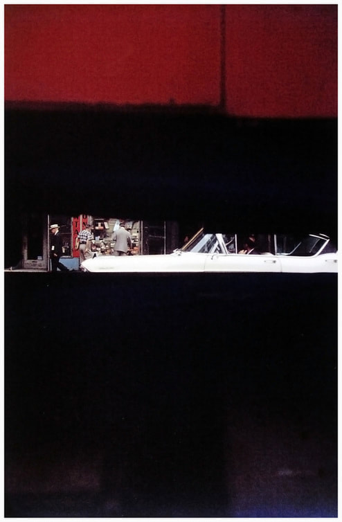
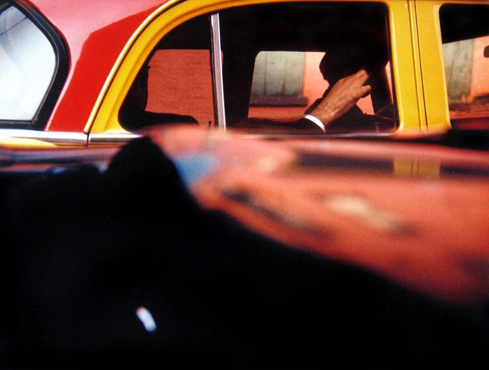
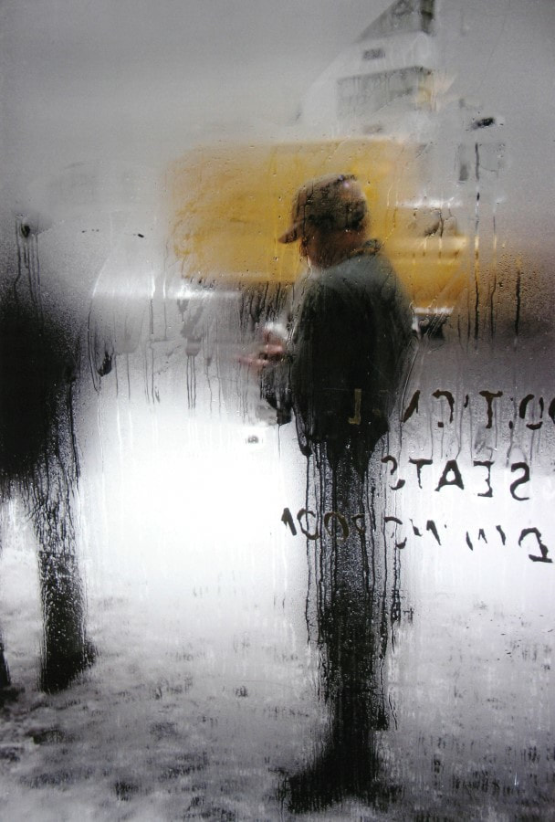

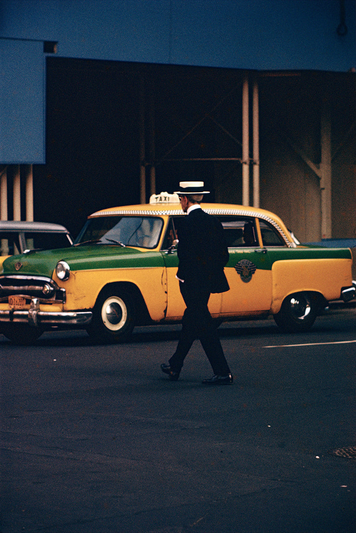
I like this image the most because of the vibrant warm colours as well as the stark contrasts between light and shadows. This is a typical Saul Leiter photograph because of the focus on an interesting composition as well as the interesting angle and position of the camera in a closed space. Furthermore, in many of Saul Leiter's photographs, he uses mirrors or glass to obscure the image as well as blur the photograph.
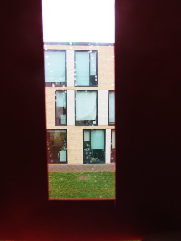
Frame Photographs:
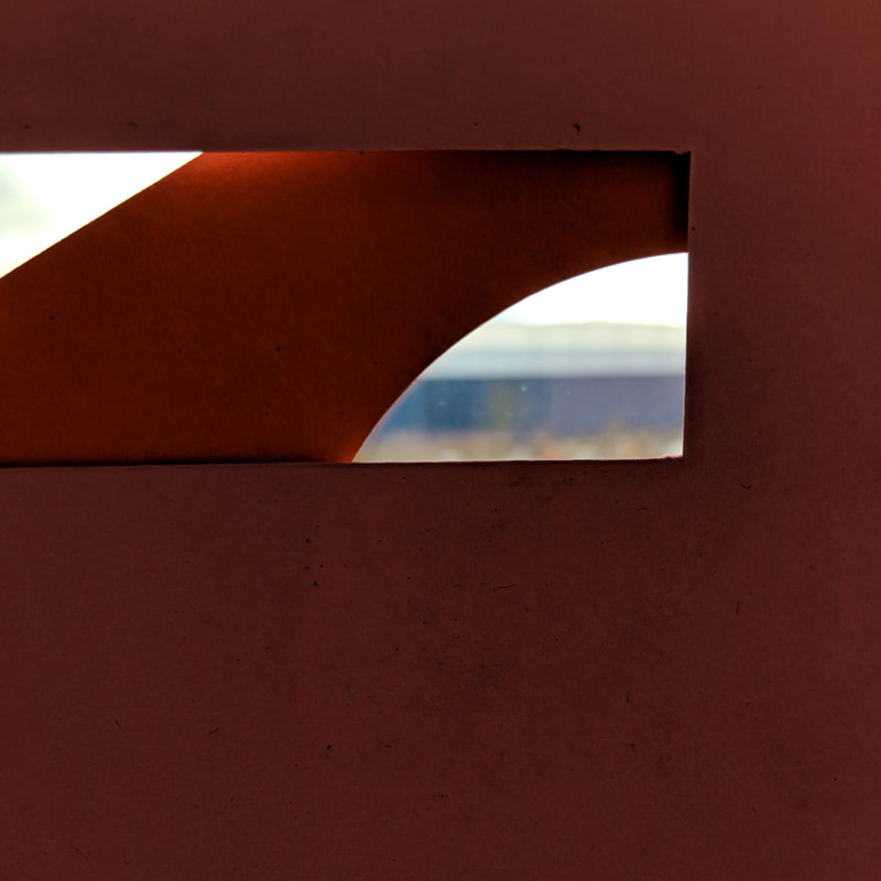
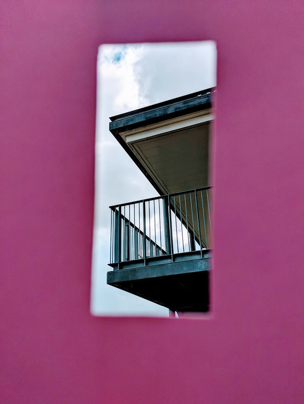
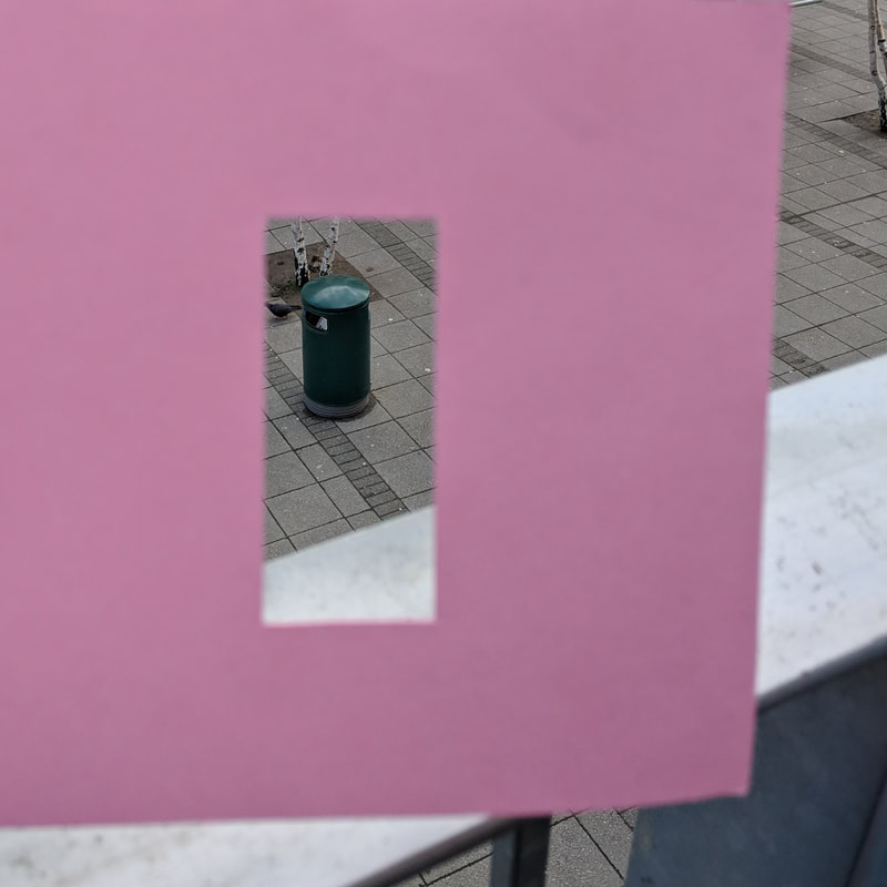
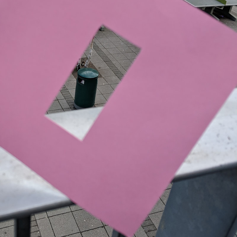
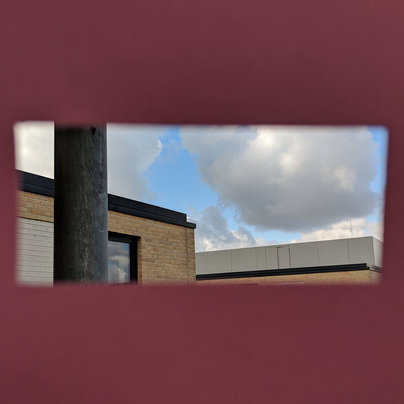
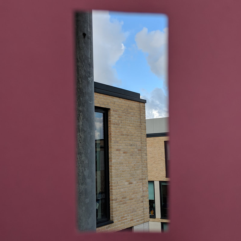
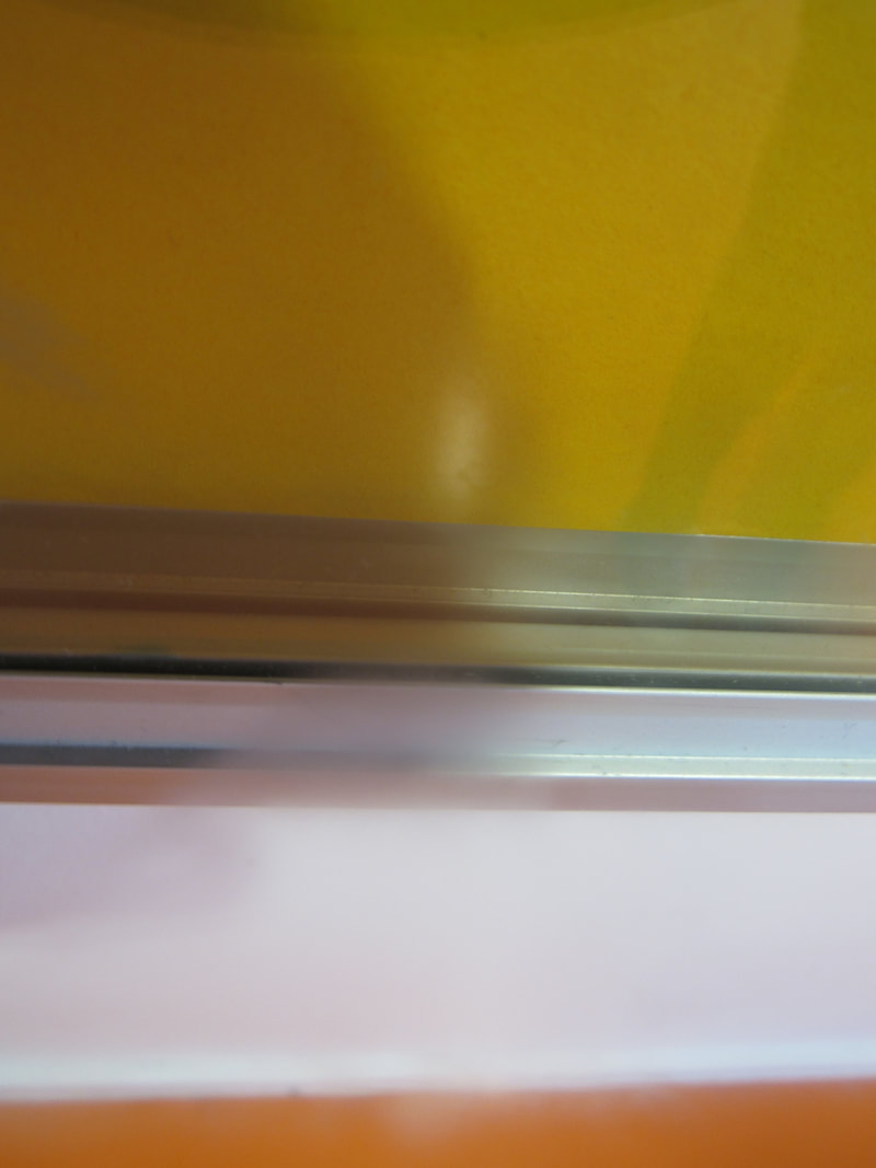
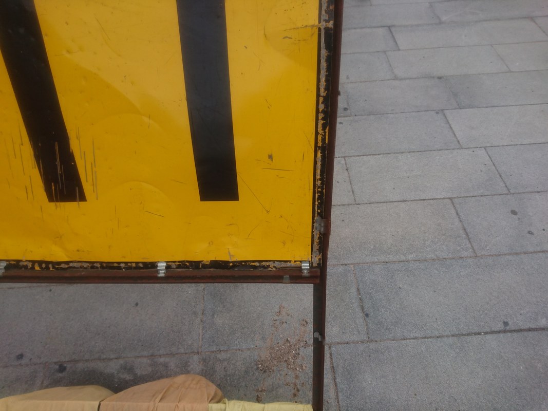
In all of these images, i used a viewfinder to crop the object or focal point. I was mainly interested in the lines and shapes in the viewfinders. The first image is interesting to me because of the way the viewfinder doesn't completely cover the table so creates a white border around the table legs. This makes it look like i had taken a picture of the legs of the table and cut it out leaving a white border then stuck it on a yellow paper. Furthermore, i like the last image because of the contrast i created in the editing process.
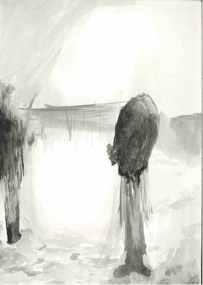
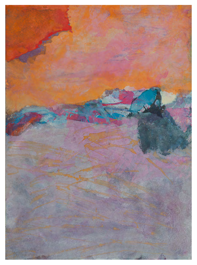
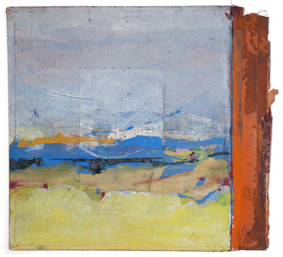
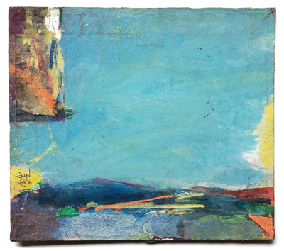
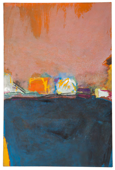
Paintings:
|
|

|
|
This photograph and this painting by Saul Leiter share many similarities as well as having many differences. For example, both share a similar composition as most of the action of the images occur in the middle horizontal third. This narrow section contains most of the colour and shapes of the images. Furthermore, due to the narrow section being different to the rest of the images, this creates a stark contrast between the middle and the negative space surrounding it. However, the two pieces also differ in some ways. One way is through the use of colour. The painting consists of mainly bright and vibrant colours however the photograph consists of mainly black with dark red as well as a small bit of blue in the corner. Another way in which the two differ is the shapes. In the painting, the shapes are irregular and textured creating a natural, calm and organic theme whereas the photograph is formed with simple geometric shapes with sharp edges and corners to craft an urban, industrial and busy tone.
Saul Leiter style photoshop:
Saul Leiter style photographs:
In these images, i layered two different viewfinder to add depth and tone to some of the images. I think that fourth image on the top row is my favourite because i have captured a scene of another photographer capturing a scene. Furthermore, i have cropped the scene using the viewfinder to only show to focus on the faces of the people to isolate the people in their own world separate from the background or edges of the image.
Photo board:
At first i was not that confident about whether the photographs would work together however i did manage to find a way to create a nice flow between the images. The darker images on the right and lighter and colourful images are on the left. I like the minimal layout since it reflects the minimal style of the photographs.
PUZZLED 'EM ASSESSMENT
Task:
In this project, we have to research, plan and take close up photographs. We will take at least 10 photos of ordinary objects from different and unique angles such that the object is unrecognisable from the photo. The task is based on the game " Puzzled 'Em " and also inspired by the 1930s " sculptures involontaires " by Salvador Dali and Brassai.
Puzzled 'Em:
This is a game where there are a set of cards that each have a photograph taken of an unknown object on the front. The objects are photographed with confusing angles and perspectives to keep the object unknown to the players. The aim of the game is to guess the object in the photographs. The only rule is that the players can't search what the object is or look at the answers.
Berenice Abbott
|
|
Berenice Abbott takes photographs in black and white to highlight the contrast between light and dark. Most of her work does not contain harsh contrast but gradual shifts in tone and i find this interesting because with many black and white photographs, the main focus is the light and shadows. However, Berenice Abbott focuses her work on interesting shapes and patterns that blend together rather than contrast.
Peter Fraser
|
|
My ideas:
I am thinking of experimenting with colour and patterns. I think that Salvador Dali and Brassai's way of abstracting an object is interesting. Their photographs suggest that making something unknown is about giving the viewer little information or contrasting information about the subject. For example, in puzzled 'em , the images are taken with a blank background which already gives us no information about where the object is used. Furthermore, the objects are positioned in angles that give us no information on the true shape of the object.
My approach to making an object unknown involves the exact opposite. Its true to say that one can't know what something is if they have little information but i also believe that it is equally true to say that you can't know what something is with too much information. What i mean by this is giving the viewer contradicting information about the object to make them think about what information to trust and what to not.
- One way in which i think i can achieve this is through the use of intense colours and complex patterns as backgrounds and then get an object, wrap it the same as the background and then take the photo such that shows some parts of the object's outline but camouflages the main object.
- Another way in which i think i can create the unknown through too much information is by taking a photograph of an object with a plain background ( like the game ) but during the editing process, i could edit the image and also duplicate it many times to cover the entire photo. This creates an interesting scenario where the object is duplicated so much that physically, you are able to see that object but you are unable to see parts as its partially covered by a duplicate.
- Thirdly, i could take a photograph of an object in its ' natural ' position and place but cover the actual object with a blank cardboard box. The idea is that the environment itself and the composition should allow the viewer to guess the object correctly even when they physically are unable to view it. This is an interesting idea since this means the viewer can know what the object is by just looking at where its placed. Similarly, to make this even more complex, i could hide the exact opposite of the object in the box and write down a clue on the box. For example, i could take a photograph of a plate , knife and then a box covering an object. In the first scenario i could take the photo like that with the object being a fork, alternatively, i could write on the box ' opposite ' and so the mystery object would be another knife.
The images and the process:
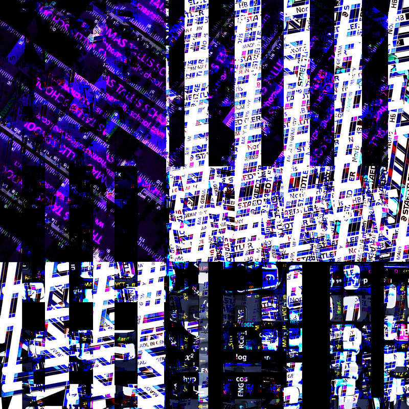
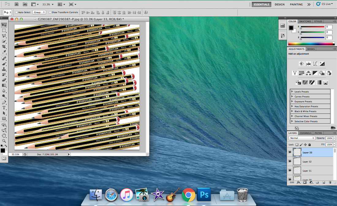
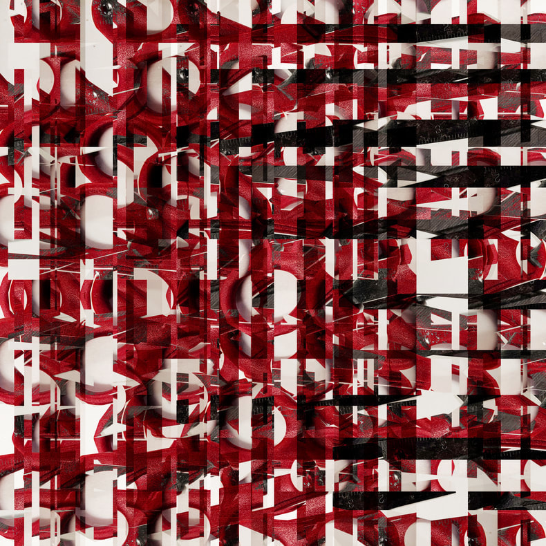
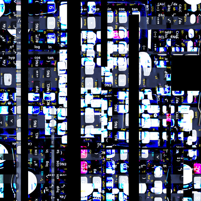
In this image, i decided to take a photograph of a pencil, a simple object that is easily identifiable, and replicated the object many times in different positions, then i edited the final image and inverted the colours to further abstract the object to become complex and unrecognisable.
|
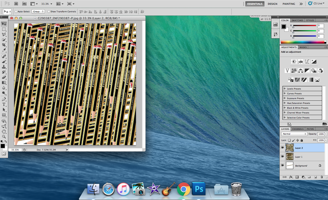
At this stage, i had taken a photograph of a pencil and using the select, copy and paste tools of Photoshop, i was able to create the following image.
|
|
|
At this point, i had merged all of the layers together, copied the entire image, then duplicated and rotated the image vertically.
|
|
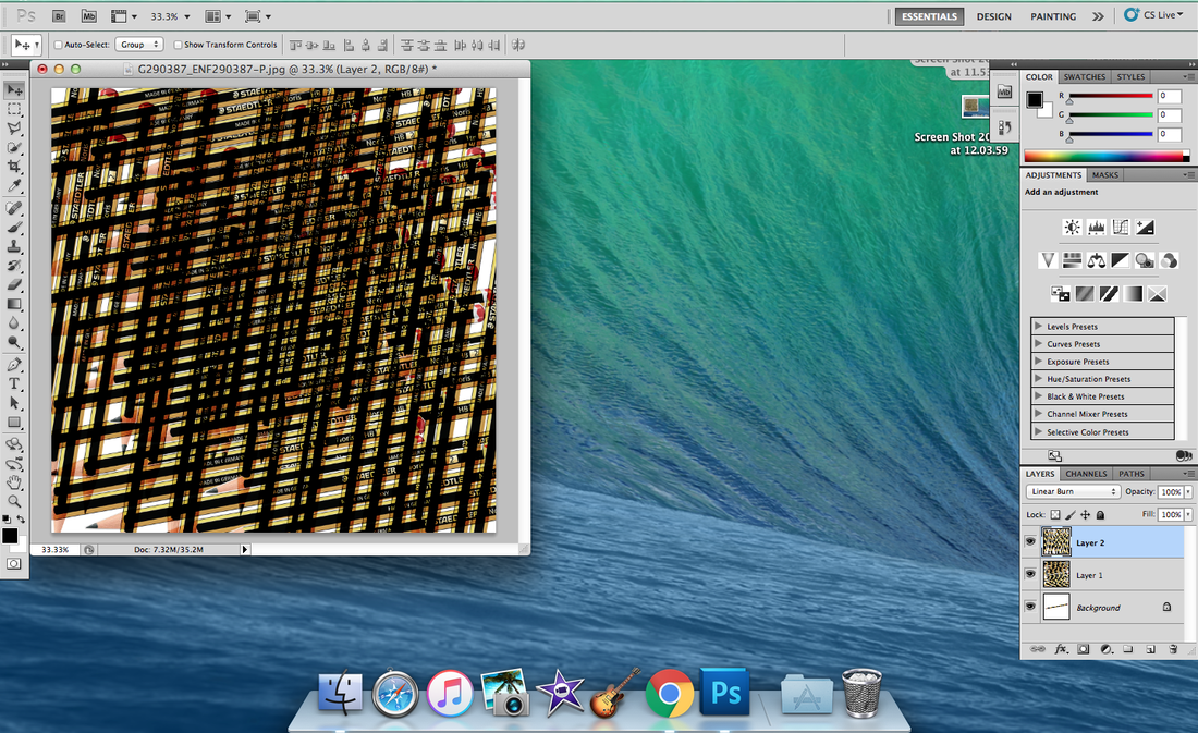
Here, i messed around with the colours, saturation and contrast as well as editing the layer effects.
|
|
|
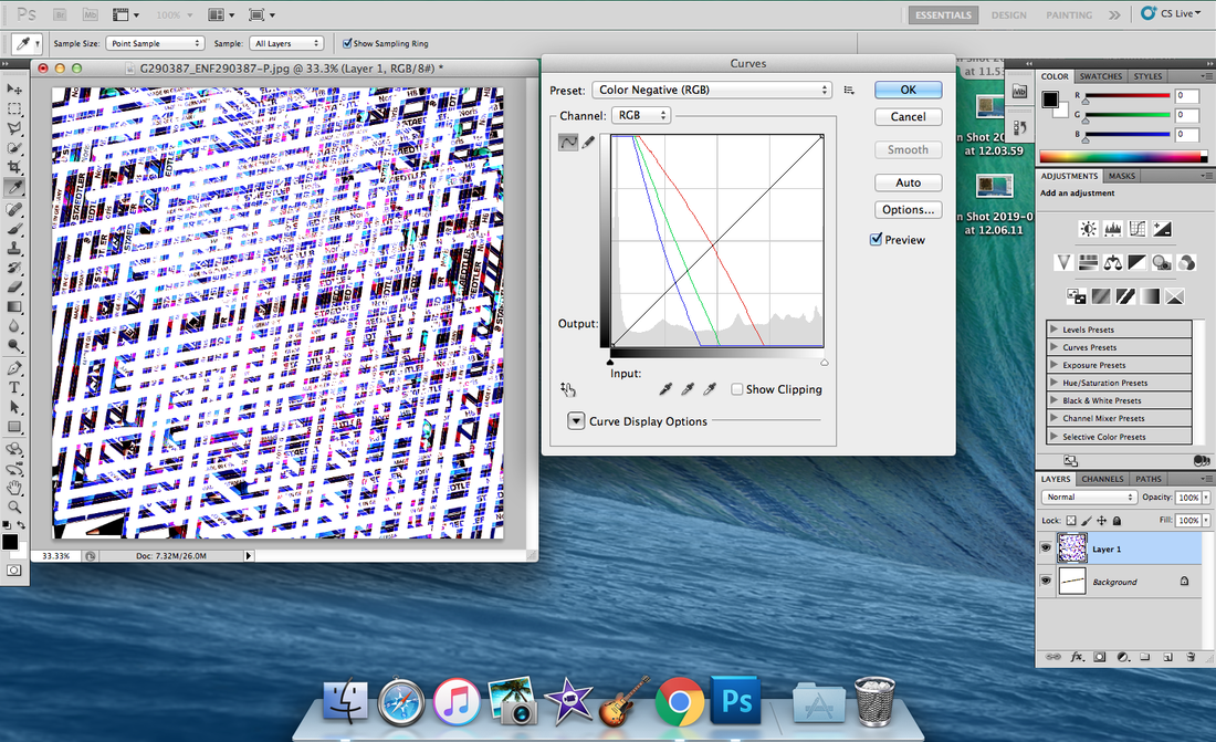
Finally, i edited the curves of the image and then inverted the colours.
|
Final image:
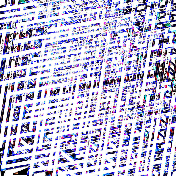
I know that the pencil is very difficult to discover because what the viewer doesn't know is that they are all pencils. I have left some clues so that it isn't impossible to see, for example, in the bottom left corner, you can clearly see a pencil or pen tip. Also , the text on a pencil is recognisable and something i deliberately left in the image. I like the image for just what it is and how abstract it looks as a piece of art and i believe that the image resembles my firsts idea , however as a Puzzled 'Em card, i think it might be too complex.
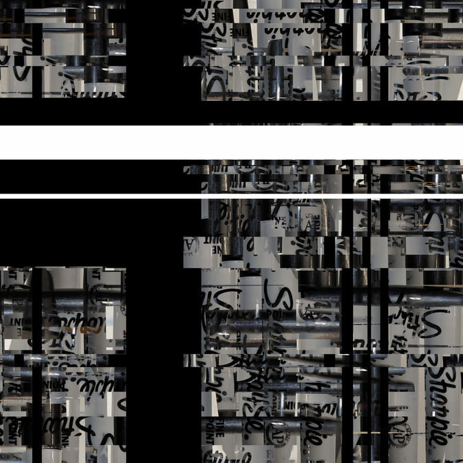
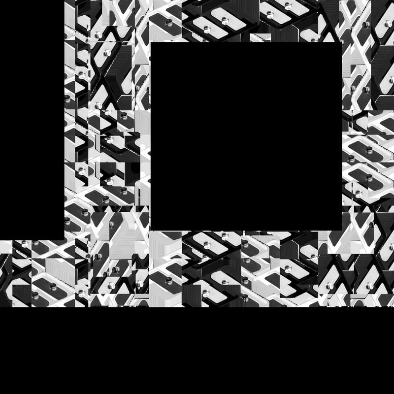
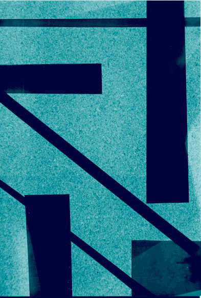
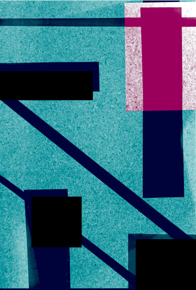
I am happy with the way that these six images turned out. I had created six other images however the original images were taken from the internet and so weren't high resolution. Therefore, i knew that when i would print those images, they would be unclear, fuzzy and messy. To solve this issue, i took six images in high resolution with my phone of the same objects, then recreated the old images and uploaded the finished products above. I like the contemporary feel crafted by the use of overlaying images, copying, cutting, pasting as well as adding rectangles and lines. I think my favourite is the first image due to it's vibrant and neon look that is what i based the other images on.
Overall, i think that i was more interested in making the images look abstract and like a painting, therefore i had focused more on the design rather than the objective of the puzzle'd em project. If i could improve, since this is a puzzle'd em project, i would focus more on the actual objects rather than the art.
Overall, i think that i was more interested in making the images look abstract and like a painting, therefore i had focused more on the design rather than the objective of the puzzle'd em project. If i could improve, since this is a puzzle'd em project, i would focus more on the actual objects rather than the art.
Puzzled'Em Box
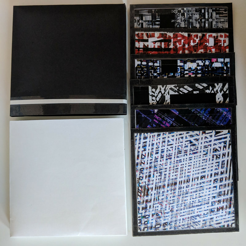
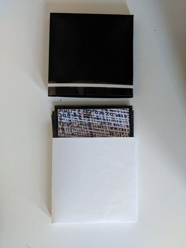
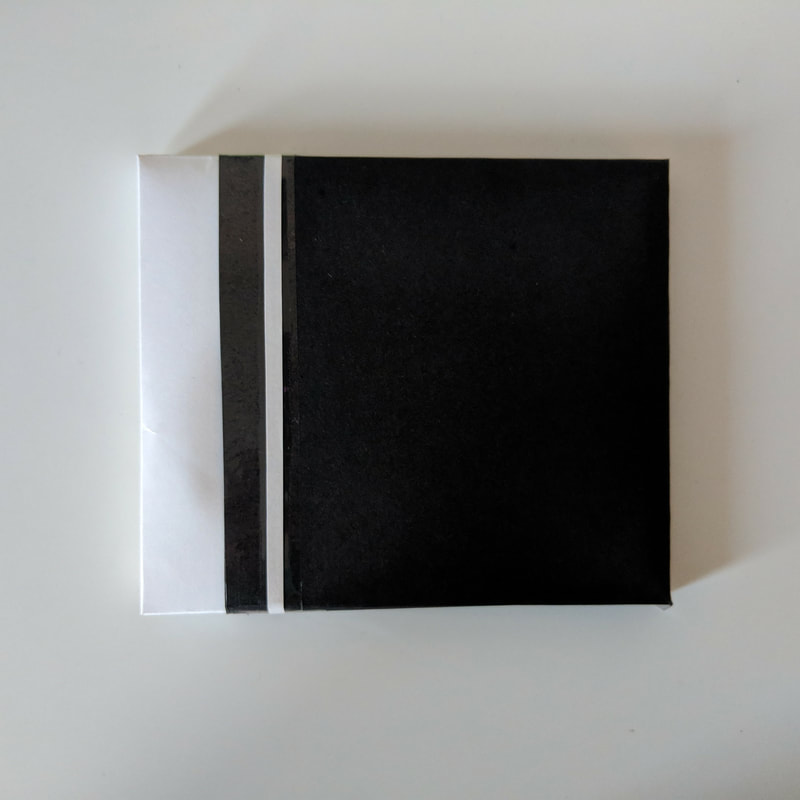
I decided to make the box look minimal to contrast with my complex and abstract photographs. i played around with different ideas until i got to this and what i like about this box is that it opens unusually which i think goes perfectly with the project title 'Puzzled ' Em'.
Abstract Collage :