The Ice Cream:
In this task we had to evaluate and analyse this image. We discussed how the photographer made this unique and what they saw in the scene.
Questions and my responses:
|
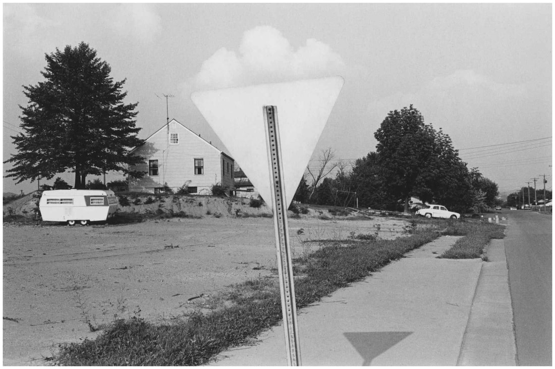
How would you describe this photograph to someone who could not see it? The image is very linear and geometric as there are many shapes and circles. There is a lot of negative space and the shapes stand out because of the high contrast. How is space represented in this photograph? There is a lot of negative space at the bottom and at the top. The foreground and background are blended together at the point where the clouds look as if they are sitting on top of the triangular sign. This is a sort of illusion caused by the blending of different distances. What is or out of focus? How has the subject been cropped/framed? The centre piece is a cloud sitting on a sign however there are more focuses such as the car, van, trees and house. It has been cropped so the sign is in the centre and is slightly tilted to make it more interesting. Which part of the photograph strikes you as most interesting?why? I find the sign and the clouds interesting but also amusing because its composed to look like an ice cream which shows the charisma and creativity of the photographer. |
What questions would you ask the artist if he/she was alive today? I would ask the artist, how did you come upon this scene? Why did you choose to have the sign in the middle? Do you think you could have taken the image again but better? What do you think it would be like to live in this image? I think it would be confusing because of the amount of lines and shapes and the high contrast. I think this looks like a very low populated town in America making it very simple and boring. Why do you suppose the artist made this photograph? What makes you think that? I think the artist chose to take this photograph to show the contrast between nature and man made things. The natural things are all round, circular and soft, on the other hand, the man made things are all sharp and abstract. What do you think is effective about the photo? What does not work so well? I think the high contrast, composition and shapes make this very effective however i think that the mess and random things do degrade the overall message of sharp man made edges vs round natural things. |
