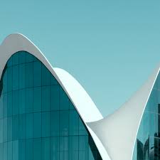
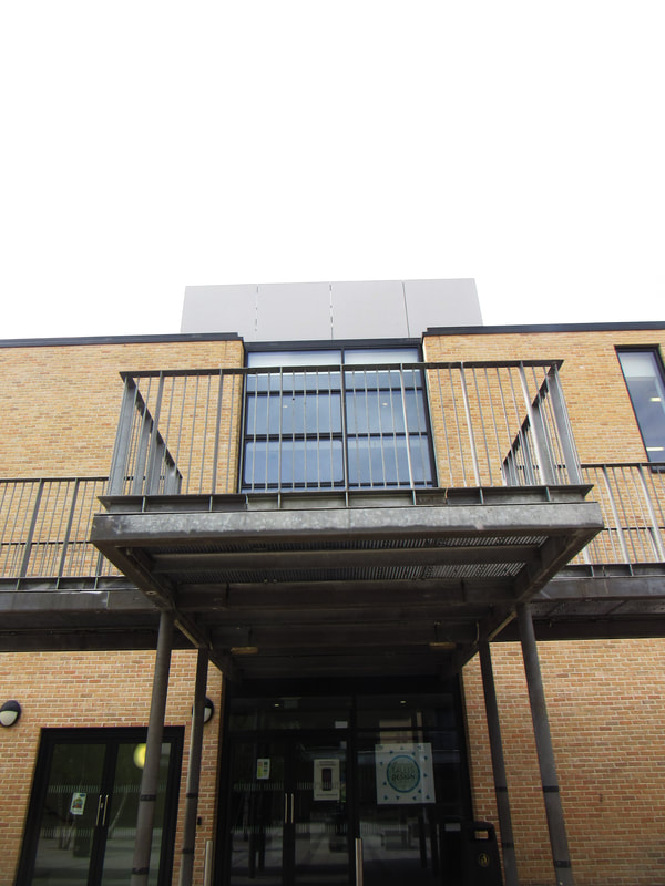
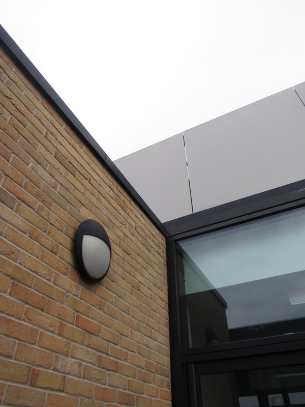
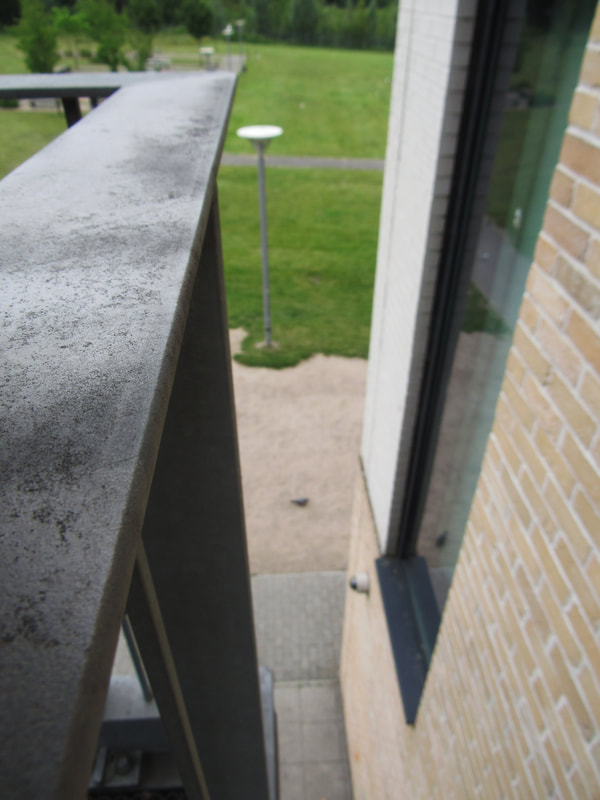
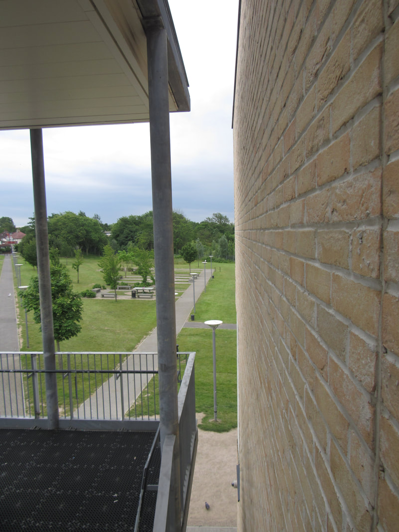
I have chosen the theme of architecture for my project since i have a good understanding about edges, shapes and composition which play a key part in architecture photography. Furthermore, i find architecture interesting as there are many complex and intricate patterns and designs as well as interesting shadows and structures. My idea is to create a photo book or a structure similar to the ones i made during my Edges 2 3D photo sculptures.
Researched Photographers:
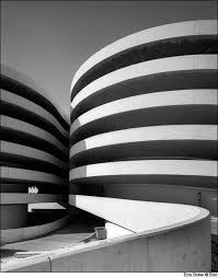
Margaret Stratton
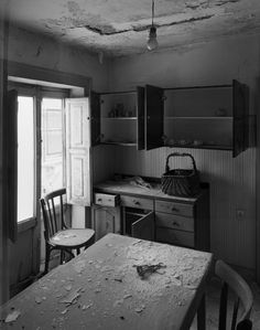
Margaret Stratton mainly photographs interiors and focuses on showcasing the depth and 3D of the structure. If i photograph interiors, i think i could mix Stratton's techniques with my own abstraction techniques and control the depth of my images in a way to make them abstract or uncanny. One way i could do this is by messing with the shadows and lighting within the image both practically / physically or with photoshop. If i can cause shadows and light to appear where they are not supposed to then the entire image will have an eerie or surreal atmosphere to them.
Berenice Abbott
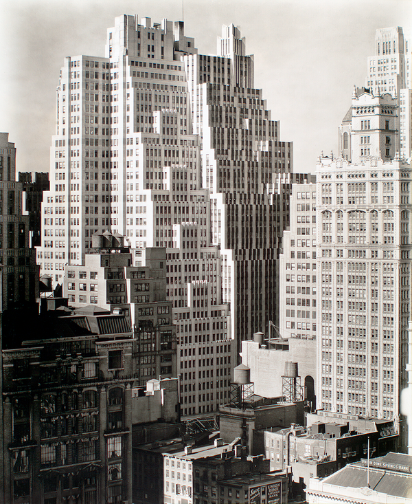
Berenice Abbott mainly photographs large exteriors and skyscrapers whilst focusing on shrinking the building down to a scale that makes the buildings appear more like toys and lego rather than monumental buildings. One way that Abbott does this is by capturing the entirety of the building within the frame of an image. This task of capturing the entire building is done by taking the photograph in a specific angle. I like this approach that Abbott takes because usually, with architecture photography, skyscrapers are photographed to highlight their gargantuan scale whereas Abbott showcases how they just as simple as pieces of lego constructed by children.
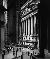
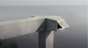
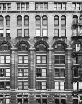
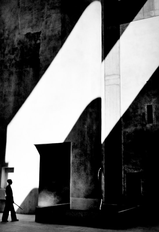
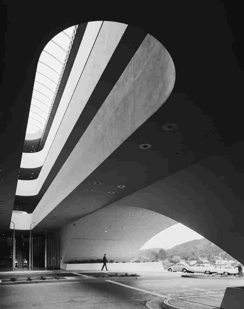
Ezra Stoller
Ezra Stroller takes an interesting view on exterior photography in which the large scale of the architecture is contrasted by a person within the image. Stroller's choice to include a person in most of the images gives many of the images a familiarity and homelike atmosphere. I believe the choice of including a human is to show how comfortable we have become with these man-made mountains, jungles, desserts and forests that we call our cities. In a way, the images showcase humans in their natural environment and so are not simply just about the buildings or the people but about our connections with the buildings.
Philipp Schaerer
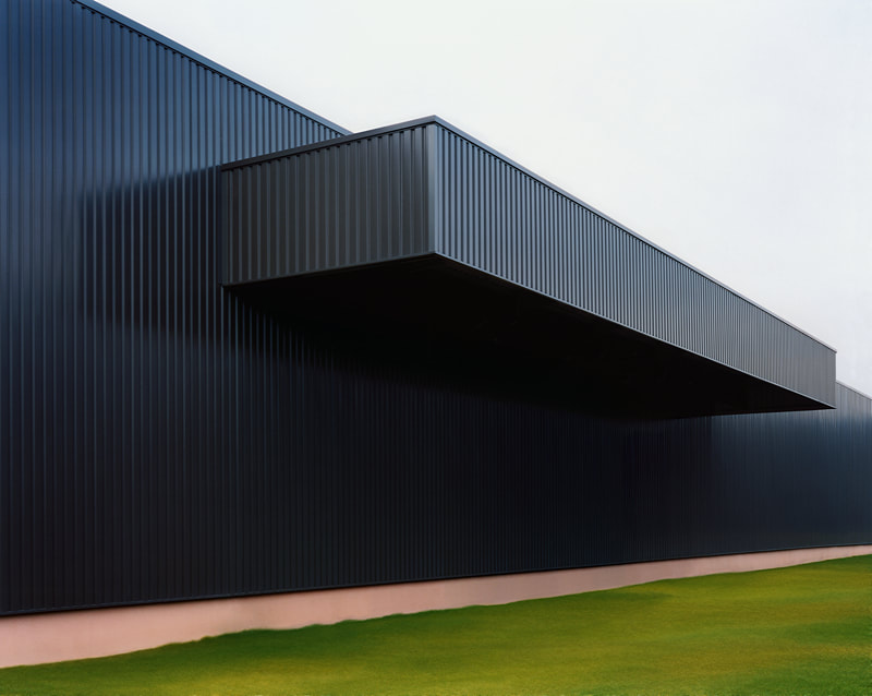
Philipp Schaerer mainly focuses on simple, minimalistic and modern exteriors. Schaerer often amplifies the geometric and minimal nature of the buildings by using complimentary angles and framing. The simplistic nature of the architecture is highlighted by the sharp contrasts between light and shadows that are created when Schaerer uses these specific viewing angles. I believe that many of Schaerer's images are taken at angles to make the 3D form really pop as though it were illustrated on an isometric grid. This paired with the relatively flat and plain looking surfaces and simple backgrounds gives the image a sort of digital vibe as though it is just a computer rendering of the real world. After all, that is exactly what cameras do, take digital interpretations of the real world.
Harry Callahan
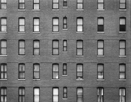
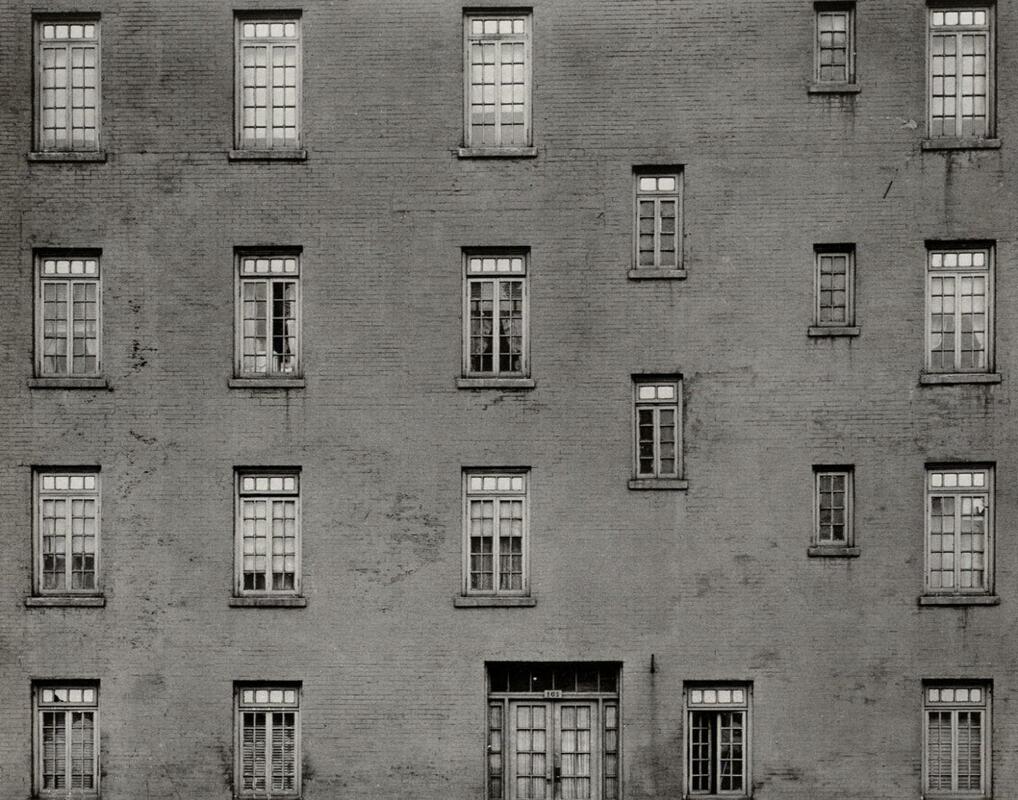
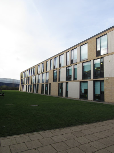
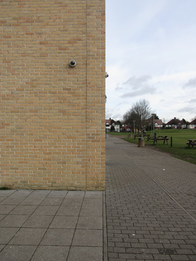
Harry Callahan usually photographs flat, urban exterior walls. The images are given a 2 dimensional surface and this simple, boring form is contrasted by the complex patterns that exist on the surface of the walls. These patterns are made of windows and give the image a sense of repetition and regularity that allows you to confidently guess the rest of the wall's appearance. However, since the framing only allows us to see one side of the building, we are left to believe there is no other sides and it is up to us to interpret where the building starts and ends. Furthermore, this 2 dimensional effect is doubled down on by the fact that the media in which we experience this collection of light is a photograph which itself is 2D.
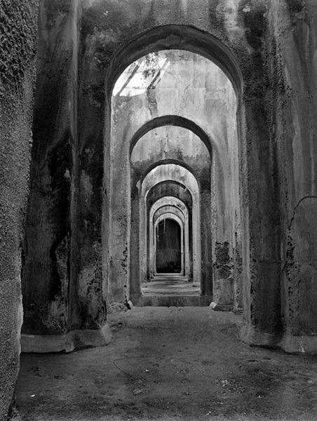
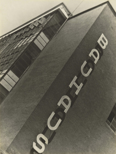
Lucien Herve
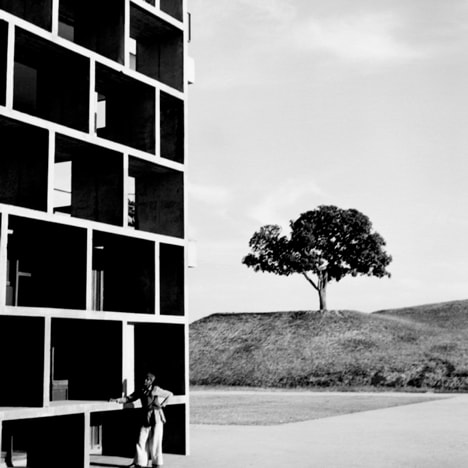
Lucien Herve specialises in complex and abstract exterior architecture. One of the defining traits of Herve's work is the use of strong contrasts, dark blacks and light whites. I believe that Herve is trying to highlight the differences and similarities between architecture features. In addition, i think that the strong contrast showcases the basis of photography which is : how light interacts with the world and how it is received. This very standard and old belief of photography is contrasted itself with the abstract and modern architecture which is actually being photographed.
Candida Hofer
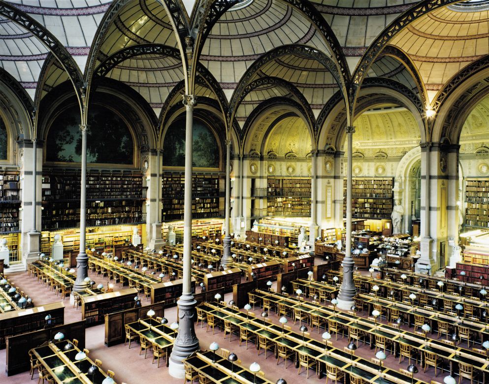
Candida Hofer focuses on large, open interiors and how complex and intricate patterns affect the architecture. Furthermore, most of Hofer's work revolves around the idea of large public spaces with little or no people. This juxtaposition gives the images an eerie or ethereal atmosphere and the lack of people forces the viewer to pay attention to the architecture. However, with the endless patterns, lines and shapes in the image, it seems as though the image has no 'physical' focal point. What is interesting is the fact that the building is a public space and should have people in it, as well as the fact that the image seems to be outside due to the high exposures and light, the viewer is to believe that there should be a focus. Ironically, the actual building itself is the 'hidden' focus of the image. This is unique to Hofer and i like that the focal point of Hofer's images surround the viewer as though the image is viewing the person rather than the person viewing the image.
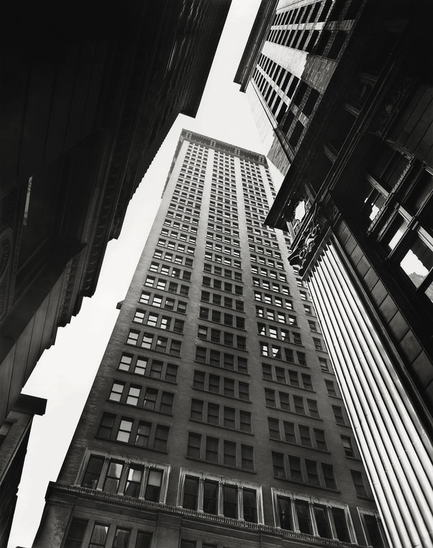
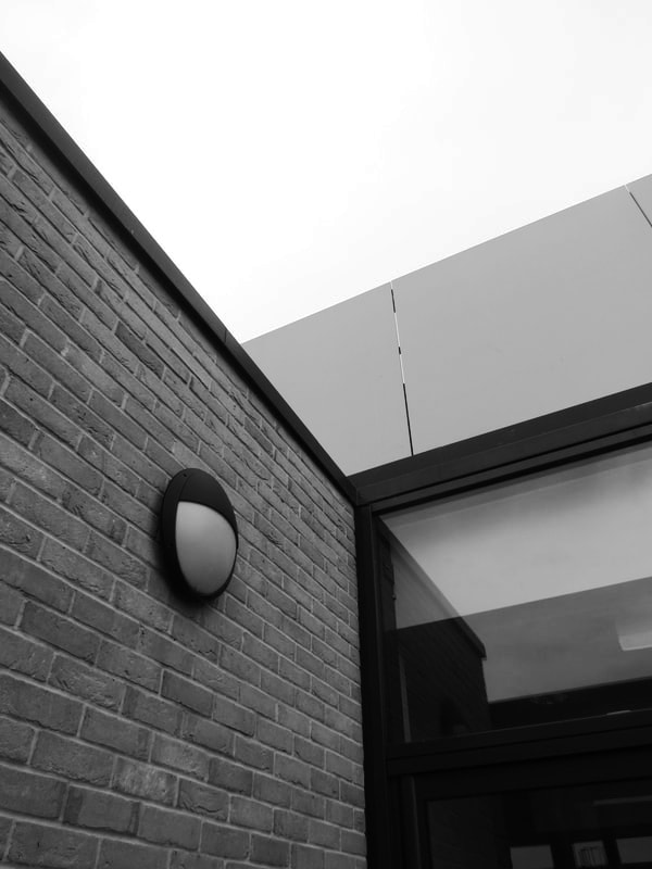
Jeroen Peter
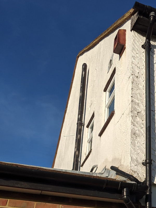
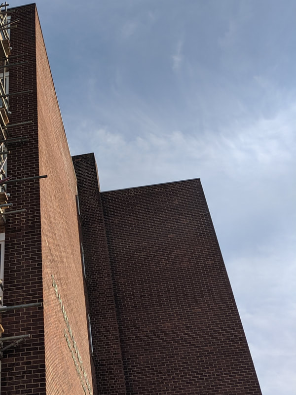
I like the minimal and simplistic form of his architecture photographs. I also like how the images are cropped so that you cannot see the entire building which abstracts the image further. For my images, i would focus on the way the light and shades create contrast around the sharp edges of the wall. I think i prefer straight, modern and geometric shapes and patterns rather than natural and classical architecture.
His main style of architecture photography revolves around exterior architecture and this gives the focal points of the image a sense of scale and immense size. Furthermore, the photos are taken from a low angle looking up to the buildings which also adds to the immense scale of the image. Interestingly, throughout his photos, there is no humans or references to humans other than the architecture. This technique has an alienating affect on the viewer that makes them view the building as inhuman, other worldly or completely isolated from humanity.
His main style of architecture photography revolves around exterior architecture and this gives the focal points of the image a sense of scale and immense size. Furthermore, the photos are taken from a low angle looking up to the buildings which also adds to the immense scale of the image. Interestingly, throughout his photos, there is no humans or references to humans other than the architecture. This technique has an alienating affect on the viewer that makes them view the building as inhuman, other worldly or completely isolated from humanity.
Old images:
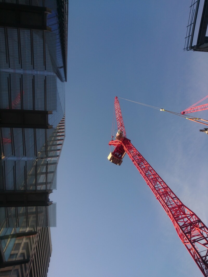
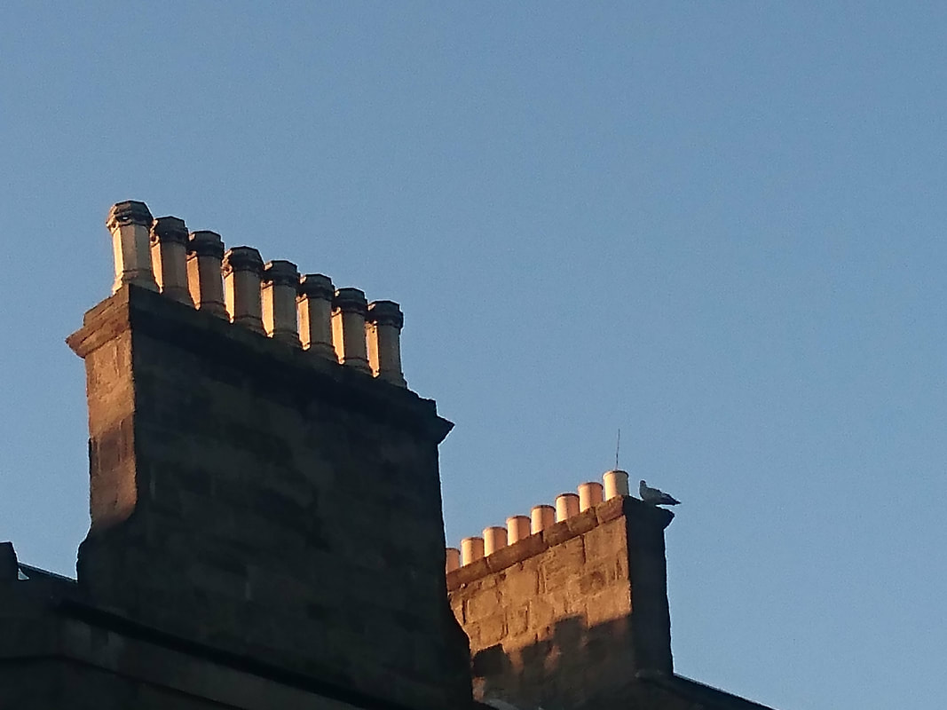
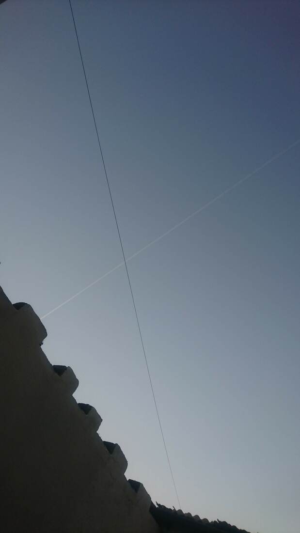
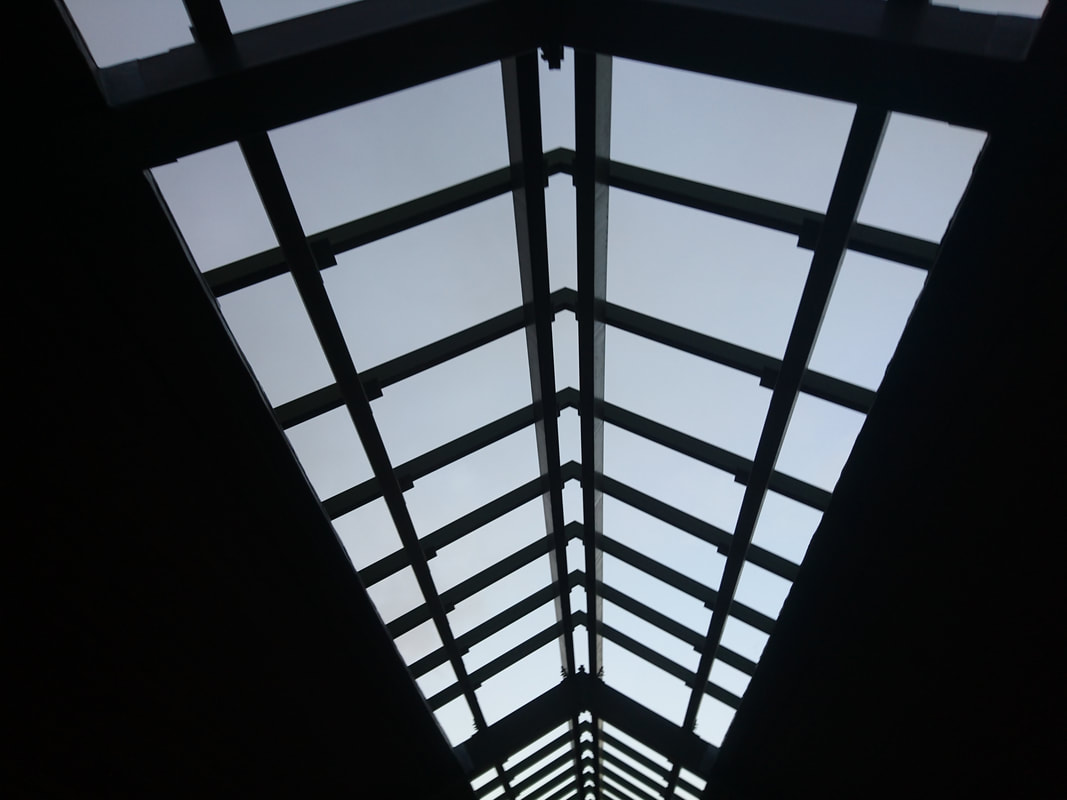
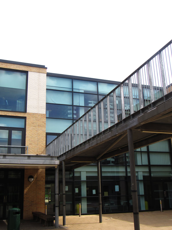
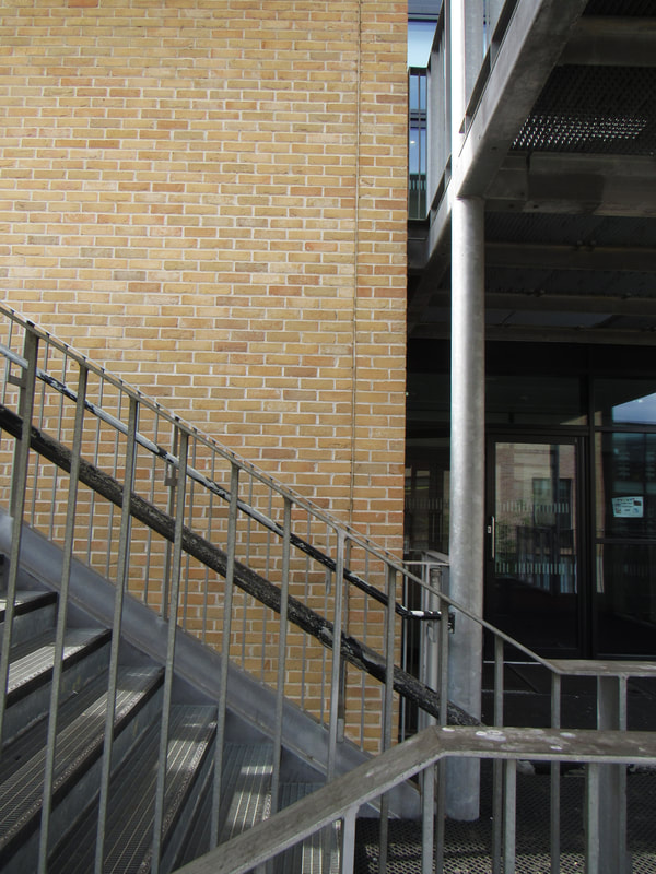
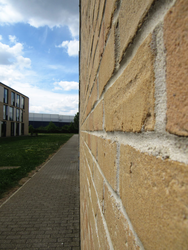
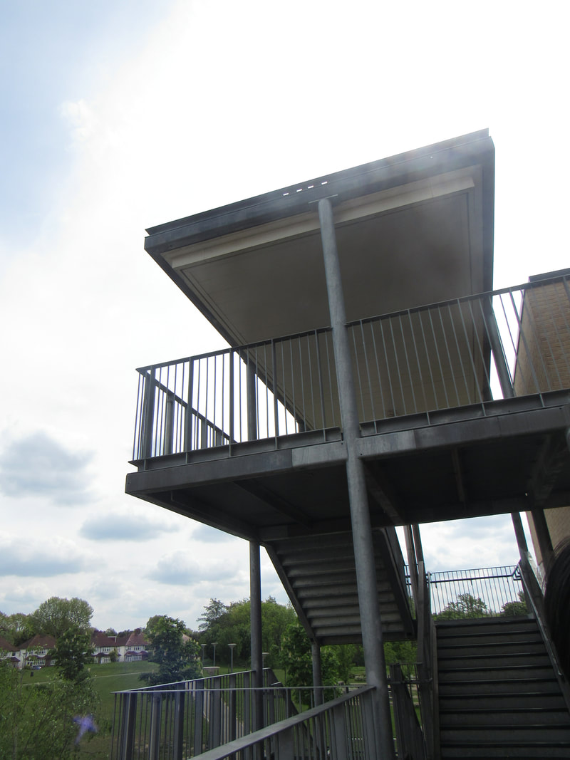
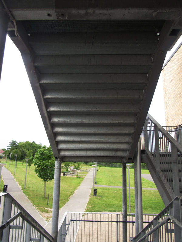
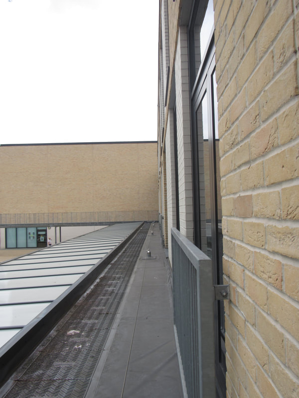
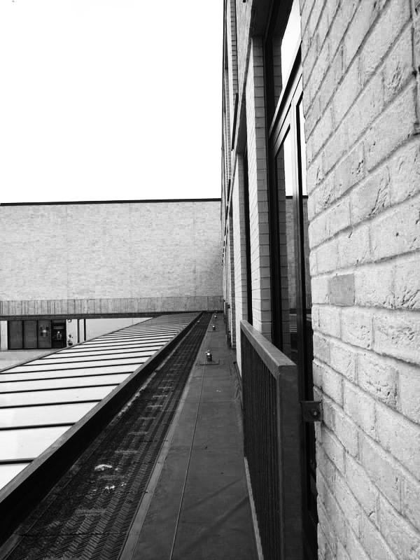
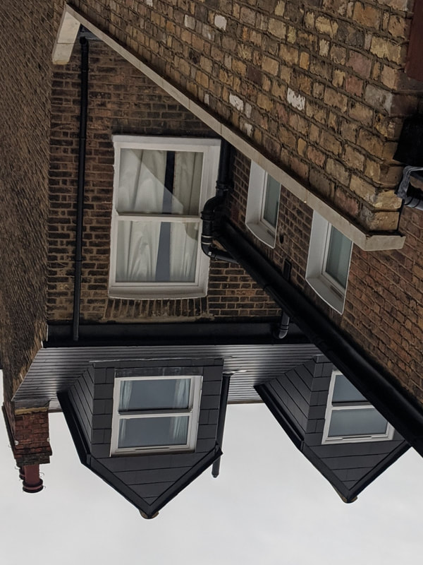
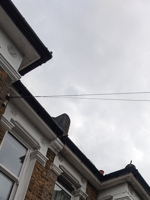
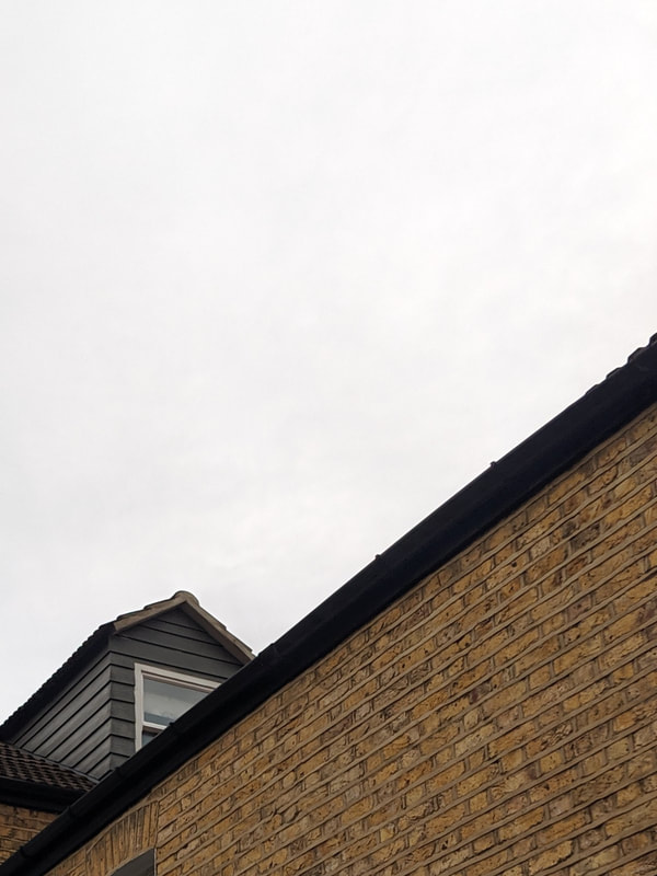
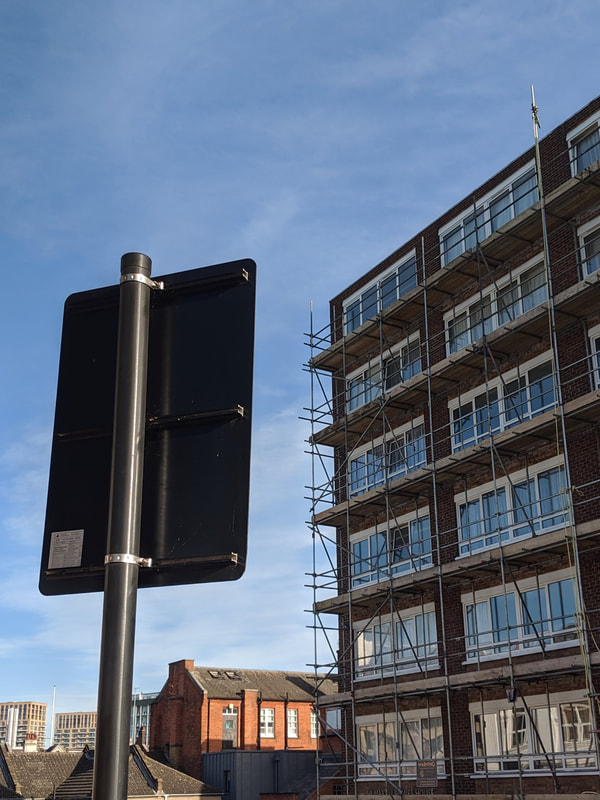
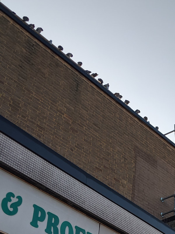
I have chosen these photographs because they reflect the theme of architecture well. With architecture photography, i specifically look for edges, lines and repetition as well as some contrast, colour and tone.
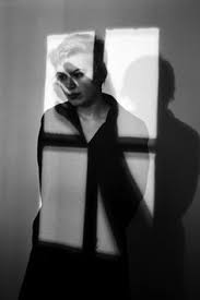
Lucien Herve : 1952-54 photograph : Essay
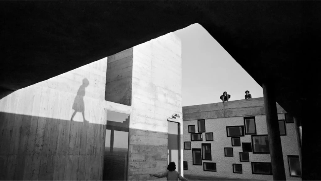
In this image, a girl is walking next to a building and under a bridge-looking construct. There are also two other people on top of the building in front watching the girl. The image is abstract due to the sharp composition and use of geometric shapes and patterns. There are also some naturalistic elements to the image including the people and the shadow of the person that are made up of curved and organic lines.
The image consists of many lines and simple polygons created through the interesting layout of the buildings and structures. Furthermore, the image uses a range of tones and contrast to further abstract it. Patterns also play a role as they take up a section of the background to draw the viewers’ attention towards the area where the people are. The image was taken in black and white so the viewer would focus on the shadows and light more than the colour, saturation or hues. The position of the shadow of the girl is misleading since we do not actually see who the shadow belongs to and instead are made to believe that the shadow belongs to the girl walking on the ground which could not possibly make any sense. Playing a key part, the composition of all subjects, background and foreground objects mislead and confuse the viewer as to where to look and what to focus on.
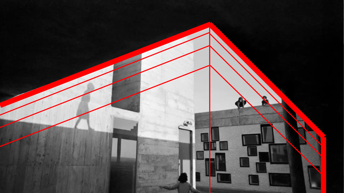
In terms of form, the image seems to blend both the foreground and the background by using the bridge as an opening to the background and subjects. All subjects are in focus however the shadow of the girl draws more attention since it is isolated on the left side of the image and there is lots of contrast between it and the bright light from the sun on the wall. In a way, the image almost looks like an optical illusion where the black area of the foreground at the top could be the sky and this makes it look like everything except for this black area is one building as shown in the image below where the thick red lines are the outline of a building, the vertical line is the edge of the building and the thin lines are the two walls that of the building.
This play on architecture further develops the abstract and confusing nature of the image and what the focus of it is.
The image consists of many lines and simple polygons created through the interesting layout of the buildings and structures. Furthermore, the image uses a range of tones and contrast to further abstract it. Patterns also play a role as they take up a section of the background to draw the viewers’ attention towards the area where the people are. The image was taken in black and white so the viewer would focus on the shadows and light more than the colour, saturation or hues. The position of the shadow of the girl is misleading since we do not actually see who the shadow belongs to and instead are made to believe that the shadow belongs to the girl walking on the ground which could not possibly make any sense. Playing a key part, the composition of all subjects, background and foreground objects mislead and confuse the viewer as to where to look and what to focus on.
In terms of form, the image seems to blend both the foreground and the background by using the bridge as an opening to the background and subjects. All subjects are in focus however the shadow of the girl draws more attention since it is isolated on the left side of the image and there is lots of contrast between it and the bright light from the sun on the wall. In a way, the image almost looks like an optical illusion where the black area of the foreground at the top could be the sky and this makes it look like everything except for this black area is one building as shown in the image below where the thick red lines are the outline of a building, the vertical line is the edge of the building and the thin lines are the two walls that of the building.
This play on architecture further develops the abstract and confusing nature of the image and what the focus of it is.
I think what most intrigues me is the parallel between the shadow girl and the girl walking on the street. Both people seem to be the same at first glance however there is a striking difference in their posture and attitude. For instance, the shadow girl seems to be sad and this is expressed through the relatively hunched posture compared to the girl on the street. On the other hand, the girl on the streets seems to be happy and lively since she is running and moving with energy and with her head up high. This could be a subtle hint to a more complex theme hidden beneath the image. If I could, I would ask the photographer what the deeper meaning or message was or if there wasn’t one in the first place.
I think that I would name this image ‘Shadows’ because of the various connotations of the word shadows. Firstly, the name could be interpreted to reference the shadow of the girl on the wall which is a main subject of the image and secondly, this could be metaphorical for how the shadow girl is always in the shadow of the girl on the street, possibly in terms of freedom, which is why she seems sad. The theme could be about how the girl on the streets is free to run and move anywhere whereas the shadow girl can only follow behind which could be a larger metaphor for an aspect of society.
I would imagine that the people on top of the building and the girl on the streets know each other and could possibly be playing a game of sorts. The photographer could have taken this image to highlight the freedom of youth, implied by the running girl on the street, whereas also showcasing the possibility of harm or the lurking presence of growing up as symbolised by the shadow following the girl. The people on top of the building could therefore be symbolising a way out of growing up and maturing which explains why the little girl is running towards them.
Overall, I think the most effective and intriguing aspects of the image are the light and shadows as well as the composition of the architecture.
First photoshoot:


I like the first four images the most specifically because they work well with high contrast. I chose to take photographs with lots of lines and repetition like Candida Hofer but edit the images to have high contrast like Lucien Herve.
Second photoshoot:


I like the first three images most because they are abstract and contain lots of simple shapes and geometry. I don't like the last two because they had a complex background full of natural imagery. I think i prefer simple shapes in front of a simple background because it makes the shapes the focal point of the image and creates contrast.
Favourite images
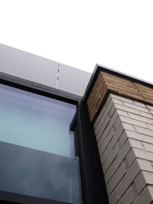
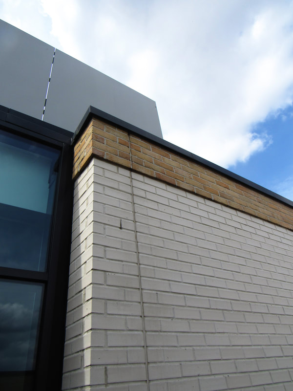

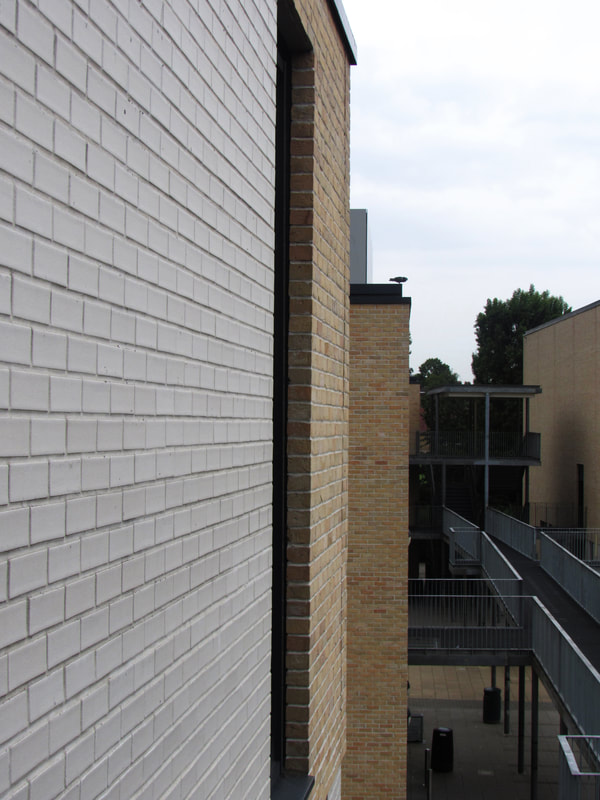


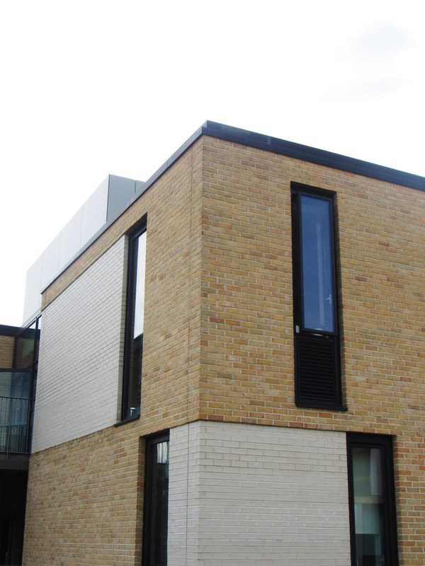
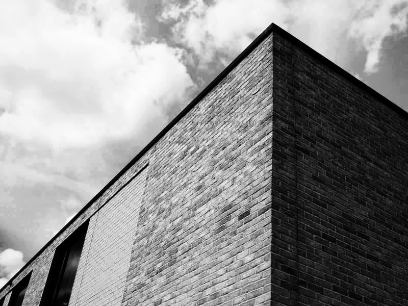
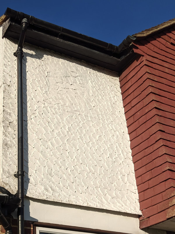
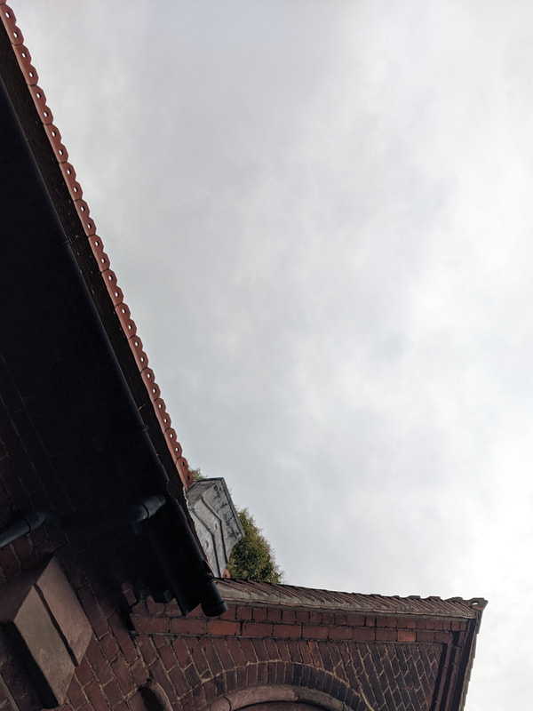
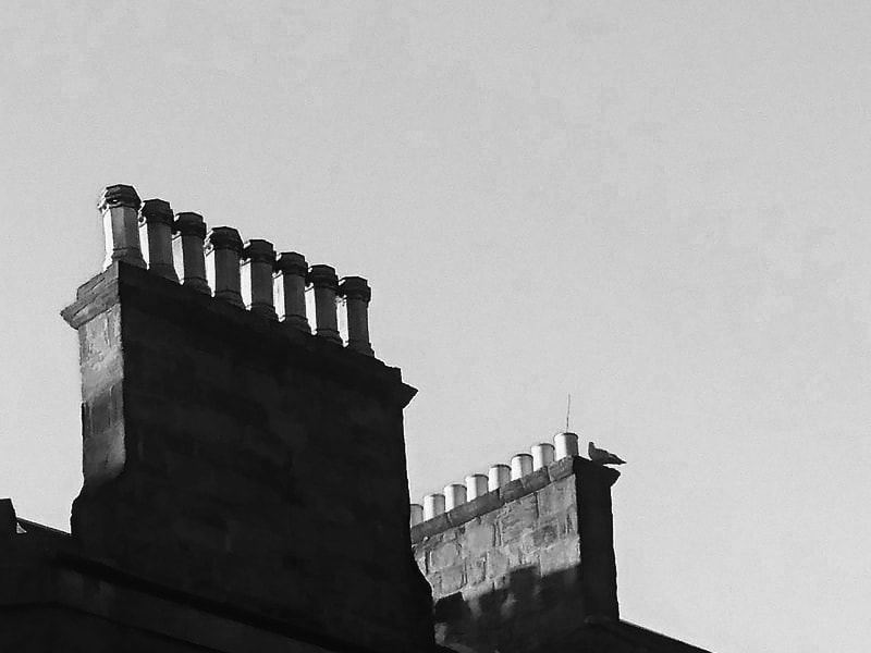
I prefer these images to the rest because they are full of lines, patterns and have been taken at interesting angles. I didn't find the other images interesting because there may have not been enough lines, shapes and patterns. I found that i prefer architecture photographs that have the sky as a background because it shows contrast between the light sky and dark buildings as well as the soft and calm shapes in the sky and the rigid complex patterns in the brick.
Abstraction process:

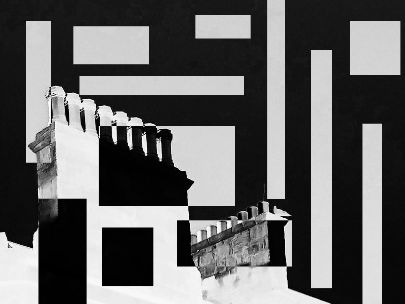
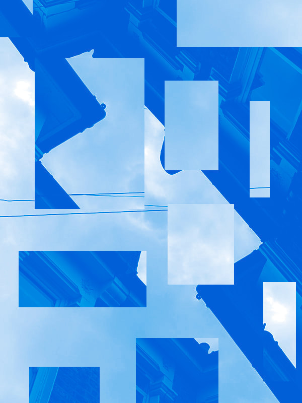
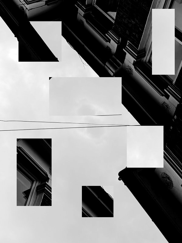
I experimented with photoshop to abstract the architecture images. My aim was to confuse and misdirect the viewer. I like that it is difficult to see where the image starts and ends and which way up is the right way to view it. I find this style interesting since the meaning and image is completely subjective.
Abstract images:
I think the majority of these images are successful however some felt overcrowded with complex patterns and shapes. I prefer the simpler images like the first one since it doesn't contain a lot of information and this abstract the image. Ironically, the fact that it doesn't contain a lot of information makes the image open to interpretations and so the underlying themes are just as complex as the images with complex designs.
Black and white images:

I made the images black and white because i find the harsh contrasts between light and dark to work well with the sharp edges used in the architecture photography. I think the end results worked as planned however i do think i can use the techniques i have learnt in the abstraction projects to improve. Specifically, i could add complex designs and colour to the black and white images to abstract them further.
Photographer Analysis: David Thomas Smith
|
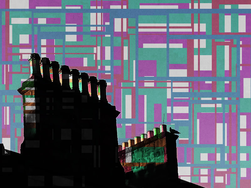
|
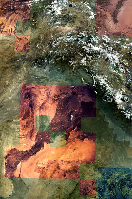
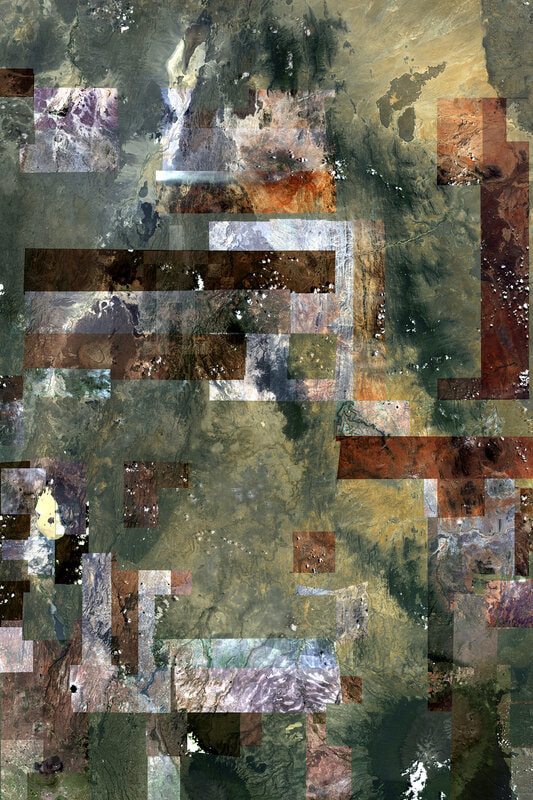
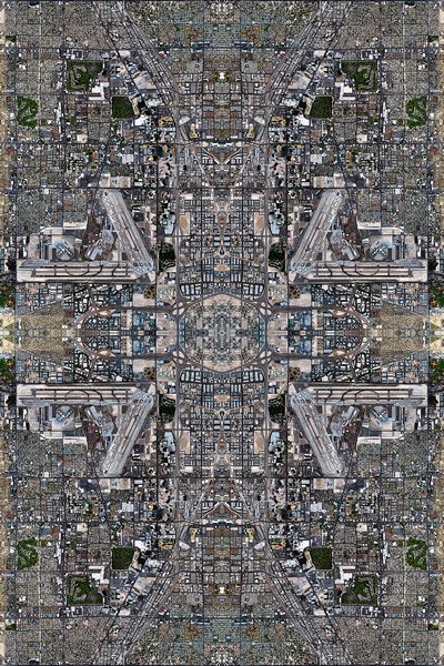
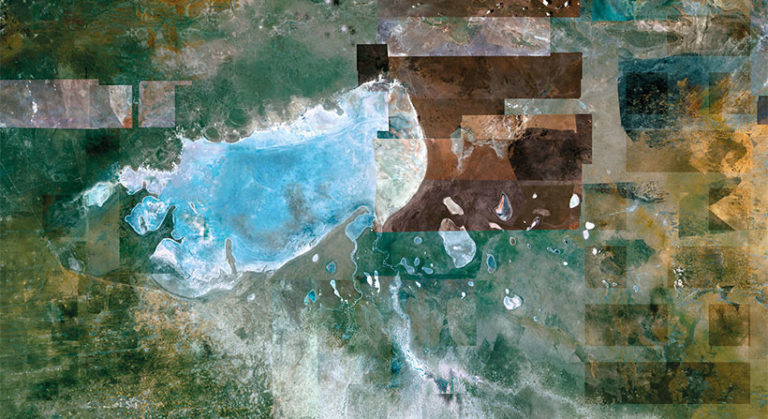
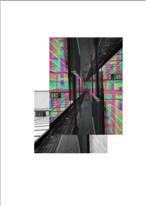
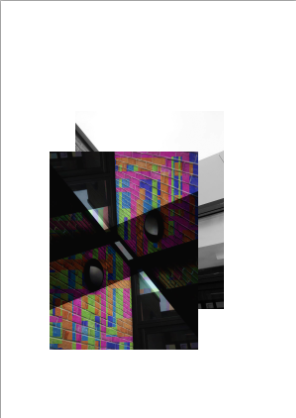
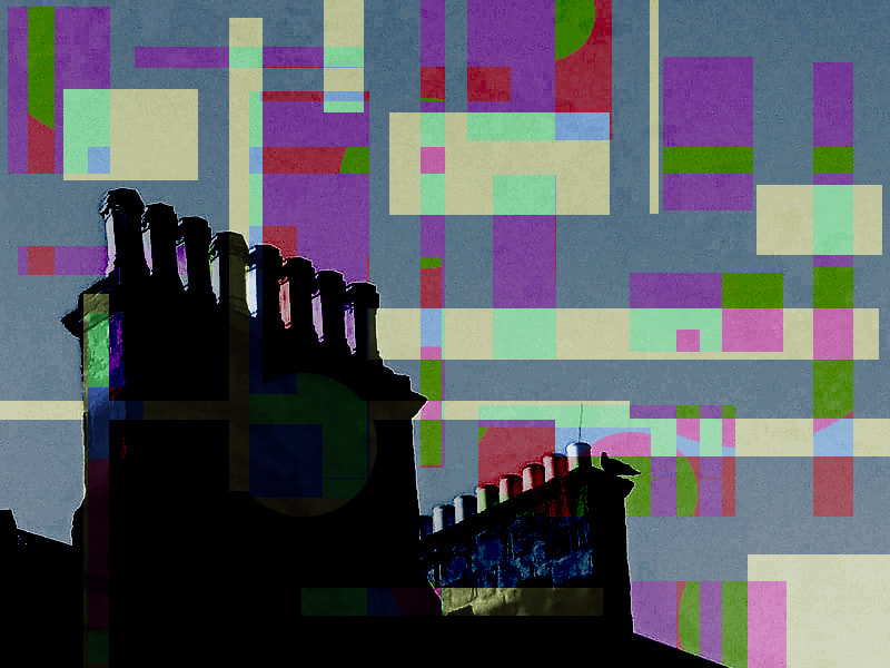
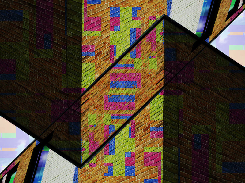
David Thomas Smith uses abstract geometry to make his image seem like multiple images stitched together when it is really the same photograph. I find his work very unique since he photographs from above and and therefore captures the 3D landscape as a 2D plane on a 2D art medium. Below is a David Thomas Smith inspired photograph abstraction. I specifically focused on the abstract patterns and geometric designs that Smith uses. I think the images were successful in terms of abstraction and design however due to the nature of Smith's photographs being aerial landscapes and my photographs being architecture photographs, the focal points of the images differ slightly.
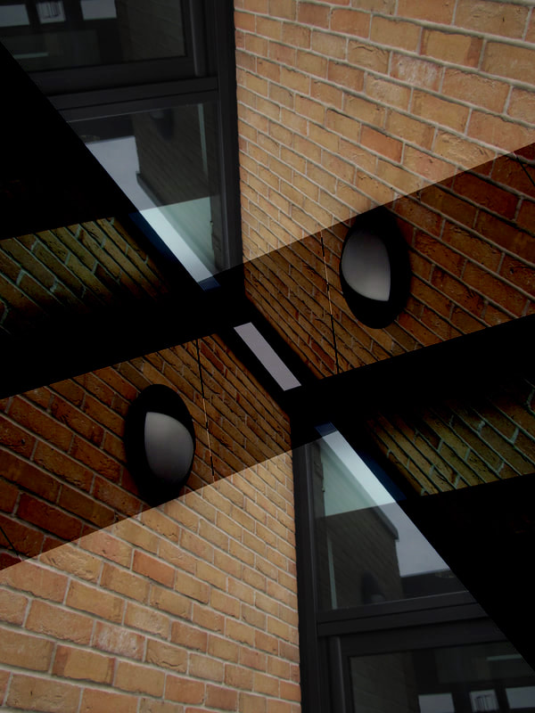
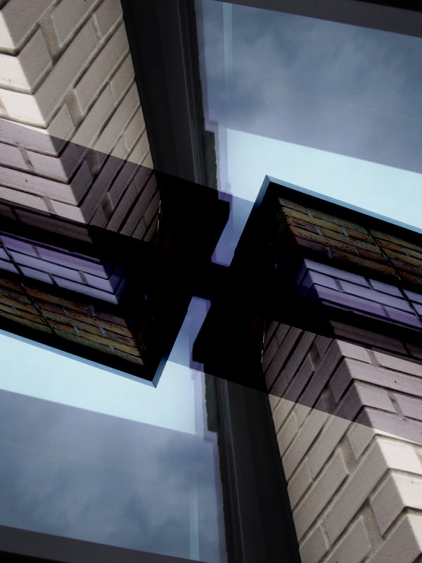
FIRST SET of abstracted images:
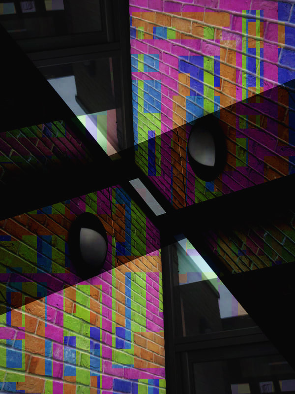
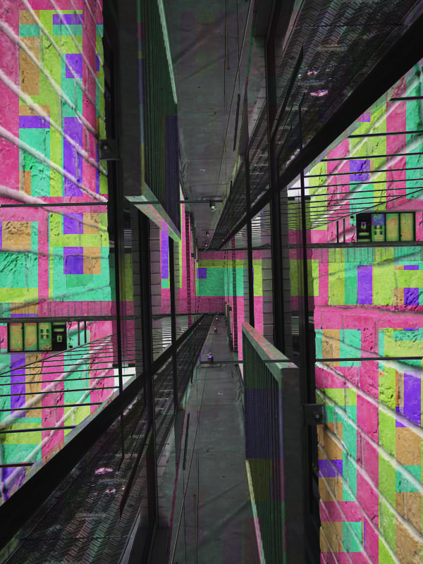
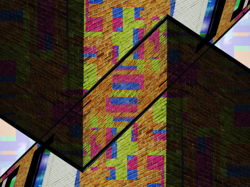
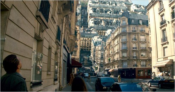
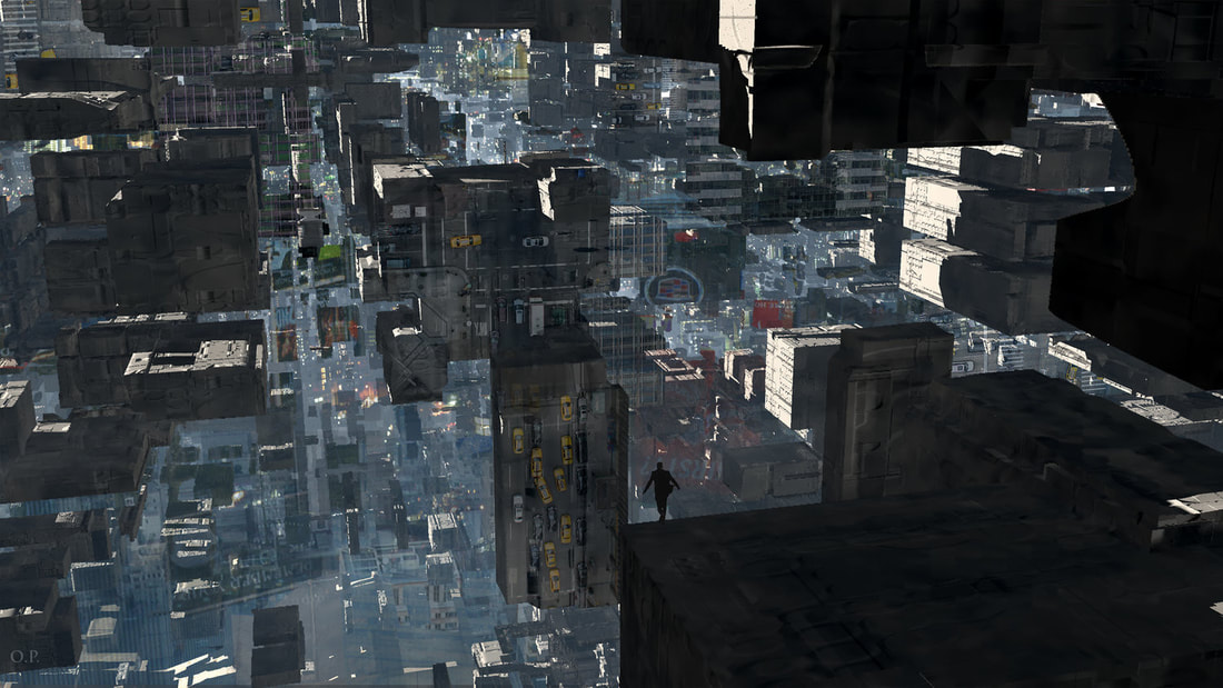
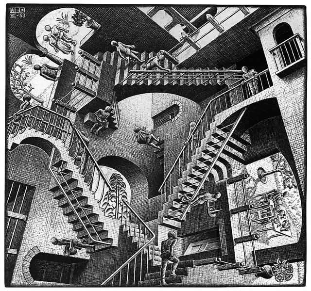
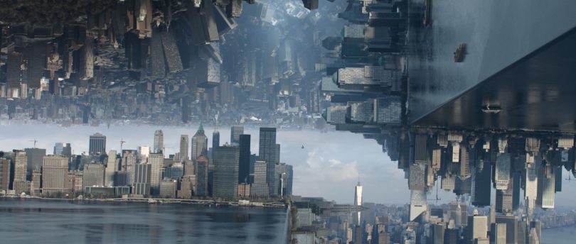
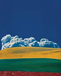
To abstract my architecture images, i decided to confuse the viewer by shifting, overlaying and repeating the image. To do this, i duplicated the same image multiple times and edited the colours of each layer. Then, i cut out small squares within each layer to show the layer beneath it and since the layer beneath is a different colour, it give the overall image a multicoloured design. I was inspired by fractal imagery as well as the complex architecture from certain scenes from movies like Inception and Doctor Strange as well as art pieces like the 1953 piece 'relativity' by M.C Escher. Examples of their work are shown below.
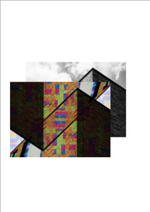
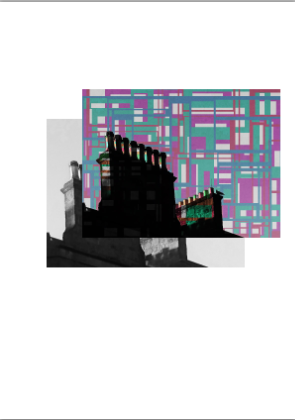
Zine photo book :
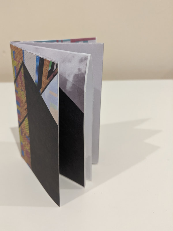
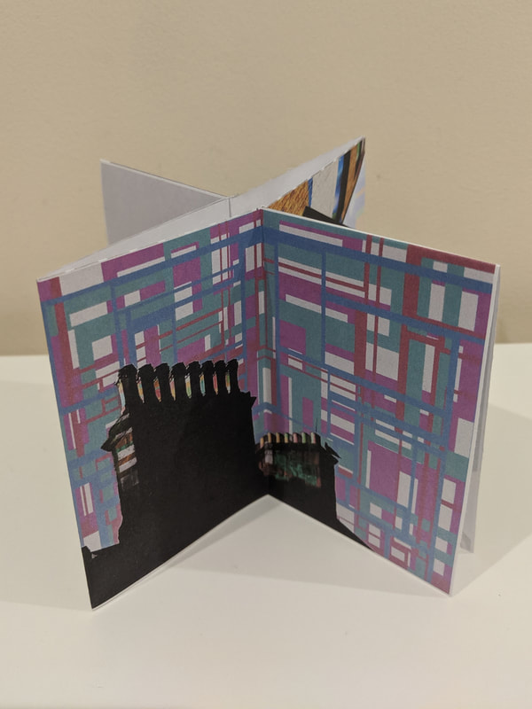
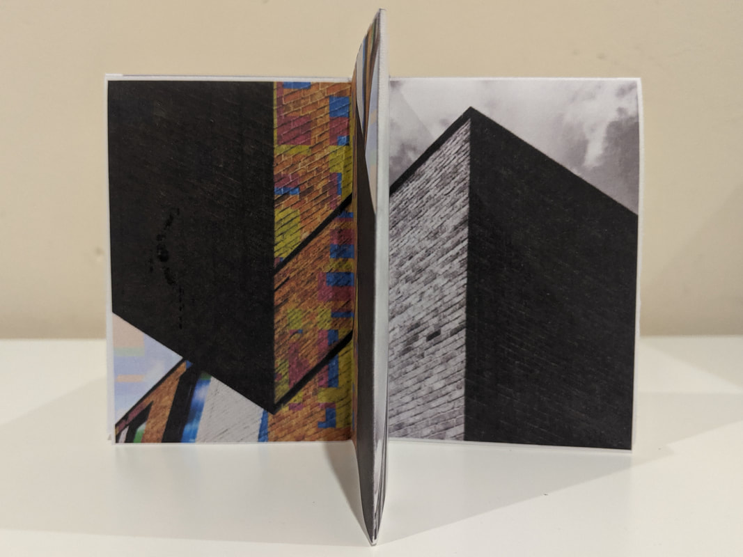
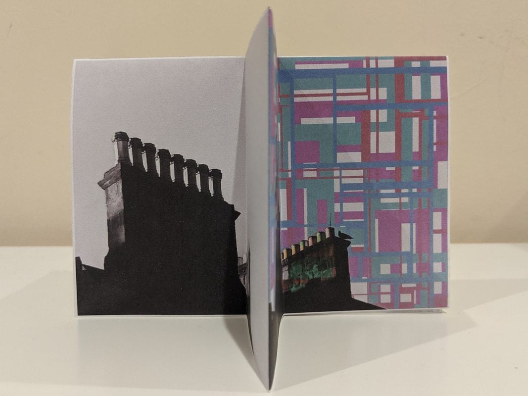
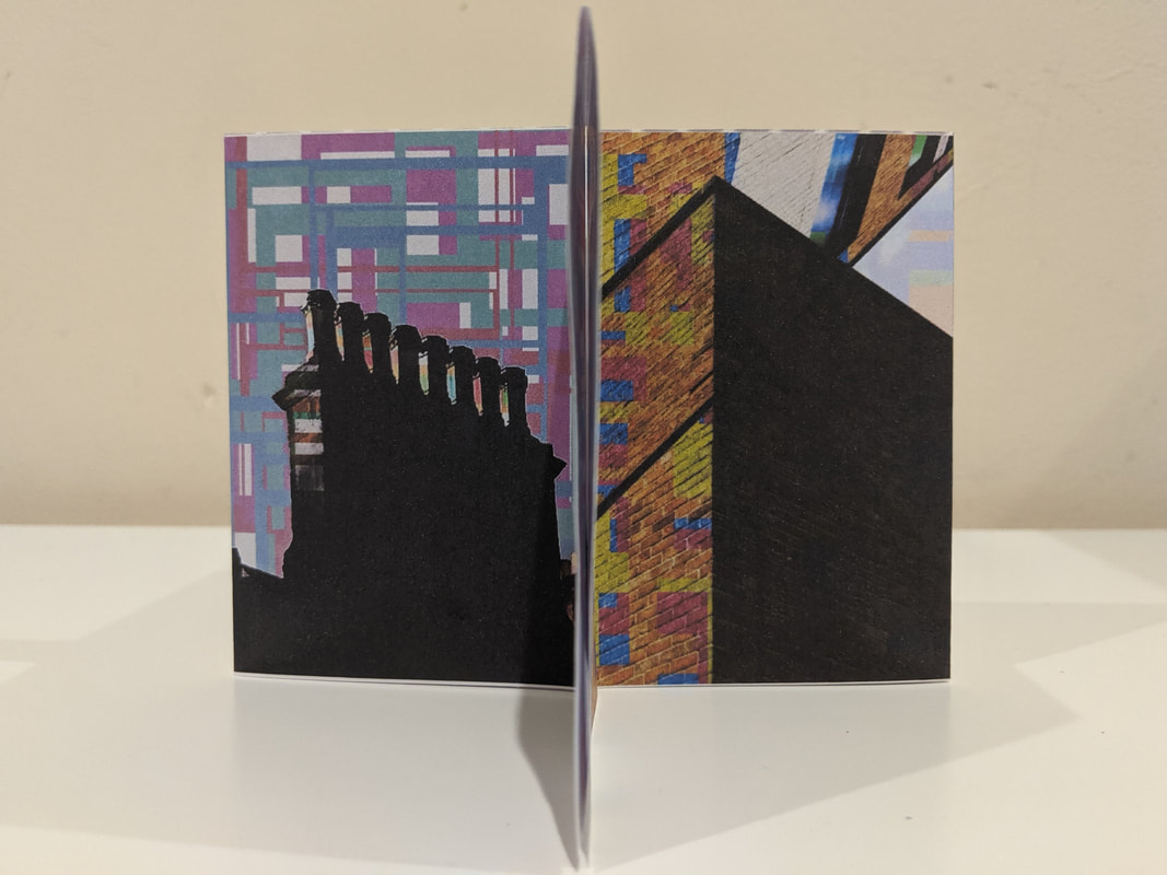
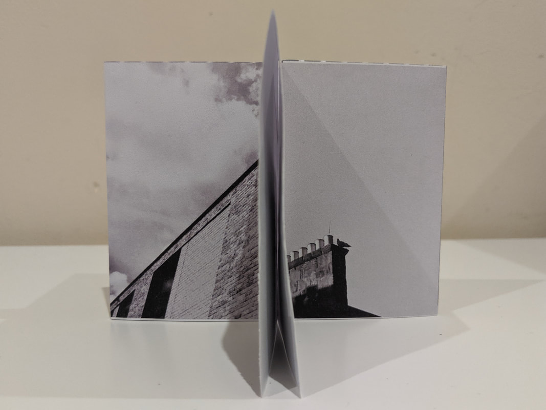
Images used for the zine


I made my zine with the intention to use the unique layout and shape of the design to my advantage when choosing images. I chose two black and white images and then chose their abstracted and distorted counterparts. This gives an interesting affect when viewing the zine in a specific way as shown in the images. When you hold it so you see two pages, you will either see one image with half black and white and the other half abstracted or two separate images both abstracted or both black and white. After completing my zine, i think i could create a photo book or sculpture similar to this for my final pieces.
Plans:
Here are the coloured images on top of the black and white images. I like this way of layering the images because it almost seems like the black and white image is the shadow of the coloured image. Furthermore, i'm thinking of creating an abstract photo board with a very similar photo composition to the images above.
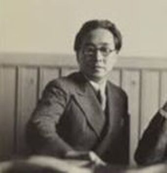
Photographer analysis: Iwao Yamawaki
|
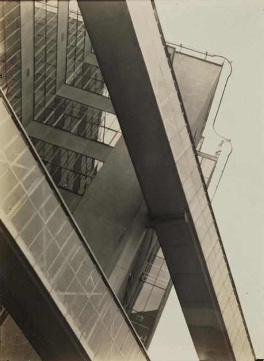  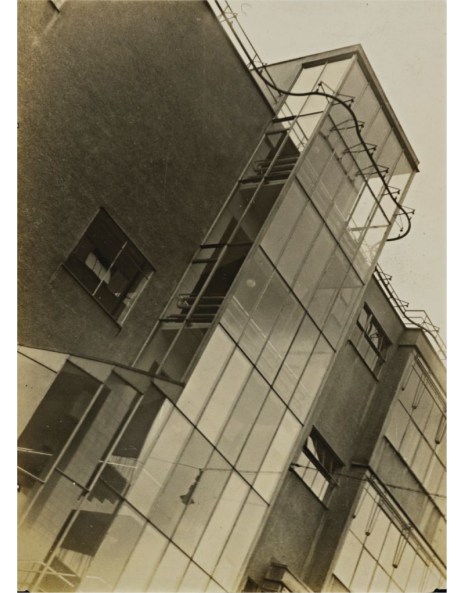 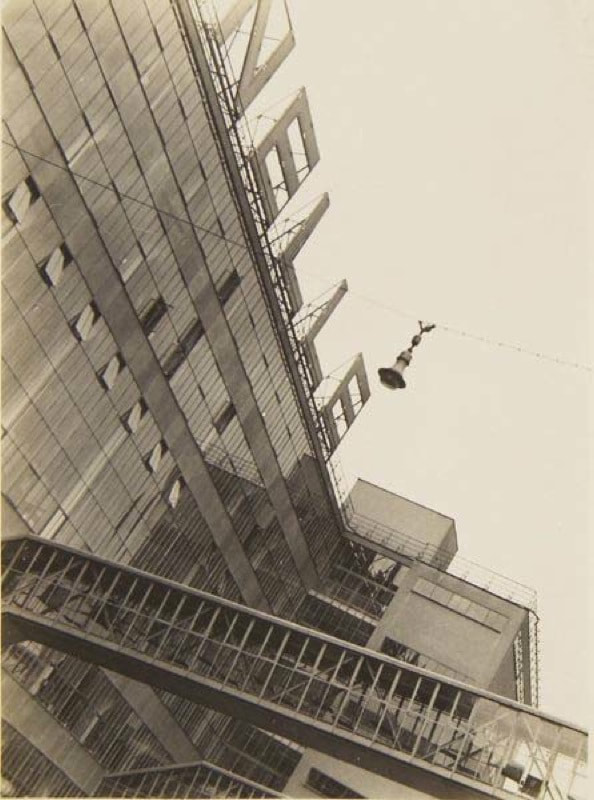 |
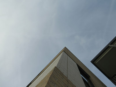
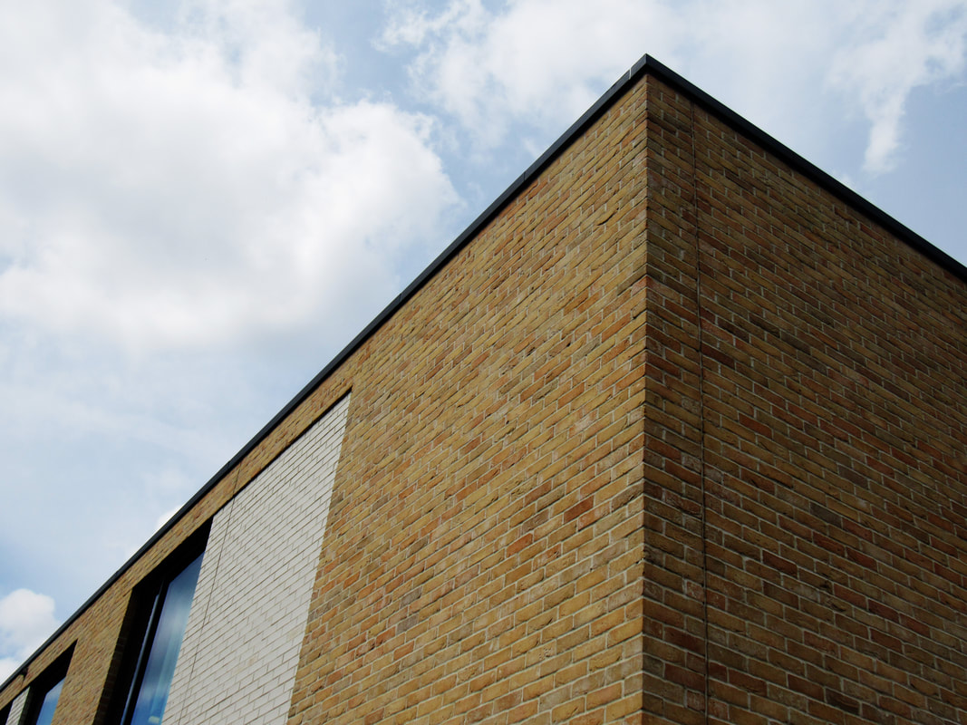
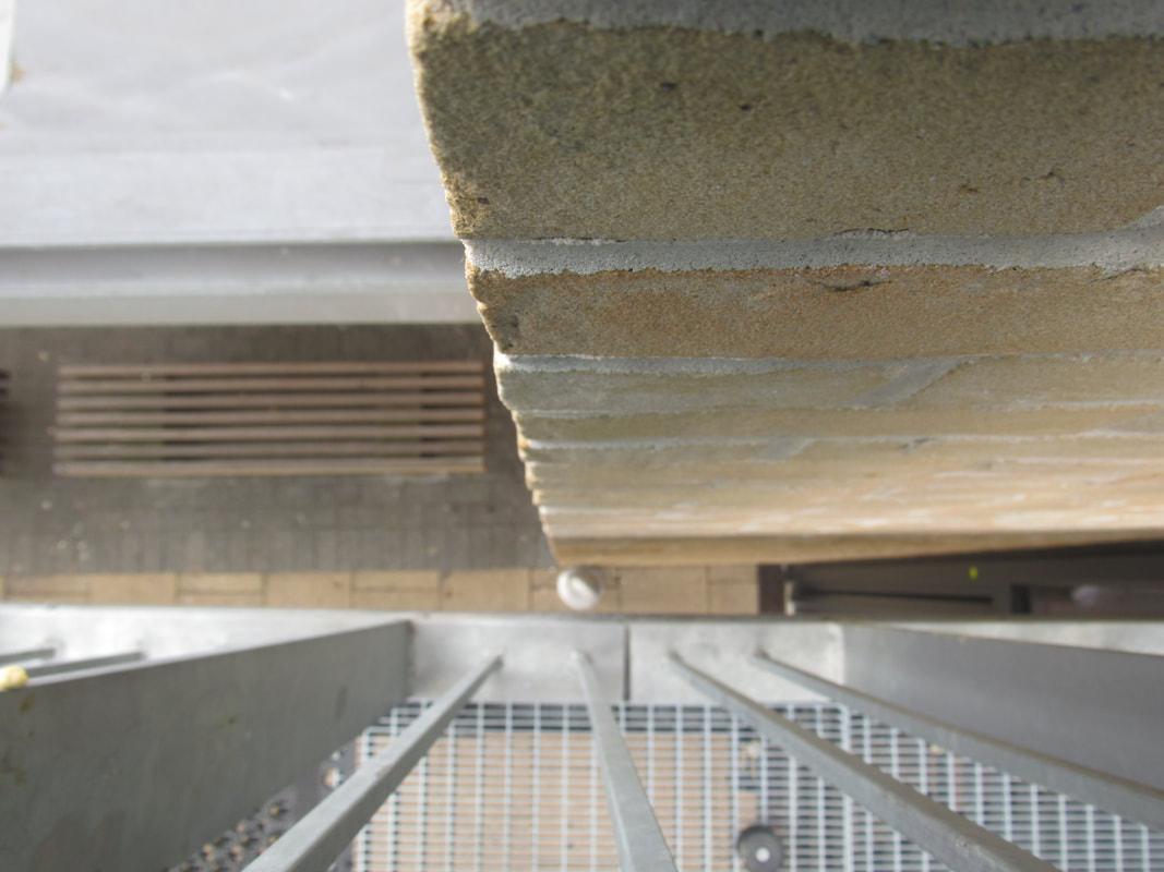
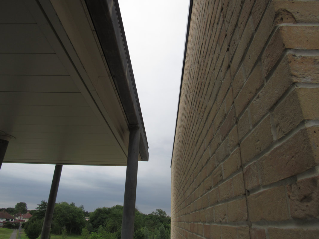
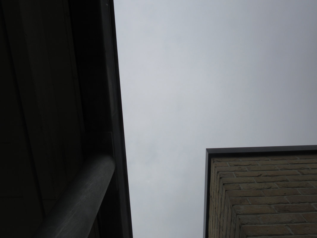
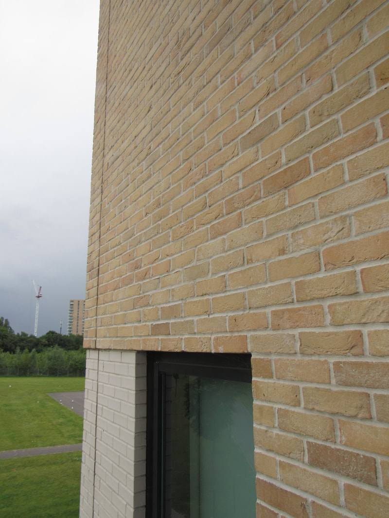
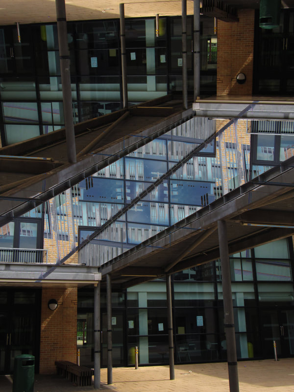
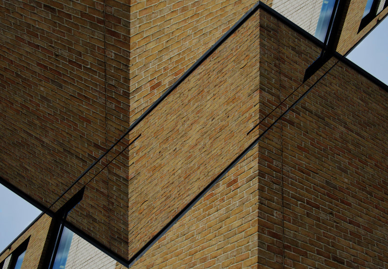
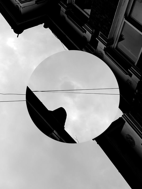
I chose to research Iwao Yamawaki because i find his style similar to mine in many ways. Yamawaki uses unusual angles that are usually from a low plane looking up to the architecture. I also do this because i like the sharp contrasts between the empty sky and the complex buildings. His images are often framed specifically to capture a small segment of the entire building to abstract the architecture further. Furthermore, there is a subtle contrast between the modern architecture he photographs and the old fashioned black and white photograph style he uses. The key formal elements used in his photographs are lines and shapes since he takes photographs of modern architecture.
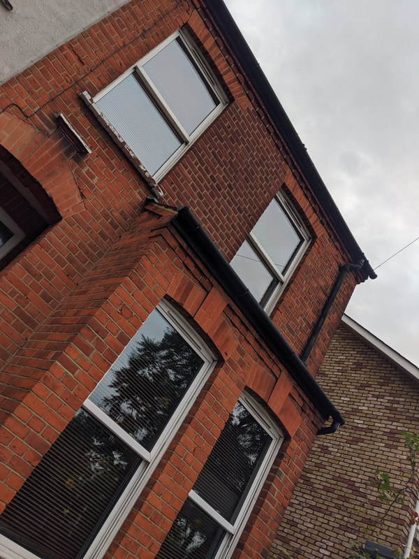
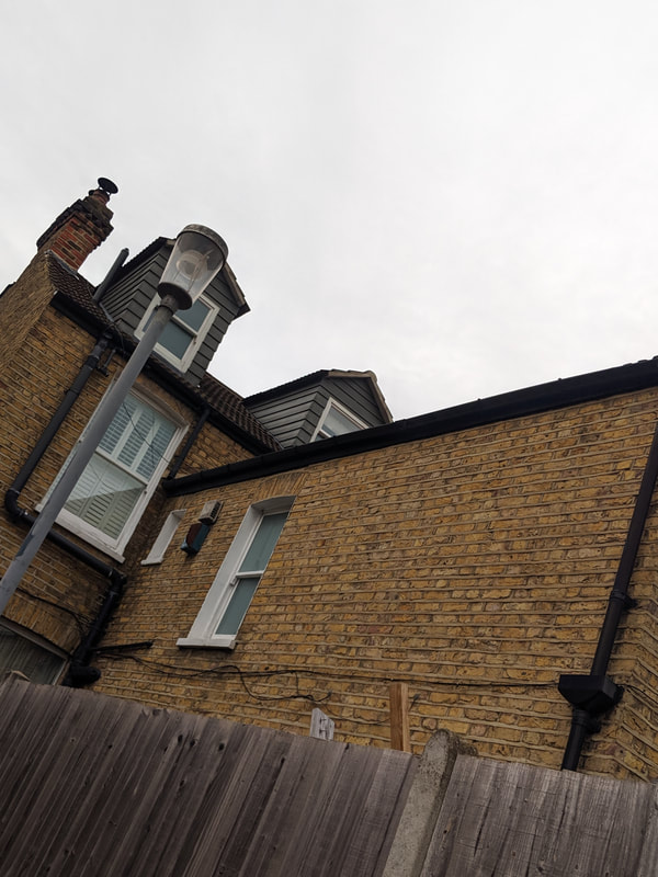
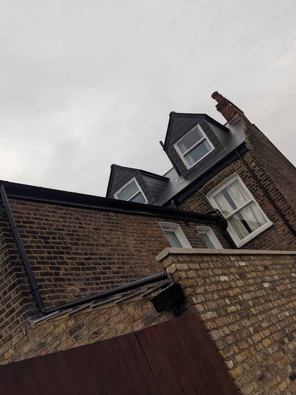
My photographs above are inspired by the unique angles that Yamawaki uses and i focused on the corners of architecture since that is the main focal point of a lot of his work. I think i could make these images more like Yamawaki's by taking photos in black and white since the only thing i was concerned about was the composition. In terms of composition, i think i got very close however i think Yamawaki used less blank space in the form of the sky whereas i used a lot of blank space. One thing i decided to do was focus on photographing old architecture with modern technology since it is exactly the opposite of Yamawaki's technique of photographing modern architecture with old technology.
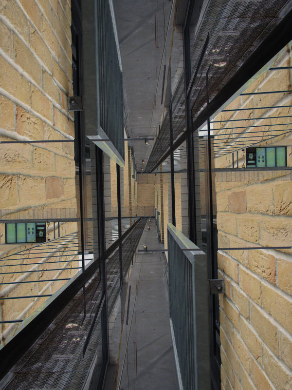
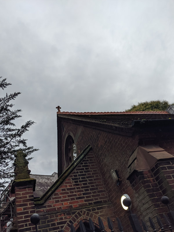
Continued home work:
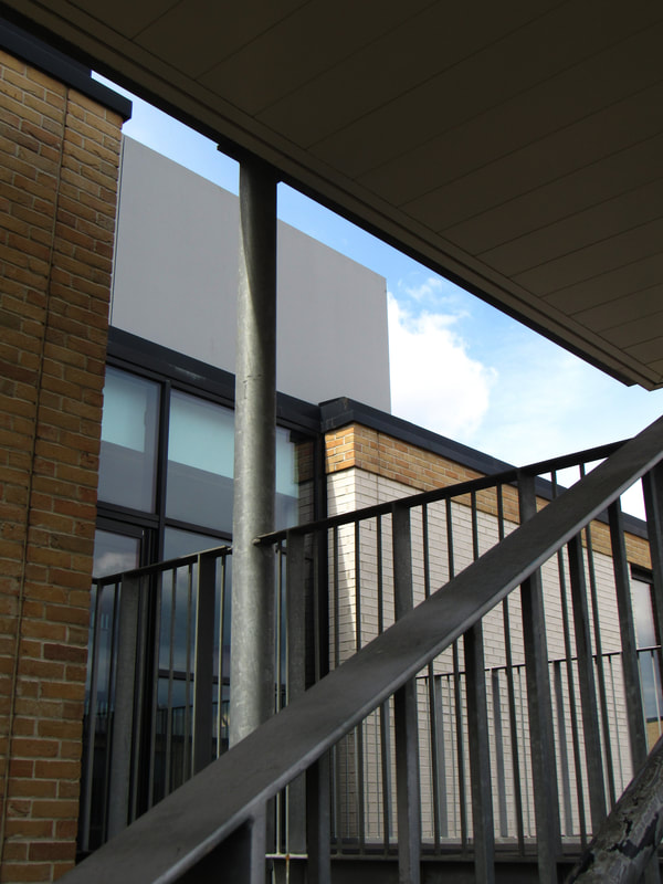
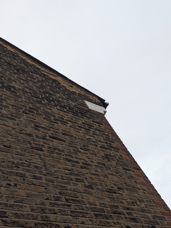
Here are the photographs i have taken outside of school. Many of these have only been cropped and or rotated to a degree. Some of the images are of the same buildings as before but i improved them by focusing on unique angles, such as photographing them upside down. Many of the photographs of other buildings have been cropped specifically to complement the lines and edges of the buildings. For instance, i made sure that the lines are either parallel or perpendicular to the edges of the frame and some lines were diagonal from the corners of the frame.
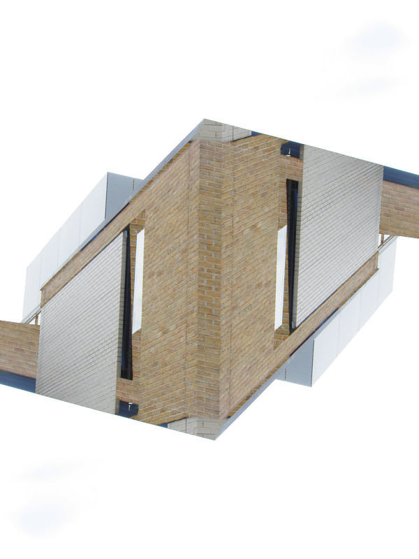
SECOND SET of abstracted images:
Here, i had another attempt at abstracting my images on photoshop. This is different from the first time i abstracted in photoshop since i didn't focus on geometric shapes as much this time. I included circular patterns and designs throughout the image. In my opinion, i didn't find adding round shapes beneficial since i ended up with an image that looks very colourful and immature whereas i was hoping it would look very complex and abstract. I may continue using only geometric simple shapes and i will experiment abstracting images in only black and white to give the images a slightly mature and thought provoking visual appearance.
In this image, i decided to use the same abstraction techniques i've been using for the previous images. However, for this image, i limited the layers to two layers, one was the regular black and white image, the other was the same image but with inverted colours. I cropped sections of the second layer to create this interesting yet minimal geometric design. Finally, i tweaked the contrast and brightness level of the image to give the image a poster like appearance so it becomes an image of minimal blocks rather than an image of extreme detail.
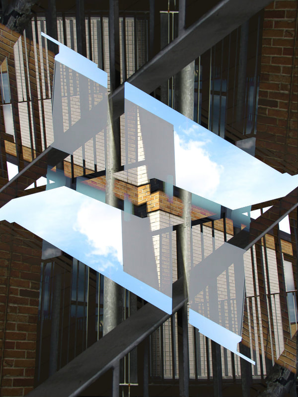
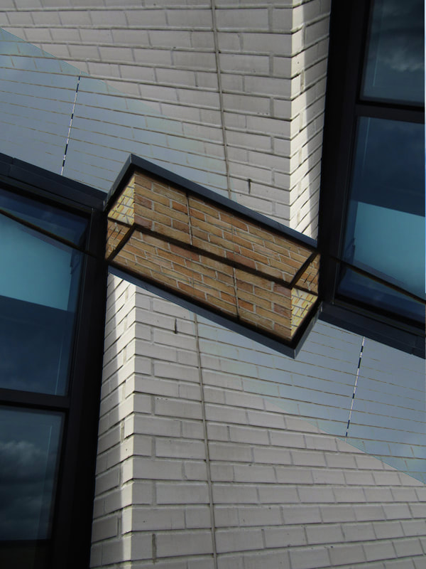
THIRD SET of abstracted images:

I abstracted one image by duplicating the image as another layer, abstracting each layer, then cropping sections of the top layer to reveal the bottom layer. I have been using this process with most of my architecture abstractions however this time i experimented with cropping circles and the duotone features on photoshop.
For this abstraction, i decided to use the same abstraction process that i have already been using. However, i specifically focused on the orientation of each layer so that both parts of the image seem like they would fit together until you realise they cannot because of the angle at which they have been placed.
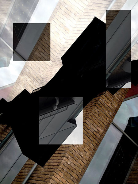
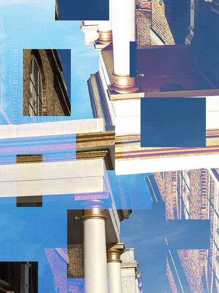
FINAL WORK:
FINAL PIECE 1 : Photo board :


These are my favourite and most successful images from all of my photoshoots and experimentations. I chose these images because i believe that these are my strongest images in terms of either colour, contrast or shape. Not only do they work well with each other, but individually they are composed and abstracted uniquely and effectively. I think that the use of colour, or lack of colour, compliments the overall nature of the image. For example, i used lots of colours for the images that are visually complex and have been abstracted with many shapes and designs (images on the left), whereas i have limited the use of colour to only black and white for the simple and minimal images (images on the right). For the images in the centre i chose to branch out from my usual methods of abstraction by minimising the usage of colour to a duotone (top, centre image) and by using non geometric shapes (bottom, centre image). I believe both cases were successful and this is largely due to the original architecture image. In all of these images, the original image of architecture is very simple yet contains enough interesting lines and shapes to play around with when abstracting. Furthermore, the original images had a lot of negative space which aloud me to duplicate the image and rotate the new layer to fill the negative space with interesting shapes and designs.
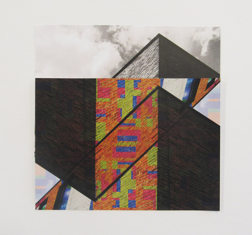
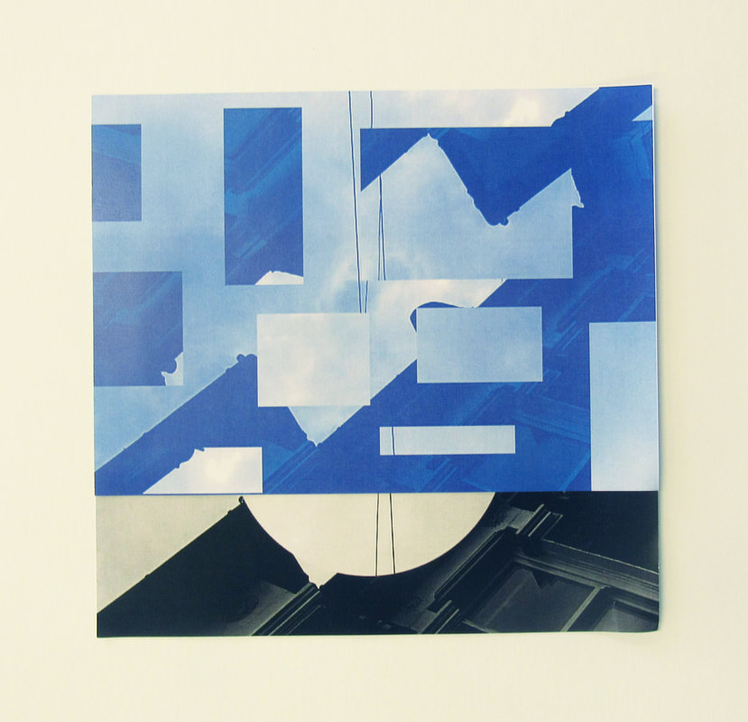
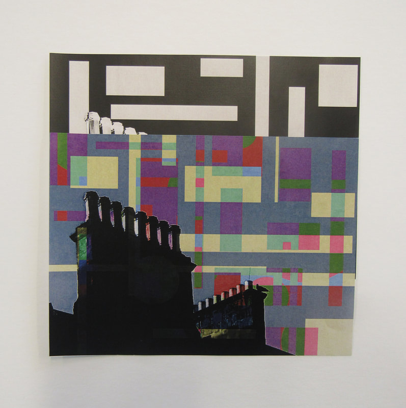
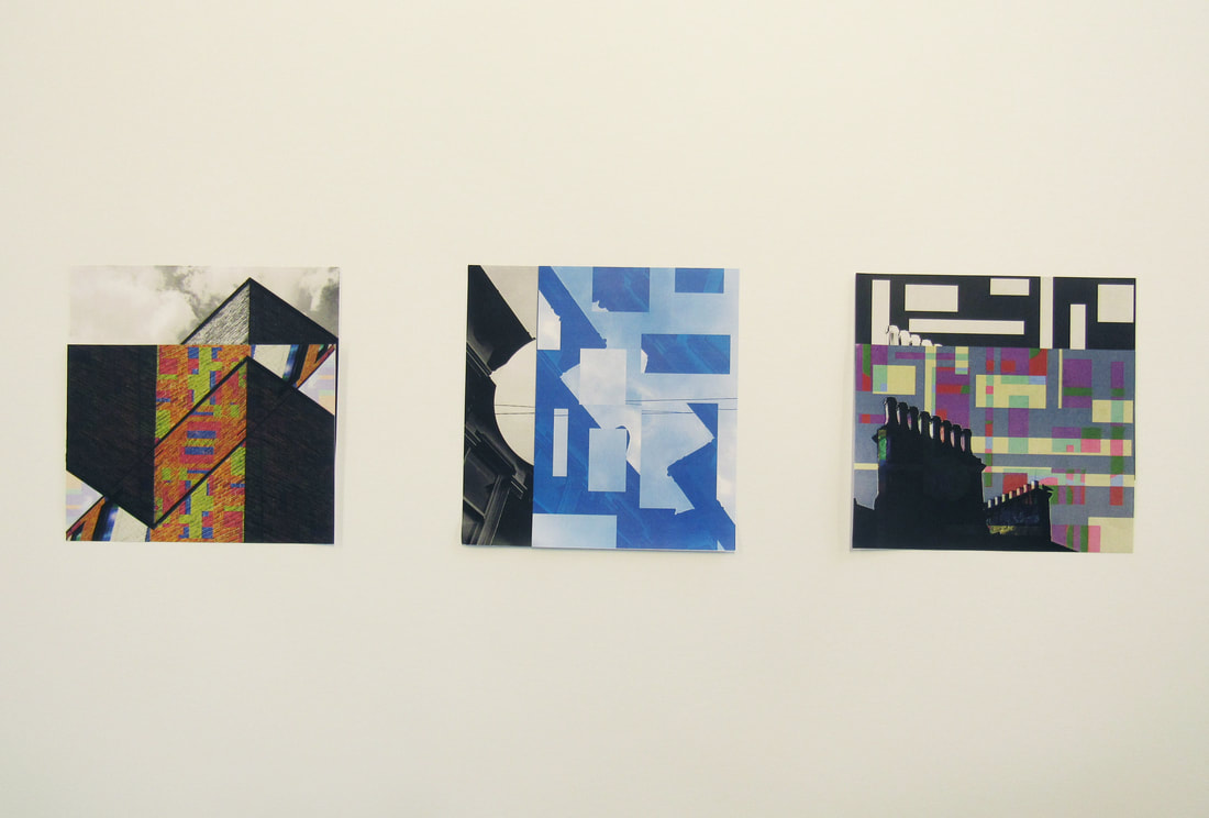
For this final piece, i had my photos mounted onto a board in a similar layout as the images above. I had one set of coloured, abstracted architecture images and one set of neutral, black-and-white images that can each be paired with the image from the other set. I matched the complimentary images and layered the coloured image above the black-and-white image in a way so that it creates one, square image that is a split into two distinct sections. I then arranged these squares side by side with equal spacing between them and around them. The composition of the board resembles a minimal, flat and empty space with three bright and bold islands of colour.
FINAL PIECE 2 : Individual images:
|
|
I made this set of images using all of my abstraction skills. Furthermore, i experimented with the colours in the images as well as the layout and lines. I think the image on the left is a strong image by itself because of the deep contrasts between the multiple sections of the image. I find that it intriguing because of the complex and modern design of the architecture that messes with the sense of reality and creates an illusive atmosphere. I like the second image because of the use of colour and the unique shades of gold and blue that create an ethereal and dream like sense. I think the contrast between the two images is best shown when they are next to each other in a way that showcases the varying degrees of colour, light, darkness, lines and textures of each image.
Component 1 Personal Projects Evaluation:
Throughout my Component 1 Personal Projects, I have drawn inspiration from a multitude of artists and photographers that each have unique and interesting work.
ABSTRACTION PROJECT -
For my Abstraction project, I researched the photographers, Man Ray, Uta Barth, Harry Callahan, Ernst Haas, Alvin Langdon Coburn, Saul Lieter, Berenice Abbott and Peter Fraser. Most of my Abstraction work was heavily influenced by the photographer Ernst Haas due to his ability to craft surreal and powerful images using vibrant and saturated colours. Furthermore, I blended the bold colour palette of Haas’ work with the uniquely abstract compositional techniques of Saul Leiter. My final abstraction photo board reflects the use of colours and shapes of Haas and Leiter, whilst also showcasing my own personal tastes for minimal yet striking compositions. For my Puzzled’em Abstraction sub project, I applied the same levels of colour from the previous work to my final piece whilst also introducing the extreme use of lines and edges that Is prevalent in the work of Harry Callahan.
SELFIE PROJECT -
For my Selfie project, i researched the photographers, Vivian Maier, Louis Daguerre, Isle Bing and Lee Friedlander. In my Selfie photographs, I mainly focused on the composition and lighting of the images. I drew inspiration from Vivian Maier’s distinct compositional choices that often break the rule of thirds in which she places herself slightly off the mark. In addition, I attempted to recreate the interesting lighting techniques common in Lee Friedlander’s work. In my opinion, my best images were the ones in which I explored the effects of lighting, mirrors, reflections and shadows. For the final photo book that concluded the Selfie project, I deliberately chose images that not only were strong individual images, but also complimented each other incredibly well. This formed a consistent tone throughout the final piece that overall, I was very pleased with.
EDGES PROJECT -
In the Edges project, I only chose to focus on one photographer who was Dolores Marat. For the project, I wanted to express more of my own abilities and techniques rather than looking at other photographers first. I think that in doing this, I was able to fully envision a blank canvas onto which I could craft something completely original. In doing so, many of my Edge's photographs explore the idea of edges and lines without any bias towards a favoured artist’s work. For instance, each of my images seems to be completely different from the rest due to the unique focuses and techniques used to make each image. I think this paid of incredibly well in my first sculpture piece. I managed to create a sculpture that not only replicated the theme of Edges itself, with it’s sharp corners and sides, but also showcases the variety of individual images clashing together into one awe inspiring, abstract amalgamation. Moreover, my postcard sculptures took the theme of edges into a new area in which I attempted to reduce the power of my previous, sharp sculpture by using less images and cutting out round and rectangular shapes instead of sharp triangular structures. In doing so, the images blended with each other rather than clashing and the result was subtle yet still conveyed a unique aspect of Edges that was lacking In the previous sculpture. For my final Edges piece, I experimented with the use of photograms and the creative ways I could take advantage of their black and white, minimal appearance. I decided to highlight and exaggerate their simplicity by pairing each photogram to a contrasting, colourful and abstract image.
ARCHITECTURE PROJECT -
In this project, i focused on researching Margaret Stratton, Berenice Abbott, Ezra Stoller, Philip Schaerer, Harry Callahan, Lucien Herve, Candida Hofer, Jeroen Peter, David Thomas Smith and Iwao Yamawaki. I conducted an in depth analysis on each photographer's styles and techniques in order to draw as much inspiration as possible. Over the course of my previous projects, i had developed my own aesthetic of photography. This allowed me to think more about the meaning and context of my images rather than the design. I began to think about each photographer's trademark style and what the overall story is that they attempt to convey. Not only were the styles of the photographers interesting, but they also contributed to their own personal perspective of humanity's relationship with the natural world and architecture. Throughout my photoshoots, i focused on capturing lines as i did throughout my Edges project. During the editing process, i experimented with colours the same way i did throughout the Selfie project. Finally, i used the photoshop skills i learnt from the Abstraction project to abstract and develop my images. I repeated this process multiple times and improved my method each time. I believe i produced a final set of images that reflect all of the skills, techniques and processes that i have acquired throughout component 1. The Final Piece 1 images were mounted onto a board that i specifically composed to showcase each image's unique qualities by paring them up with complimentary images and also rearranging them into a format that conveys my own personal photography aesthetic.
Overall, i would say that all of my projects have been completed to varying degrees of success. I believe that the weakest project in general has to be the Selfie project purely based on how little i experimented in the project after i took the photographs. Although i was proud of the initial images i took, i think i could have developed my images further. I think that, the Edges project is my next favourite since i began to experiment with my work a lot. I really like the 3D experimentation i began conducting with the Edge's photo sculptures. My next favourite project has to be the Abstraction project because this was were i developed my photoshop skills and began finding my own style. Overall, i became more confident in experimentation both during and after i took my images. I think my Puzzled'em sub project really shows how much i have developed since the start of component 1 and also shows the best aspects of my Abstraction project. That being said, my favourite project is the Architecture project. I prefer this project to the rest because of the fact that i was able to choose the theme of architecture myself and conduct my own work independently. This allowed me to freely experiment and pursue my own personal ideas which led to a more meaningful final response to the project. In many ways, the Architecture project symbolises all of my abilities merging together to produce the best possible work i have done. My Final piece 1 was surprisingly more effective due to the images themselves rather than the actual physical layout whereas in my earlier projects, the layout of the images would have been the focus and so i am proud that the first final piece was strong because of each and every individual image as well as the layout.
